曾任某電動車系統公司行銷長。主業是數位行銷與媒體管理顧問。長年的寫作者、譯者、編輯、重機騎士、雪茄和艾雷島威士忌愛好者。 我也是養兩隻貓的犬派潛水員、健身教練、書法家。 關於我/https://fred.mba
Big is not necessarily beautiful, customers pay the bill: Is Nie Yong really bad at designing?

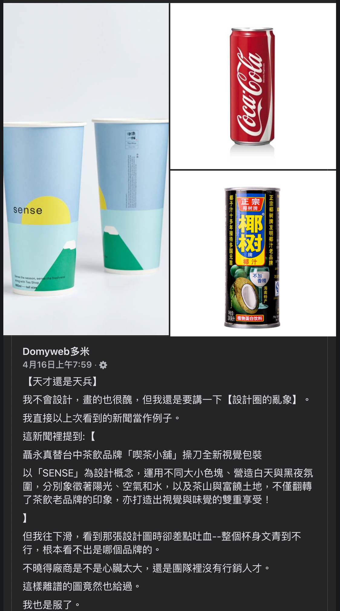
Maybe you have noticed that two days ago, a person who claimed to be "no design" posted on Facebook "Tell me about the chaos in the design circle", criticizing designer Nie Yongzhen's packaging visual planning for a tea brand. For the original criticism and Nie Yongzhen's reply, please refer to this post on Nie's version:
https://www.facebook.com/somekidding/posts/5195968447134788
Although I don't particularly like Mr. Nie's design, I don't quite agree with the comments in the post about "designing based on logo size" and "designing based on the ability to convert sales".
The batch mentions:
The place where [Reasons for Purchase] can be placed has become inexplicable blank space and unintelligible illustrations.
Even the most basic LOGO was reduced to the point where he couldn't see it clearly.
That is to say, only [Nie Yongzhen] is seen in this package, and there is no [Eat Tea Shop] at all.
Isn't this funny?
Of course, you can discuss the impact of the overall arrangement on indicators such as brand recognition and product recognition, as well as technical perspectives such as illustration quality or white space ratio; but jump directly to "The logo is not big enough, so... very Ridiculous." It jumped a little too fast.
Swinging Design Trends
If you pay attention to the history of CI (Corporate Identity) in recent decades, you will find that in terms of key visual elements (usually logos and standard words), the design trends of various brands have been oscillating between the following points:

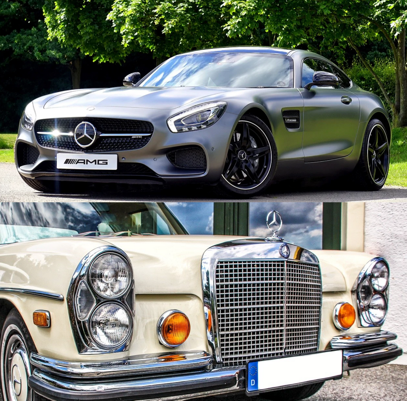
- Logos are getting bigger and bigger: For example, the logos of various car brands in recent years have become smaller in the past and larger now;
- Logos are getting smaller and smaller: some so-called "wenqing" designs, or genres that advocate that logos are not necessarily the main visual elements (by the way: the ultra-small "wenqing typesetting" of some publications makes the layout more creative, But it's not very friendly to read. I hope the designer can read the text for himself);
- The logo overshadows the overall design: the logo is not just a logo, it becomes the structure of the overall design itself when enlarged, such as the Starbucks logo that is often joked. This technique is also quite common in recent sports brands such as Nike and Adidas;
- Logo is design: for example, the LV leather goods that you often see have an undisguised whole piece of LV continuous pattern, and almost all products look like this;
- Other designs replace the logo as the main visual element: for example, BMW's "big nostrils" are "non-logo elements" that are more recognizable than the original logo on the road; or some of Apple's classic designs, so that most people don't need to see the logo, I know it's an Apple product.
There is no absolute right or wrong in these methods, and few manufacturers are "one-stop", often swinging between different methods in a cycle of about ten years. You might as well choose an international brand that is more active in brand management, and observe whether they have undergone such changes in the past ten years.

And these changes are usually not to "directly increase sales" (or "conversion rate" in e-commerce parlance), but to increase recognition rate and recognition, or to establish a brand positioning image that was originally lacking; Under the joint promotion of products and sales channels, the purpose of increasing sales volume is achieved.
(In other words, if product design and sales operations don’t help, design alone will have limited success.)
As for the reason for the logo or other branding element change, I'm in "New Music for Family Mart...do you like it?" > has already been listed in the article, so I won't repeat it here.
Therefore, any design can be commented on, but the premise and focus still need to be clarified. There is no formula for "...it's good" in brand design, otherwise those brands wouldn't need to swing.
Only see the designer, but not the brand?
Another question is, is it a good thing or a bad thing for the design to "only see the designer, not the brand"?
In the cooperation between designers and owners, the ideal situation is to pull each other up; sometimes brands pull designers, but there are many cases where designers pull brands (and this kind of situation is often reflected in design cost).
Therefore, by hiring well-known designers, publicity through the designer's personal network, and even making a name for themselves in such controversies, these are all additional benefits that owners can get. While this type of promotion is short-lived and may even be controversial, it's understandable.
The favorite case of many designers (including myself in the past) is "the owner buys my design style" instead of "call me to execute the (very low) design he wants", so it is better to spend The big money lets me do whatever I want, and in the end, I pay the bill without any instigation.
However, such cases are rare, and from the perspective of professional ethics, it is impossible to completely ignore the opinions and needs of the owner; unless, your "story" can completely seal the owner's mouth. But even if it succeeds, it becomes Spider-Man: the greater the dominance, the greater the responsibility; usually few designers have such audacity.
- Reference reading: Talking about the modification of Xiaomi logo design by Kenya Hara <🔏Small modification, big fee, is this reasonable? >
If the designer's personal style is so strong that the work "designs for design's sake", ignores product and brand needs, the work does not match the attributes at all, or can be executed, but the cost-effectiveness is disproportionate, etc., even if it can lead to a temporary Discussion or controversy is still a bit unethical in terms of overall marketing (the designers themselves may feel okay).
Putting this aside, in a short period of time, "seeing a designer but not a brand" is not necessarily a bad thing; if the owner itself is not well-known, it is a shortcut to hitch a ride with a designer. However, the owner must have a follow-up marketing plan to properly use the design and the initial "designer bonus" to find out how to expand the market.
Otherwise, the designer is actually the same as the matchmaker, who is "inclusive of marriage but not having children"; ensuring that the designer can provide long-term dividends and even guarantee the conversion rate is just as impractical as wanting to have children by relying on the matchmaker alone.

Epilogue
My thoughts on this controversy are:
- I don't particularly like Mr. Nie's work, and the controversial design didn't impress me; this has nothing to do with the size of the logo, it's just a personal indifference.
- I believe that Mr. Nie's works have not stepped on the red line of "personal style defeats the owner" and "design for design", and there should be a consensus between the owner and the owner; and according to Mr. Nie himself, "Actually, the photos did not take pictures. There is a big logo on the lid of the cup.”
- But Mr. Nie is a designer with a distinct personality and a storytelling ability.
- The man who criticized has his own position and freedom, of course he can speak; but his argument is too weak, the examples given are too archery and target, and he ignores the interaction between the designer's personal style and the owner (thinking that only the designer sees the designer). No) and the "swing" of past design trends, that is, the actual case proves that "it doesn't have to be a big logo to sell."
- Once again, in addition to basic factors such as aesthetics and applicability, the "recognition" and "recognition" of the brand are the highest indicators, not the illusory "conversion rate".
However, in terms of internet volume, this incident has won the critics, Mr. Nie, and the owner for about a week.
Next, it's up to the owner.
Like my work?
Don't forget to support or like, so I know you are with me..

傅瑞德的硬派行銷塾

歡迎來到「傅瑞德的硬派行銷塾」。我從事寫作和翻譯逾30年。曾擔任企業行銷長、雜誌社長、開了語言行銷服務公司、寫過很多中英文文案。個人簡介請參閱 https://fred.mba 。
Comment…