來自香港的上班族,十八年跨國外商工作經驗,三成職涯外派於各大金融中心。現時為私人銀行商務顧問,屬極少數定期分享雙語簡報心得,並同時仍在國際職場一線打拼中的商業簡報專家;著有「全圖解!避開99%簡報地雷:職場商業簡報實戰懶人包」一書。 FB/ IG: salaryman.presentations
Briefing Design|The Design Thinking Behind "Good-looking": In-depth Analysis of Apple's Briefing Layout Skills
Looking at the blank slideshow, I don't know where to start. It is probably the doubts you and you encountered when you first came into contact with the briefing. It is not difficult to align objects in the software, but how to assign layouts, establish layers, and guide the line of sight is not something that can be used skillfully at all times.
Appreciating other people's real presentation works, compared with blank templates, can learn the skills more effectively. If you can steal the logical thinking behind the teacher, it can be of greater help.
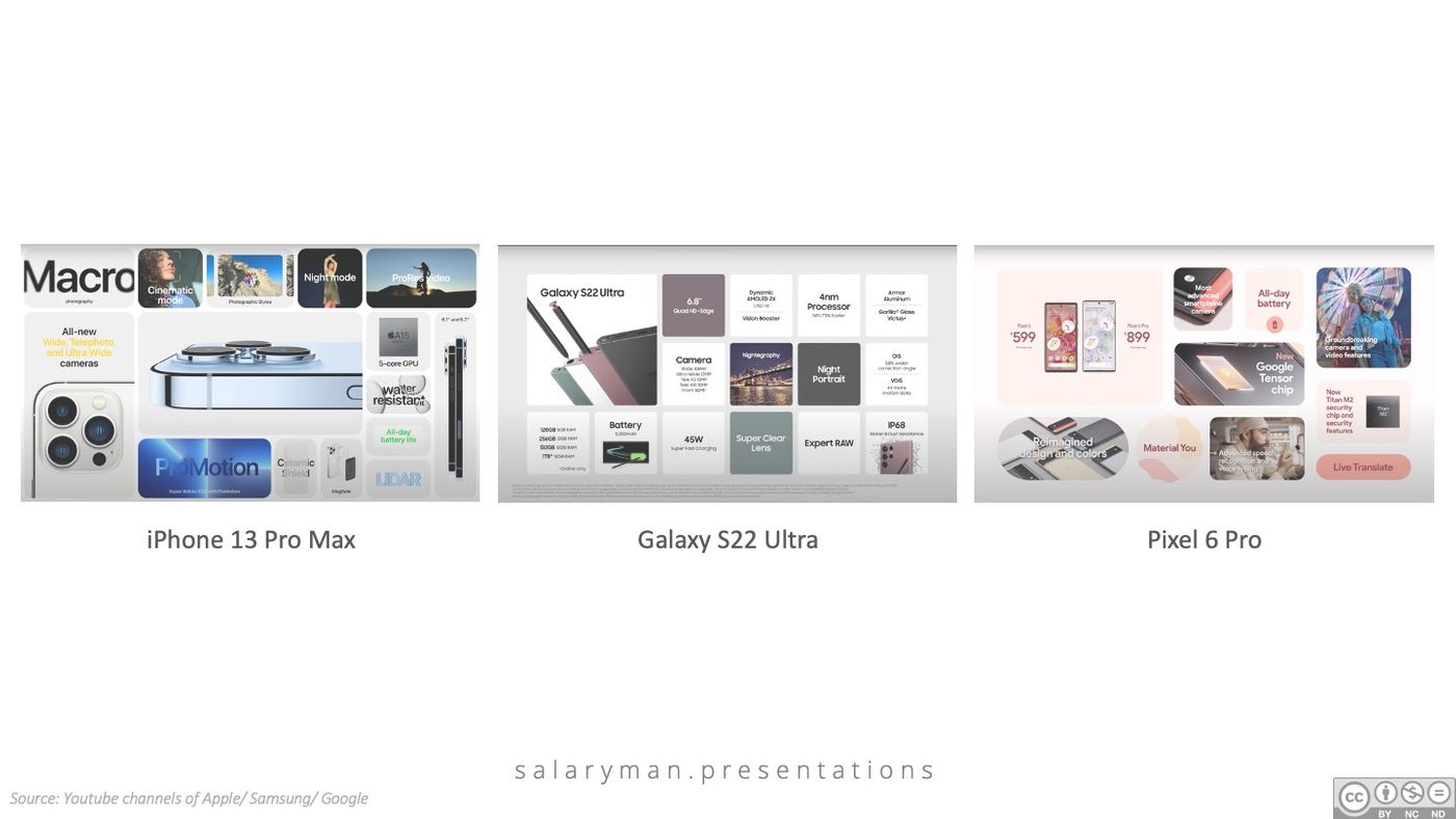
In the product launch conferences in recent years, when dealing with the function summary page of the product, major international brands all use the tile-based style, although each will infiltrate a little size, proportion and rounded corners Changes, the design is becoming more and more similar:
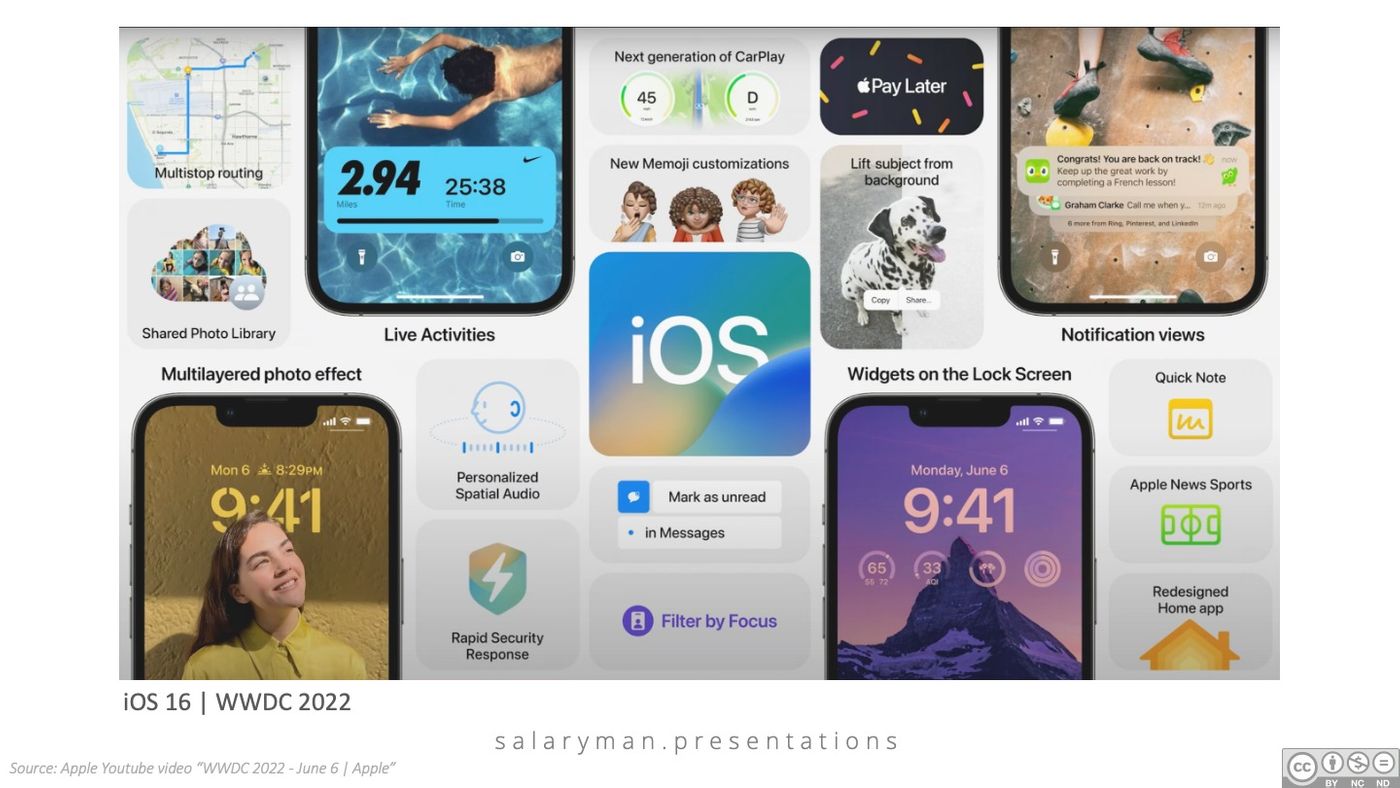
When Apple introduced the new version of iOS at WWDC in June, when summarizing the various new features, it seemed inconspicuous, but there were ten tips for the layout of the briefing:
1) Use the phone screen directly
For other brands or Apple's previous designs, the frame line of the square cannot be surpassed, and the content or images are all within the frame line. This time, Apple's slideshow design directly replaces some of the squares with the screen of the mobile phone. The method is innovative without being obtrusive. It is precisely because the appearance of the mobile phone is already a rectangle with rounded corners, so it can be easily integrated into the original design. The design style of iOS 16; and many of the new features of iOS 16 are all around the lock screen, putting the mobile phone screen directly into the slideshow, which can also cooperate and display new functions;
2) The mobile phone screen extends beyond the edge
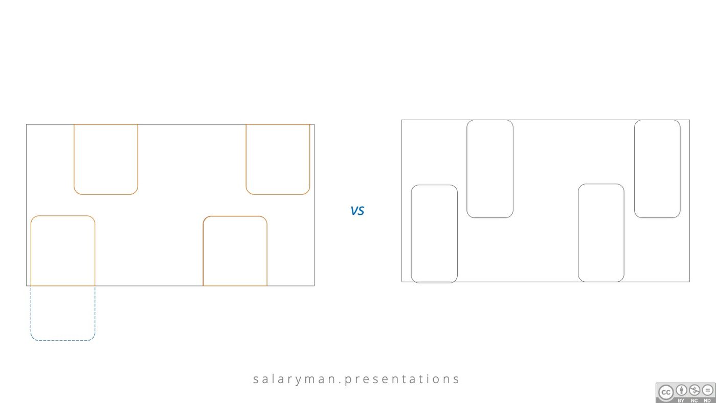
Compared to putting the entire phone in the slideshow, Apple's design only shows half of the phone, which can visually create a hint that there is actually more content, making the picture look richer; on the other hand, this Compared with the display of the entire mobile phone, the proportion of the mobile phone screen that can be displayed by this method is larger, and the new lock screen function can naturally be displayed more clearly;
3) Strategically allocate screen cuts
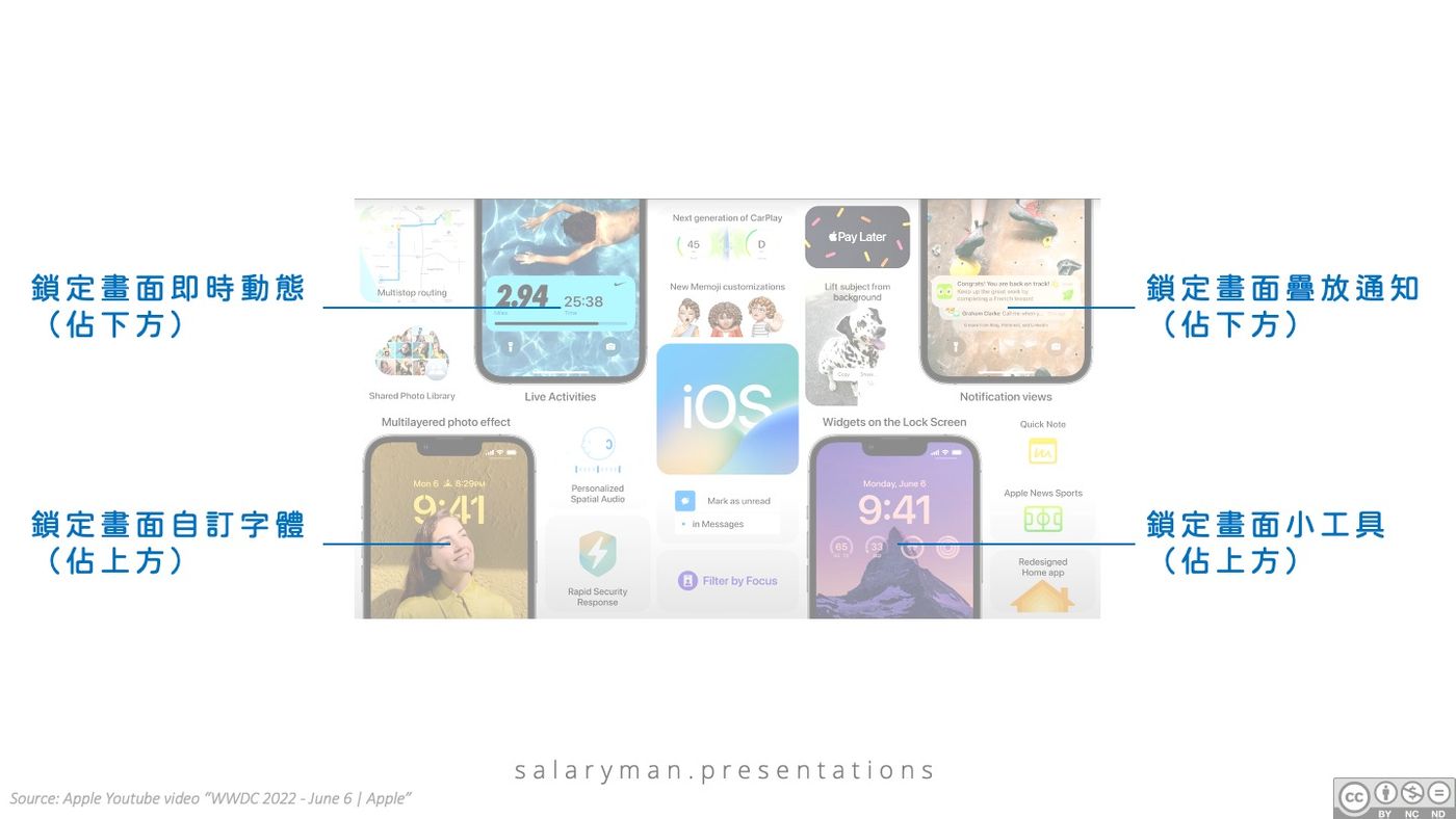
Are several new functions of the lock screen randomly assigned to the four mobile phone screens? In fact, there are also considerations. That is, the function is located in the position of the mobile phone screen. For example, if the custom font occupies the upper part of the screen, it is naturally allocated to the screen displaying the upper half of the mobile phone; on the contrary, the overlay notification appears at the bottom of the screen, and it is allocated to the lower half of the mobile phone. the screen of the Ministry;
4) Staggering left and right brings reading rhythm
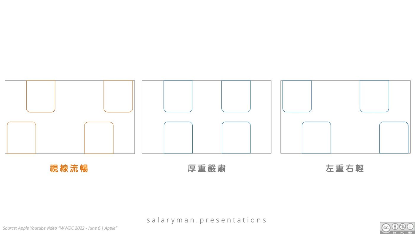
When the screen with half a mobile phone is selected, how should the four screens be distributed in the slideshow? At this time, it is necessary to consider the way of the audience's line of sight. Most of the audience's line of sight is from left to right, so Apple's four mobile phone screens are staggered from left to right, and the line of sight is smooth; Placement will inevitably lead to a heavy and serious feeling, and when choosing a staggered distribution, be careful to avoid the situation where the left is heavy and the right is light;
5) Focus on the main function explanation
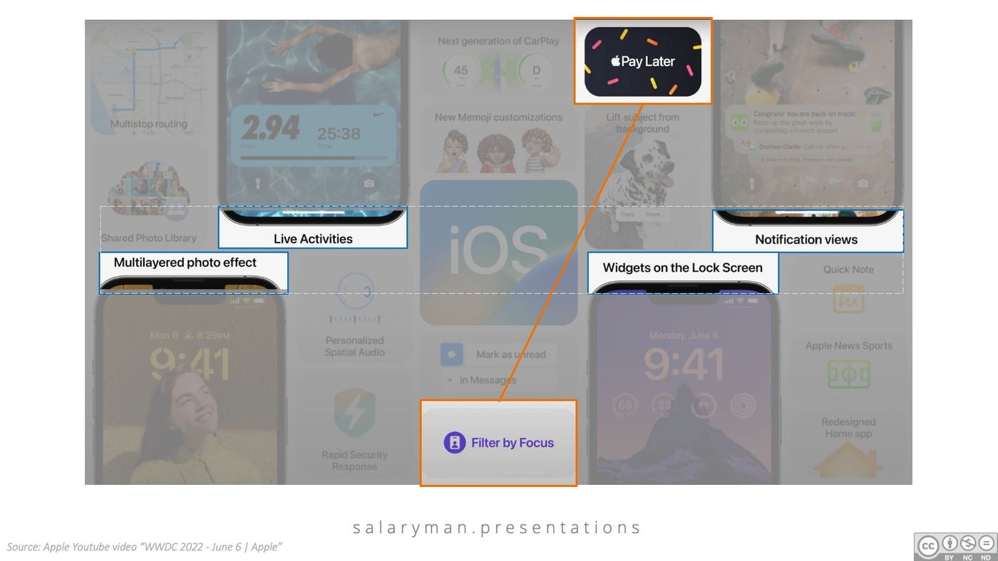
After placing the screen of the mobile phone, focus the commentary text of the four functions on the center line of the screen, because the center line is the place where the audience is most likely to notice; in addition, as the main function, the font of the commentary text should also be the largest among them. ;
6) Create space for second-level interpretation
If we reduce the font size at each level of information, we can visually highlight the divisions, but the cost will be that the text at the bottom may become too small for the audience to see clearly. Apple's typography is designed to subtly place the second-level commentary (Filter by Focus and Apple Pay Later) at the top and bottom edges of the slide, farthest from the main function commentary, which is the farthest from the center line of the screen. Such a distance allows the text size of the second level to not be decreased, and in disguise, it also avoids the situation where the font size is too small for the explanations of the other levels. In addition to the design of increasing the distance, there is also an ingenuity in the positioning, that is, like the bevel formed by the four major mobile phone screens, it is more visually unified;
7) Area A uses vertical quarters as the interval
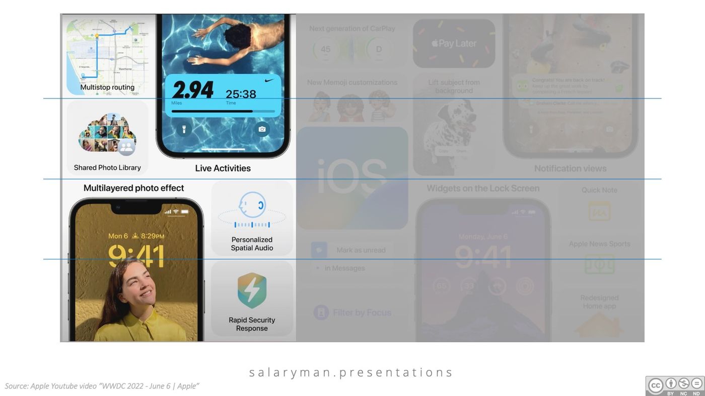
The left part of the slide is called "Area" first. The layout format of area A is vertically divided into four equal parts. The even distribution can bring out a sense of stability. Four areas close to a square are also drawn outside the mobile phone screen to carry and display the rest of the software functions. The four areas in area A uniformly use the layout of the image on the top and the text on the bottom, and the proportion is also close to the iOS image of the dotted title in the center of the slide, which makes the line of sight more continuous when entering from area A to area B on the right;
8) The size of the central iOS main image is 1:3 golden ratio
The classic tic-tac-toe golden ratio in photography composition techniques is also used in this slideshow. In the central point of the iOS main image, the size of the top and bottom is allocated in a ratio of 1:3. From the middle to the right of the slide, we first call it "Area B", which is different from Area A in that it is vertically divided into six equal parts. You might be wondering why not make a third division? Although this will not affect the golden ratio of the iOS main image, the area and area of the divided area will be the same as the main image, which will seriously affect the effect of highlighting the theme. Then why not follow the vertical quadrant division from the A area? In this way, it is difficult to design the main image in a proportion close to a square to imitate the program icon on the mobile phone screen;
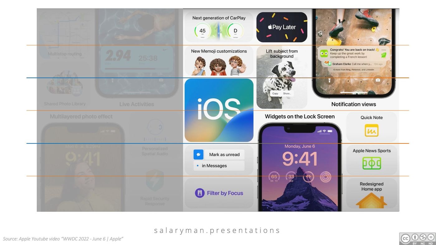
9) Four equal parts of area A and six equal parts of area B and not the other way around
The vertical division of Area A and Area B each has its own principles and considerations. However, if the proportion of the cut is reversed, that is, the A area is divided into six equal parts and the B area is divided into four equal parts. It seems that the design will not be destroyed, right? The direction of the line of sight has once again become a reference factor for the layout design. The line of sight from left to right, from the quarter A area to the sixth equal area B, the software functions will become visually denser, with more and richer hints ; On the contrary, if we reverse the proportion of the cut, the function introduction will become more and more alienated, and even there will be a bad impression that the function is not enough to fill the slide;
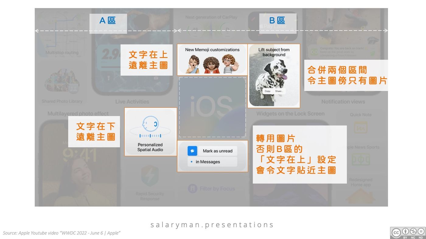
10) The text in area A is on the bottom and the text in area B is on the top
In the same way, the typesetting principle in area A is that the image is on the top and the text is on the bottom, while the opposite approach is used in area B. In addition to the unified visual processing of the two areas in the design, it also hides the last design consideration. It is to keep the text away from the central iOS main image, so as not to affect the prominent theme. The following figure analyzes the four functional introduction intervals surrounding the iOS main image, and behind it is also devoted to avoiding text near the main image, so that the theme has a full stage.
The traditional wisdom of "one minute on stage, ten years of work off stage" is also used in presentation design. From the above in-depth analysis, we can see that the presentation design of Apple's conference seems simple and easy to do. The design thinking behind it, as well as the consideration of information level, line of sight, and screen distribution, cannot be done easily.
After reading the graphic analysis, want to apply Apple's design skills? In fact, you don't have to bother looking for free Apple product materials and templates. Did you know that there are a lot of free resources available for download on the official website? Icons, fonts, buttons, product casings of various models, software design templates, PNG/ PSD/ Sketch files are also available. If you often do technology/software/mobile program briefings, don’t let the official resources slip away in vain!
https://developer.apple.com/design/resources/
If you want to learn presentations or visual design, but like to read pictures more than text, you can follow my page , one-stop content, suitable for learning while commuting.
Like my work?
Don't forget to support or like, so I know you are with me..
Comment…