
https://linktr.ee/penfarming 金融職人|文案編輯|雜食性閱讀者|Heptabase 愛用者 🌐 區塊鏈科普網站【鏈習生】專欄作家 🗞️ 電子報【創作者經濟IMO】主編 👤 臉書專頁【閱讀筆耕】
Reading pen farming | #AmwayConference•How to become a well-trained drafting editor?
I checked it online, and it turns out that "Amway" means sincere sharing.
Today, I want to show you guys how to cook "Bar Chart". First, have an outline of the whole, which is more important than the detailed instructions! See the forest, see the tree.
It was originally made with the Numbers spreadsheet software. For the sake of popularization, Google Sheet was used as a demonstration. The logical thinking behind it is the same. Attach the materials for practice 👉Click here .
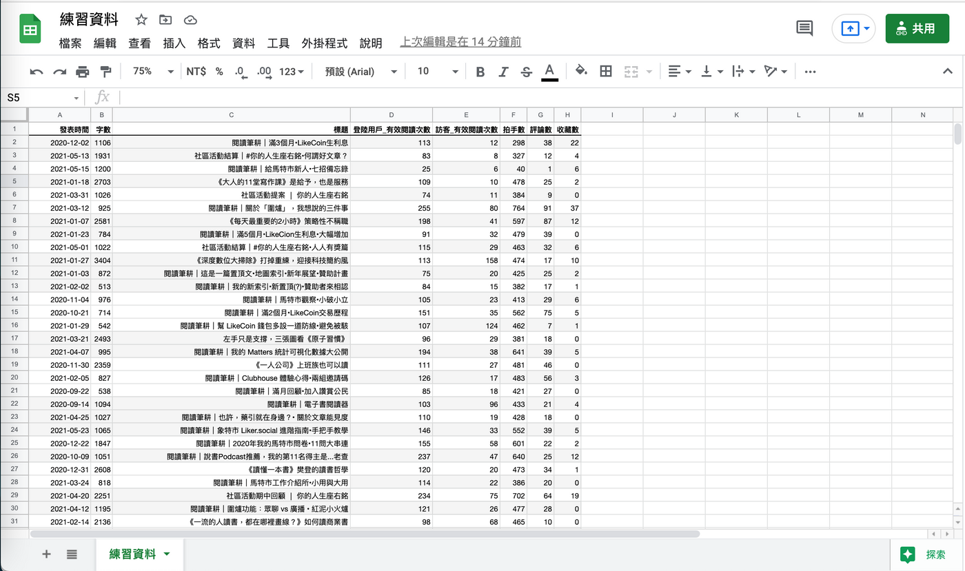
Let's use "Top 20 Readers by Visitors" as the name of the dish!
■ Step 1: Data sorting
This is the action of "washing ingredients".
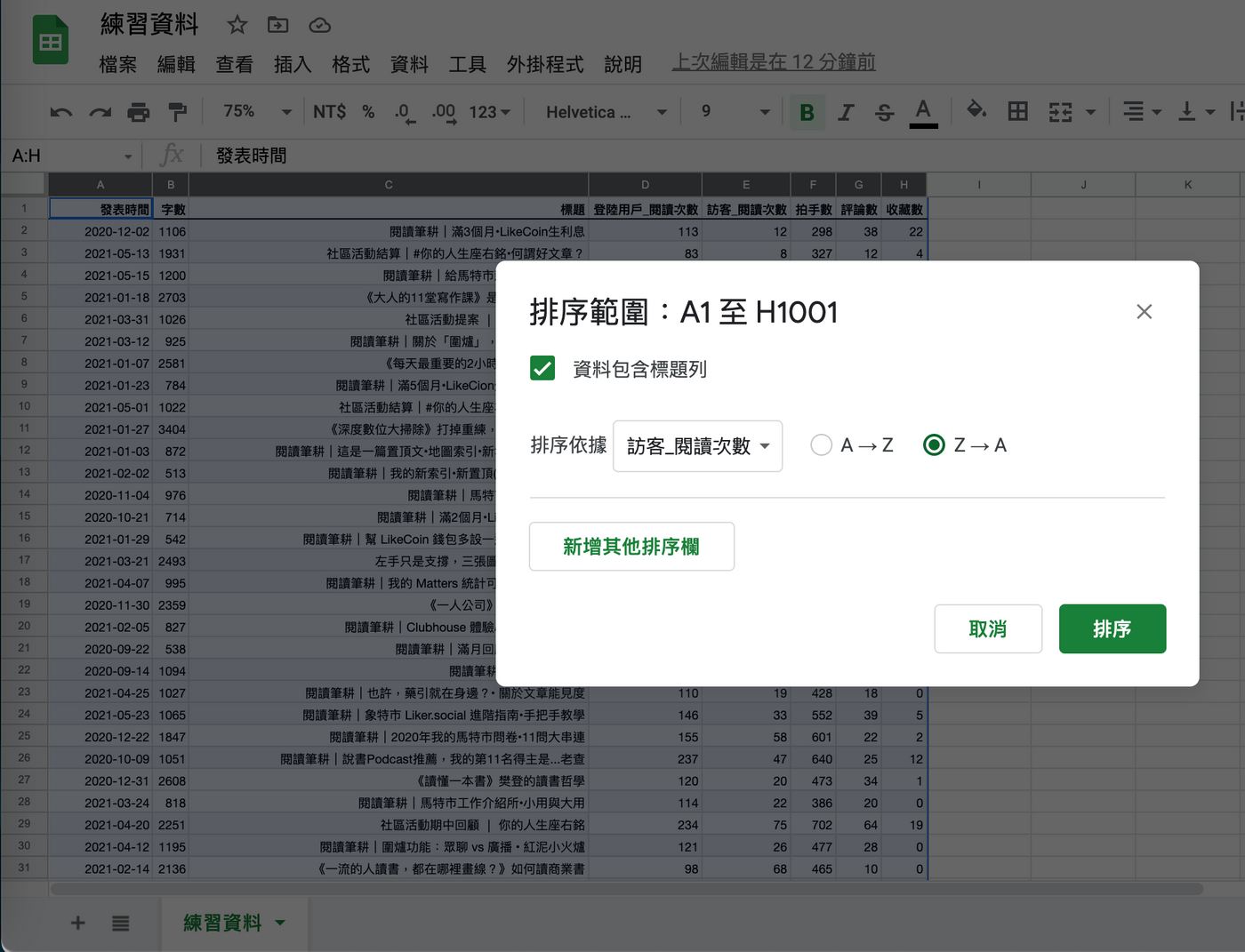
Since "top 20" means ranking points, so first sort the "number of visitor readings"; and want to rank those with higher numbers in the front -- power down , Google Sheet uses "Z → A" to represent this.
⚠️ Instructions:
□ Select all the data in a box → click [Data] → click [Sort Range].
□ Check【Data includes title bar】→ select【Visitor_Reading Times】from the drop-down menu.
□ Check【Z → A】→ click【Sort】
■ Step 2: Make a map first, then adjust the sequence
Define the noun first. Each row of vertical columns corresponds to a type of data, which is a " sequence ", and Google Sheets call it a "series".
For this exercise, we only need two series of "article title" and "visitor_reading times"; so some people will delete the rest of the unused parts directly in the Sheet.
But my personal preference is to keep the original data as little as possible. Make the graph first, and then cut off the unused series from the graph editor. Although there is one more procedure, the integrity of the "ingredients" can be maintained.
⚠️ Instructions:
□ Select all data in a box → click [Insert] → click [Graph].
□ Go to Chart Editor | Settings → find [Chart Type] → select [Bar Chart].
□ Scroll down to find 【Series】→ Remove 6 irrelevant series.
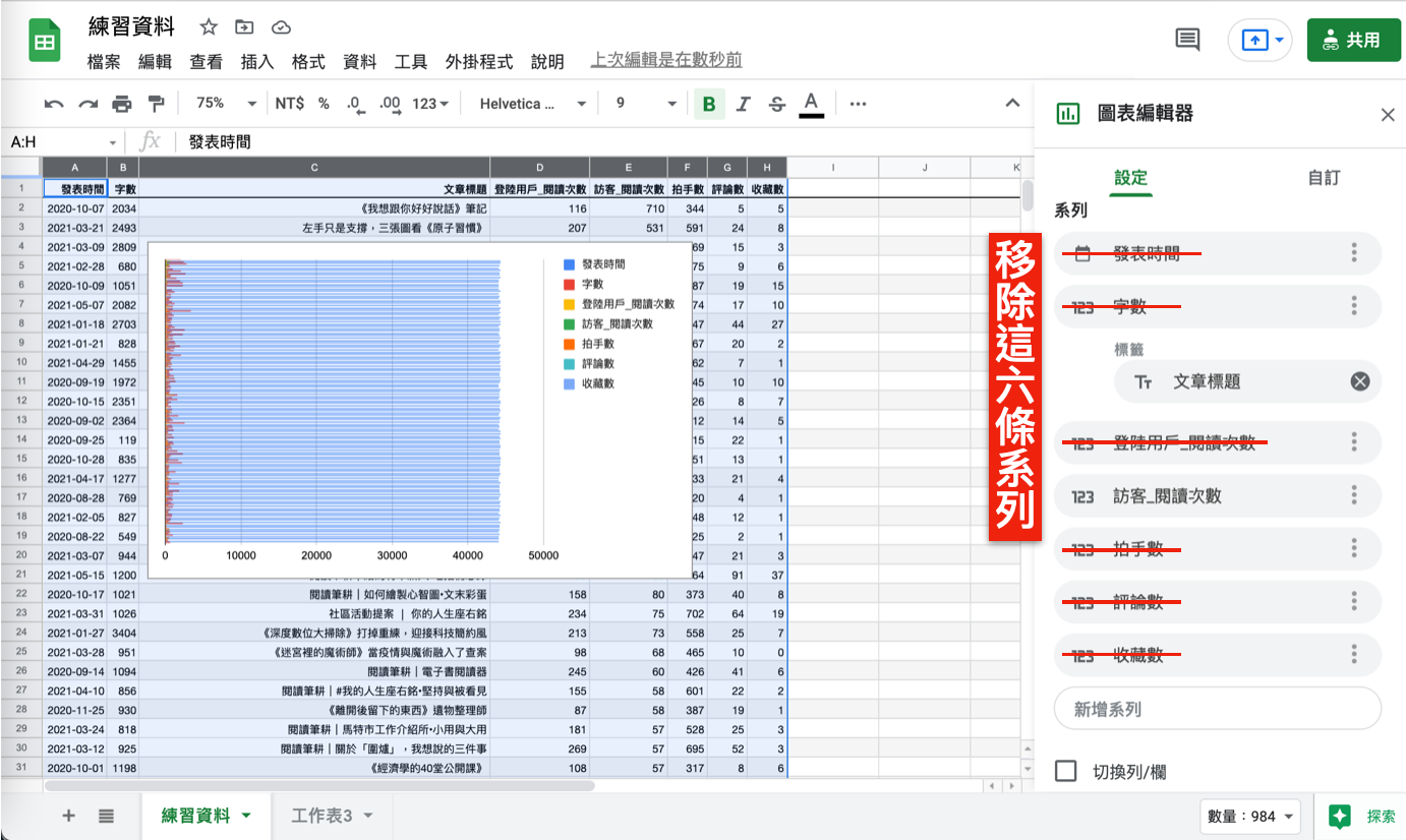
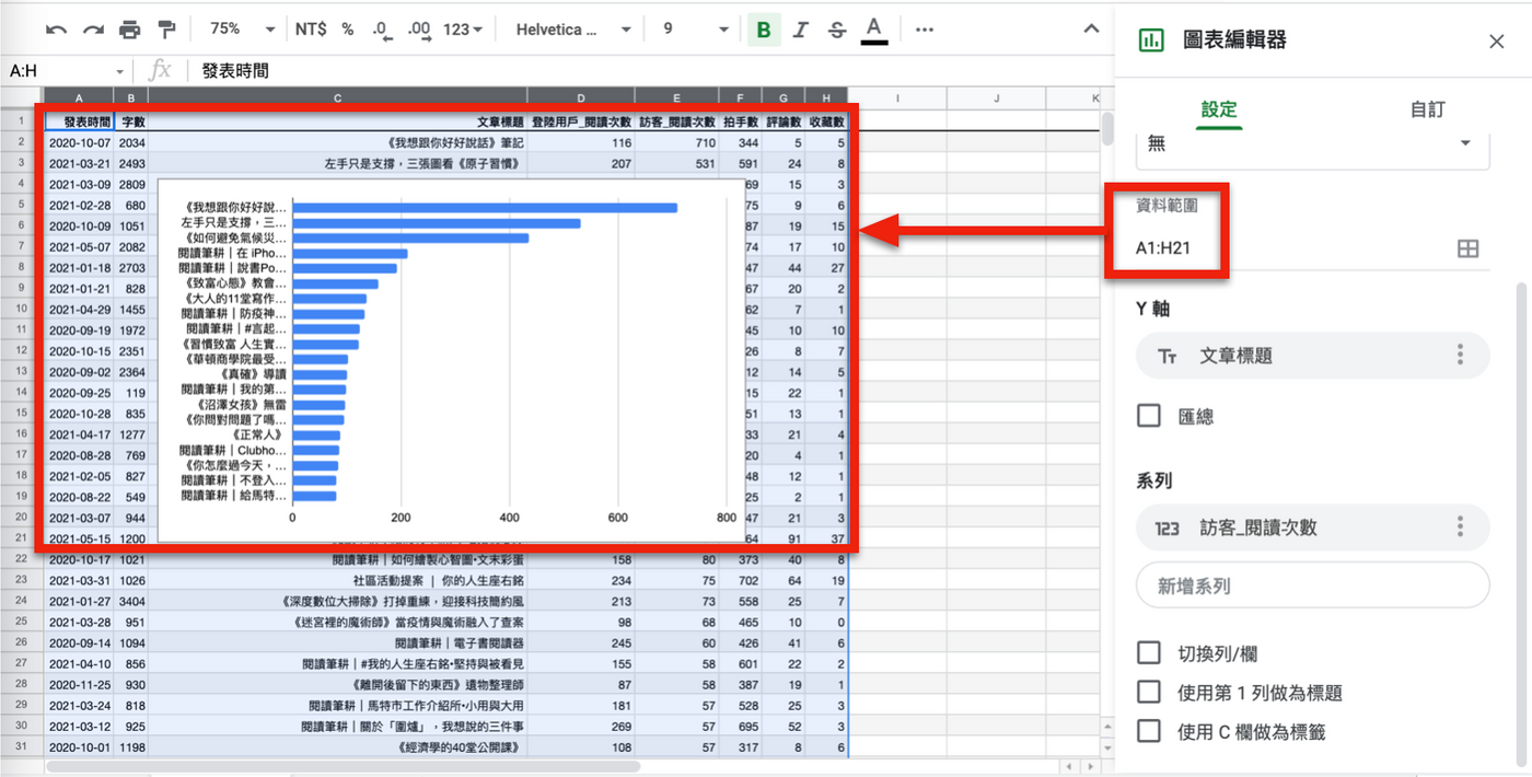
Now, your graphics should be much cleaner. Because only the "top 20" are taken, the scope of the data needs to be changed next, and the top 21 rows can be sampled (one more title row).
If you deliberately sample the data when you frame the selection, you can save this procedure. But it's a hands-on teaching, it's okay to spend a little more effort.
⚠️ Instructions:
□ Go to Chart Editor | Settings → find [Data Range] → change it to "A1:H21".
■ Step 3: Be sure to enter the title of the chart
A little trick is that you can directly double-click the part of the chart, and the chart editor on the right will quickly switch to the corresponding column, which is convenient for fine-tuning, so that you don't have to spend too much effort to find the layers of menus .
First drag and drop the entire chart to enlarge (see it clearly), then double-click the "Bar Chart Area", you will see a small white dot appear in the border, drag it left and right, so that the "article title" of the Y-axis can be comfortably displayed .
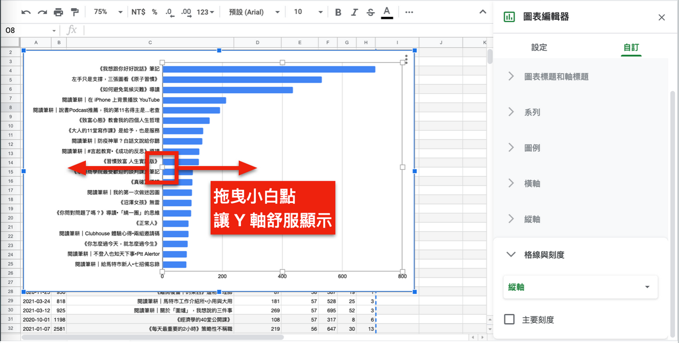
Next, we need to help the title on the chart—the soul of this dish—if the title expresses its meaning, we can omit the descriptions of the X-axis, Y-axis, and legend according to the situation, so as to save the space for “arrangement”.
⚠️ Instructions:
□ In Chart Editor | Customize → select [Chart Title].
□ Enter "Visitor Reading Times" in the [Title Text] box below
By the way, to beautify the layout, I made the font size of the chart title 12/bold/center, for reference.
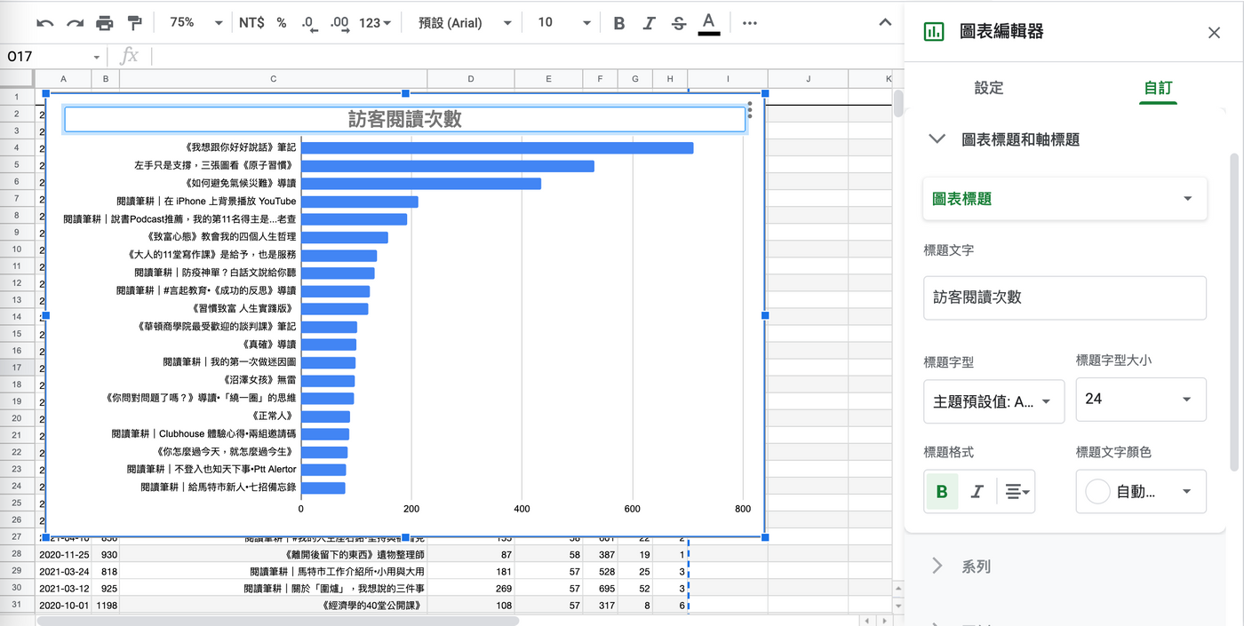
I double-clicked the "Bar Chart Area" again, this time by dragging the small white dots up and down to loosen the spacing between the chart title and the bar chart.
■ Step 4: Final embellishment
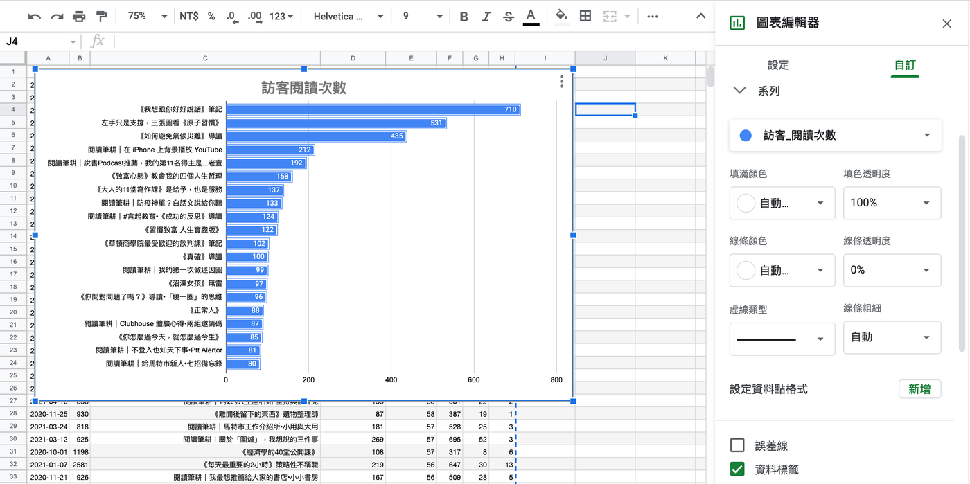
✅ 〔Data Tag〕
This is a personal habit, and the numerical value will be inlaid; double-click the "blue bar", and the position where the mouse touches must be controlled very accurately, and it is really necessary to click on the blue bar!
⚠️ Instructions:
□ In Chart Editor | Customize → select [Series].
□ Swipe down to find [Data Tab] and check it.
✅ 〔Scale〕
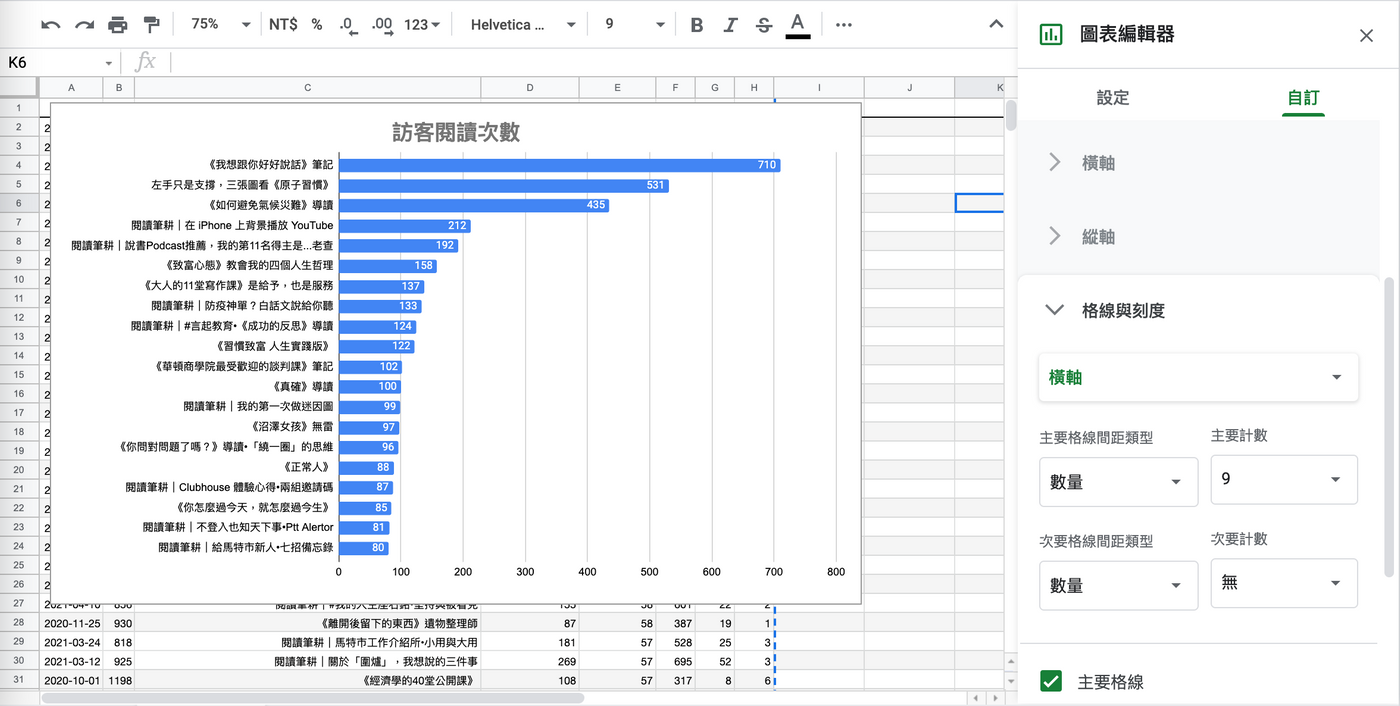
I also think that the preset scale of the X-axis is too sparse, and I hope to use 100 as the spacing; double-clicking the "X-axis" is also very delicate mouse operation, but you should be familiar with it.
⚠️ Instructions:
□ In the Graph Editor | Customize → select [Bars and Scales] → select [Horizontal Axis].
□ Select "Quantity" in 【Main Separation Type】.
□ Select "9" in 【Main Count】.
Both the head and the tail are counted, so selecting "9" can be divided into 8 scales, each of which is 100.
■ Epilogue
Just take a screenshot, crop the chart, and you're done.
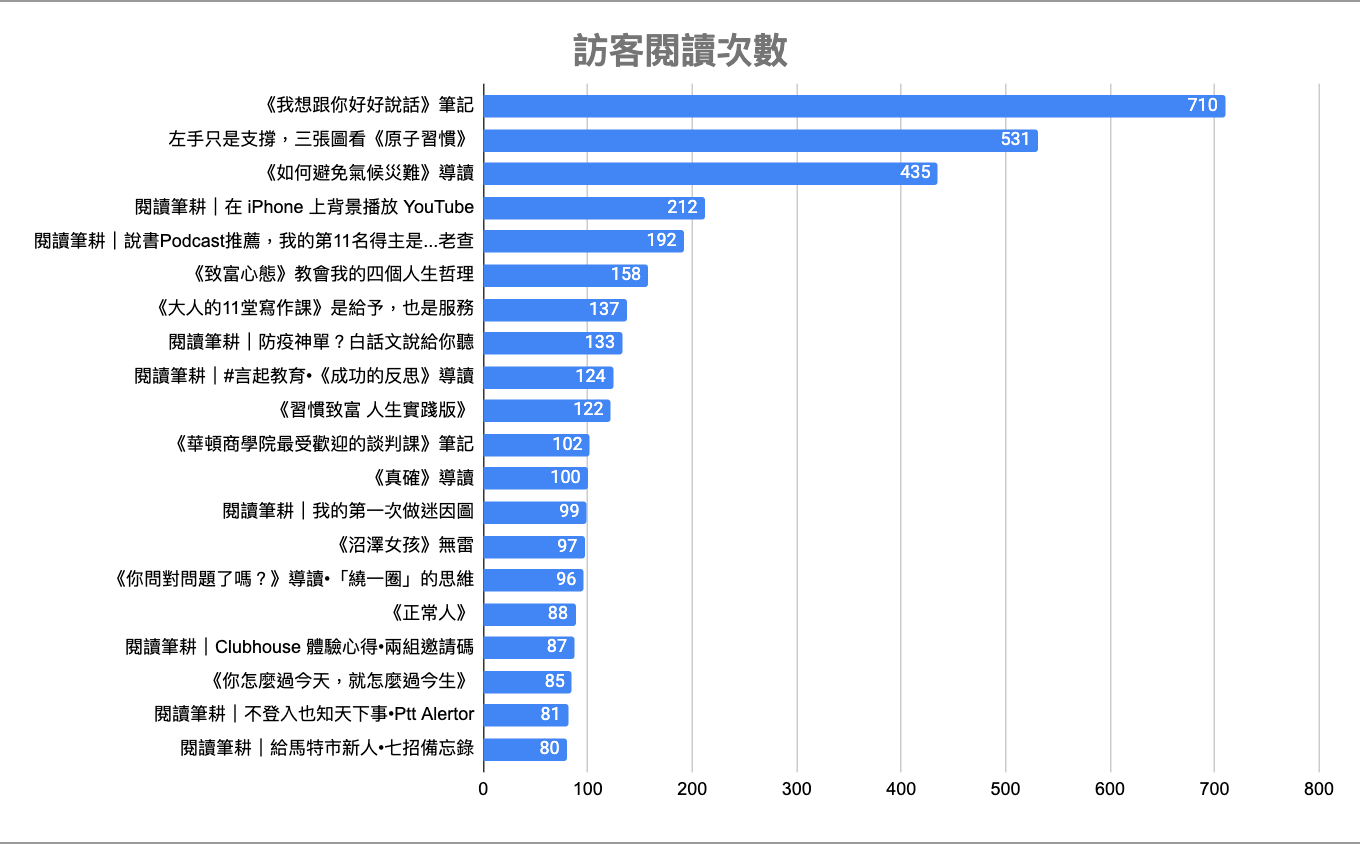
In fact, there are more details that can be played with, such as the thickness of the straight bars, shadows, etc., but those are too obsessive! It is enough to show the most critical general direction!
Thank you for seeing this, and please attach my [ Facebook Page ], [Mastodon Page] , [ Appreciate Citizens 2.0 ] and [ Room ] subscription links, welcome to support and encourage ❤️.
🌱 Facebook 👉 https://www.facebook.com/penfarming .
🌱 Xiangte 👉 https://liker.social/@Penfarning .
🌱 Continuously ploughing and irrigating regularly 👉 https://liker.land/leo7283/civic .
🌱 Red clay small stove 👉 https://matters.news/~penfarming .
Like my work?
Don't forget to support or like, so I know you are with me..
Comment…