
網路泡沫倖存者,前CSS Design Awards評審,臺北設計與藝術指導協會成員,現職國際中文版時尚雜誌設計總監。
How to evaluate the font design of Taiwan Railway "Tengyun Cockpit"
※This article was originally published in the " Zi Hi " community. Considering the completeness of the overall description of the independent article, some paragraphs may be rewritten and supplemented.
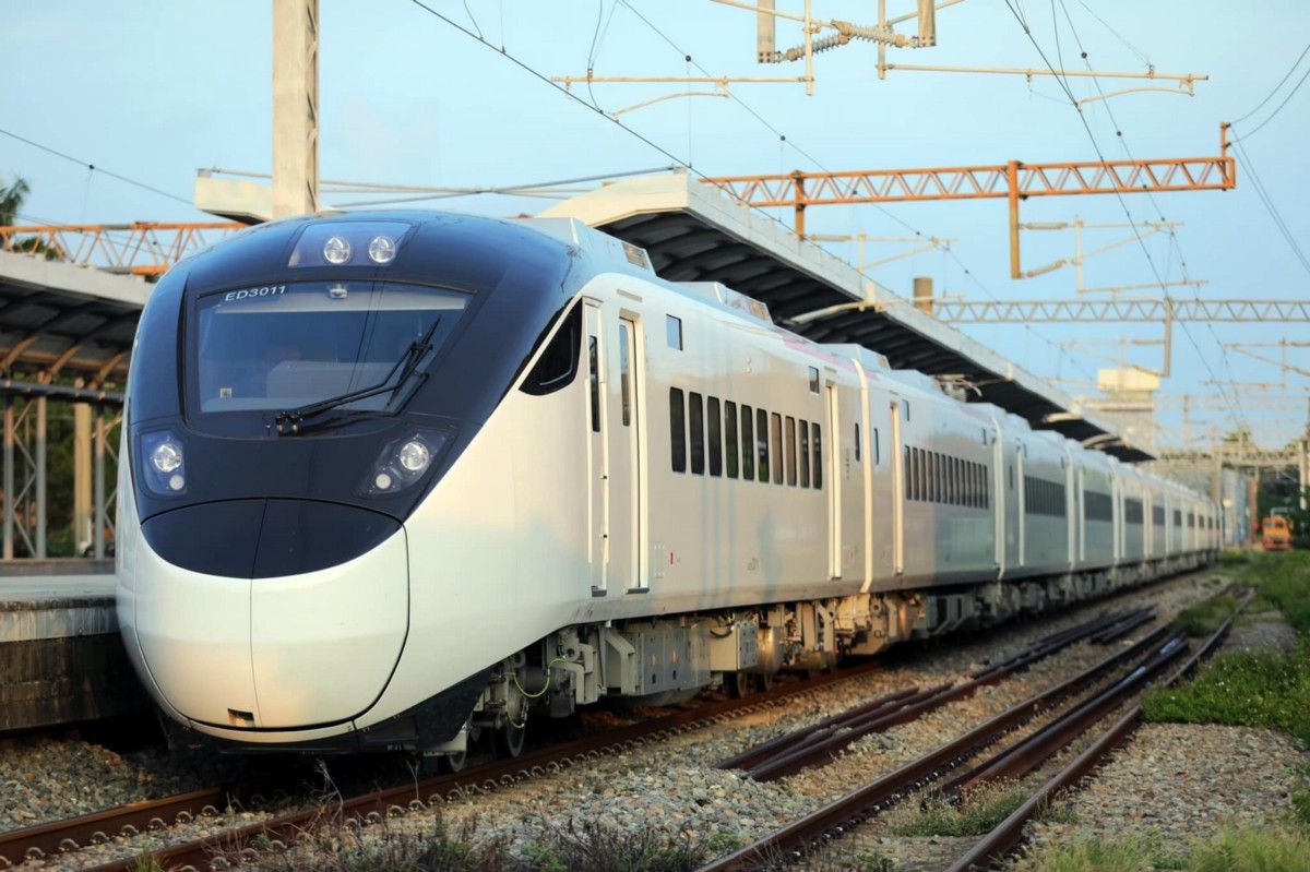
I didn’t take a serious look at the discussions raised by various parties regarding the Taiwan Railway Administration’s EMU3000 business car “Tengyun cockpit” identification case for two days. I personally don’t think there is a big problem in the font design itself. On the largest discussion group "Zi Hi", I saw two articles one after another with the topic of font discussion, but the content of the discussion only stayed at the level of sensibility and criticism, without too many professional elements. After a night of tossing and turning, I made up my mind to come. "Headwind" commented.
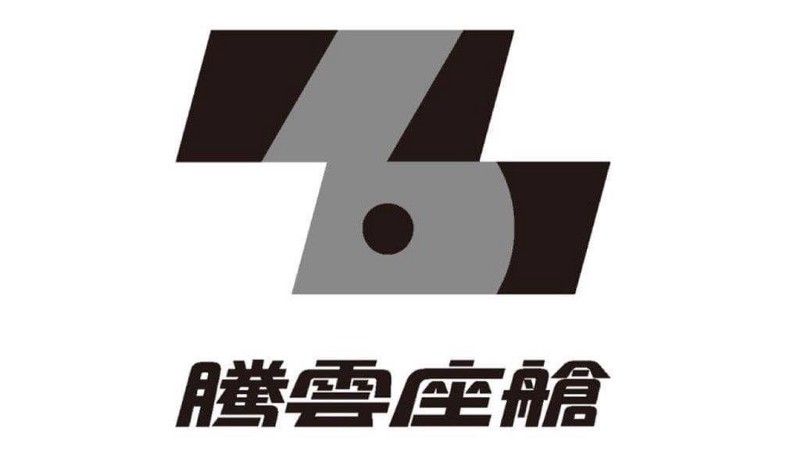
I personally have no particular preference for the "Tengyun cockpit" identification case of Taiwan Railway, but it is not to the point of disgust. Because of whether the identification system is suitable or not, I think it is not the focus of the discussion of the "Zi Hi" community, so I will not do it here. Related comments, just comment on the font section.
First of all, I felt a little dumbfounded when I saw most of the comments that the fonts were not ok. Hi” The reply at the bottom of the post: “If you really want to criticize like this, at least you have to put forward a superimposed image to prove it is responsible.” At that time, I was also thinking about the designer’s efforts in font design. Is it so hard to be seen, and has to be said so badly? This should not be the "word hi" discussion level that I recognize, it is more like a message from the general news media, and the design can definitely be criticized, but in such a specialized font discussion community, should we take care of our own speech? quality?
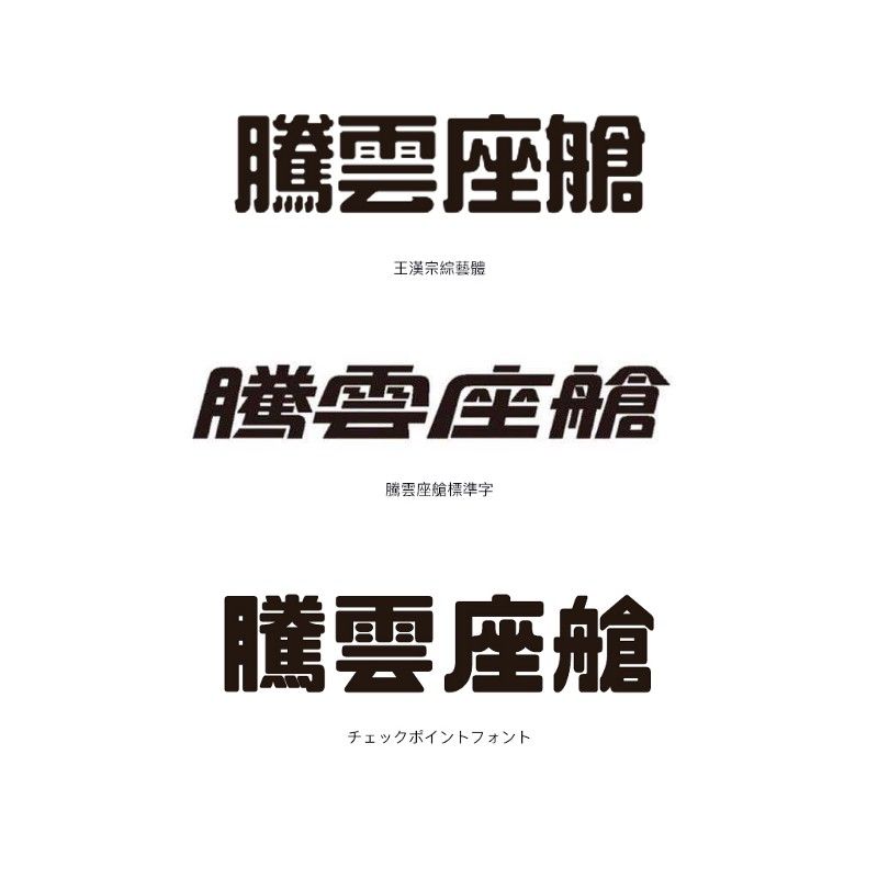
Regarding the views on the "Variety/POP" part, I probably tried several fonts to indicate, including the "Wang Hanzong Variety Style", "Huakang New Variety Style Std W9" and the powerful country-style variety shows that everyone cares about. One of the styles is "Chinese Dragon Variety Style", but some commercial fonts are compared on the official website using the preview function. I do not own the copyright of these fonts, and I will not put the pictures on the basis of authorization considerations. It must be said that, after a little comparison, you will know, as long as you choose a font and slant it , where is it? It's not that fonts with uniform stroke thickness and rounded corners must be classified as variety or POP, right? In the comparison chart, I also added "チェックポイントフォント" that often appears in the "Zihi" community (it was just recommended by someone at the time of writing this article), I don't know that a font like this style will also be called Is it a "Japanese variety show"?
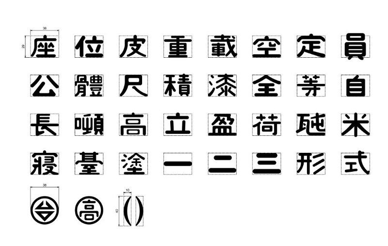
Well, let's take a look at another picture. This picture is from Plurk. The reason why we found this picture is because it is said that the standard word "Tengyun cockpit" was developed from the standard font of the old Taiwan Railway carriage. In this regard Relevant information is hard to find. The only one I found suitable for comparison is this picture. It can be clearly seen that the part of the herringbone in the word "Zuo" is similar to the shape of the font inherited from the Japanese National Railways period. I think It can be understood as a tribute to this writing method. Other characters have no particularly similar parts in the strokes, which can be compared and cannot provide more evidence, but at least it can be seen that there was a special traceability in the design of the font skeleton at the beginning, not directly appropriating both. There are fonts. In addition, I personally like to change the four strokes that originally symbolize raindrops in the word "cloud", and change the strokes to a Z-shaped structure with electrical imagery. "Words", cloud: "Water flows from the clouds. It is like the sky, like the clouds, and the water is in the middle." I personally think that this change is also in line with the pictographic writing method, but this is my own speculation based on the picture. , does not represent the designer's own thoughts.
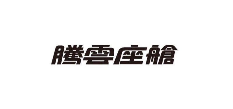
Going back to the font design itself, oblique Chinese fonts are inherently difficult to design. Those who know a little about font design should know that the result of physically slanting and compressing fonts will never be the best state of balance. , but judging from the standard character of "Tengyun Cockpit", I don't think there are too obvious flaws in the stroke distribution and grayscale, so it is difficult for me to agree with the suggestion of "poor quality", "rough" or even "simplified Chinese". ", the simplified spelling of these four characters is "Tengyun cockpit", except that the four points of "horse" can be understood as simplified for the sake of expressing the sense of speed and overall sense, the word "horse" itself is not There is no structure like "horse" in simplified Chinese characters. The word "cloud" adopts the normal version instead of the simplified version of "cloud", and even the structure of the word "cabin" is completely different. I can only say that I am influenced by the "Tencent" brand. There are a lot of sex comments.
Finally, it has not yet been confirmed whether the designer Zhang Xuanhao mentioned in the official post is the Zhang Xuanhao of Eyeson Type I know, but in terms of the style of the font itself, I think it is similar to some of his Owen design works. This part is yet to be confirmed. In fact, I can fully understand that this case may not meet the public's expectations for the identification and transformation of Taiwan Railways, but I don't think that directly choosing a stable clear body or black body must be the best solution for this case, but it is very happy. See there are some attempts to take into account the modernity in font design (yes, I think it is indeed modern in stroke style). Frankly speaking, I am really surprised that the discussion of this set of standard characters in the "ZiHi" community is going this way. I dare not say that I am very specialized in font design, but I would like to share my own knowledge and experience in The different views on this case are for your reference. If you have more professional opinions, I hope you will not hesitate to give advice.
Further reading: How to evaluate the new logo design of Burberry creative director Riccardo Tisci and Peter Saville
Do you like this article? You are welcome to express your views. If you feel that the content has inspired you, please share and clap your hands. You are also welcome to follow my Instagram . :-)
Like my work?
Don't forget to support or like, so I know you are with me..
Comment…