Eye of Wright, Eye of Ledoux, Eye of Escher
On the ground floor of the Guggenheim Art Museum, there is actually an "eye" hidden on the ground - the "eye" prepared by the architect Frank Lloyd Wright from the beginning of the design. However, it is difficult to notice and observe this "eye" nowadays. Why?
Daniel Treiber recently published his second book about Wright: "Frank Lloyd Wright : Cinq approches (Wright: Five Ways of Seeing)", there is a passage in the book that takes us to look at the unusual "eye":
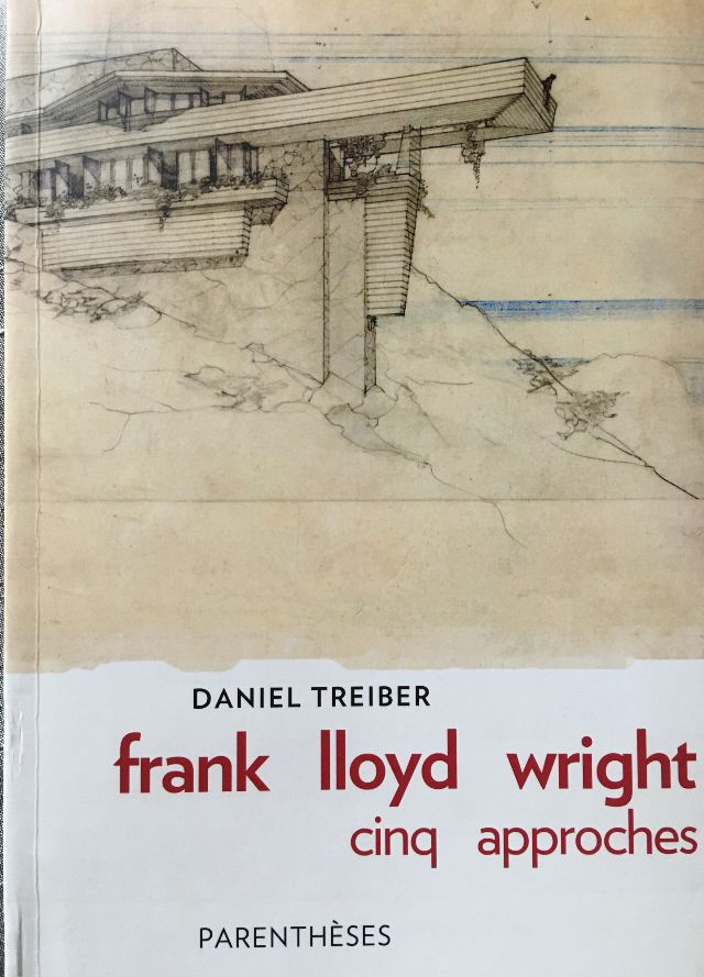
"On that highest floor, when we leaned beyond the arc of the fence, we could see the bottom of the sky, and one eye was staring back at us: an almond-shaped small pool, and the central spring left ripples on the surface of the water, like dark flashing pupils ——This almond eye has already sprouted from the original design drawings. Another famous eye is the eye painted by Claude-Nicolas Ledoux (1736-1806), located in Besan The loose design (annotation: a theater design); that is a much calmer frontal eye. It looks at us (and at the row of columns behind us) at eye level. The Renaissance architecture in its eye, Subordinate to the world of perspective - we can easily imagine that there, the actors are performing with their backs upright, standing straight ahead, and Wright's "eyes" are only facing directly when we look down from a height. We; it is not so calm and stable. The strange water almond eyes are still full of strong symbolic energy after all: it is both a white pool and a black eye, and it is also an extremely wide opening, and it is also a lost vanishing point, lost in the world of movement , a dizzying world, and at the same time, nothing more than the austere end of that unbelievably winding staircase.”
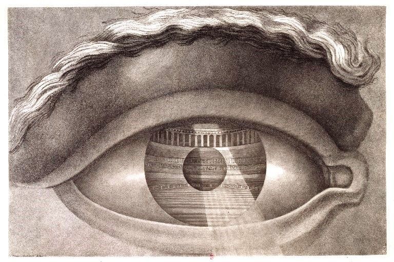
Comparing the "eye" designed by Wright with the "Eye of Ledoux", Wright's "eye" suddenly expands the dimension of history, time and space, and the dimension of the body.
They are all almond eyes. The "Eye of Wright" looks straight up and needs a bending body movement to see it; while the "Eye of Ledoux" separated by a century and a half is an engraving in the book, no matter how it is extended, reproduced or displayed on the screen It shows that when we see that eye, it is always looking at you and me.
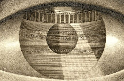
In the "Eye of Ledoux", the regular perspective perfectly presents the theater designed by Ledoux. The theater was actually built and is located in Besançon. Although Ledoux's design may not be fully preserved, the row of "sign" columns borrowed from Palladio's (Palladio, 1508-1580) Olympic Theater is still there today.
There is a mysterious top light in the center, projecting down, the familiar light column reminds people of the Pantheon in Rome (27 BC/125 AD). Moreover, the dark round shape of the pupils is also reminiscent of the round hole in the dome of the Pantheon, from which the skylight falls.
However, the strange thing is that this pillar of sky light completely went out of the eyes, which violated logic and betrayed the world of perspective. This is a century earlier than Escher's (MCEscher, 1898-1972) painting, but it is also a mechanism that strictly obeys the law of perspective. Tell you, what I create is an illusion, and the three-dimensional world of the perspective law is all an illusion. A two-dimensional sheet of paper. Come and play visual logic games with me.
Has Escher ever seen "The Eye of Ledoux"? Anyway, he drew his own version: a skull inside the pupil, memento mori (remember, one is mortal).
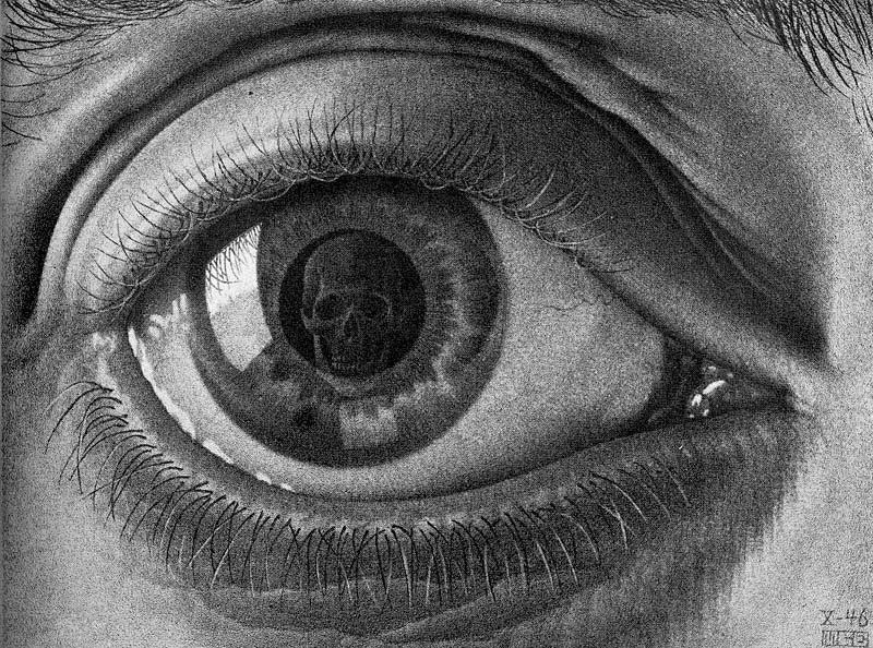
When D. Treiber wrote, "(Ledoux's eyes) looked at us" and "at the same time looked at the row of columns behind us", I was wonderfully aware of two different visual logics.
One is my own: it is impossible for the "Eye of Ledoux" to look at us and the scene behind us at the same time - if so, our shadows would be reflected in the pupils, as he goes on to imagine the actors, On the stage, "stand straight, stand and look straight ahead". However, there is no "I/We" figure in the pupil. Then, it is impossible for the "Eye of Dürer" to look at us. It is only possible that we use Dürer's eye to watch the empty theater like a movie lens. "We" hide behind the eyes.
However, the viewing logic in the book is established. The reason is that "Dürer's Eye" is a painting, and D.Treiber did not eliminate the "us" of the viewer. "We" are on the opposite side of the eyes. The eyes can see us, while retaining what the eyes have seen. "We" blends with the seen scene, which is very strange. The viewer cannot hide behind the eyes, they are in front of them. For example, it is more exciting to look at "Escher's Eye" with this logic: the viewer, "I", becomes a skull—this may be closer to the meaning Escher wanted to express.
In short, the two visual logics are that you are more willing to substitute your "eyes" to see, or stick to yourself facing the frame.
As for the "Eye of Wright", the author originally hoped to use a photo of Ezra Stoller, which was taken when the museum was just completed (1959), which perfectly demonstrated Wright's design ideas. It is a pity that the edition fee is probably too expensive, and the editor finally used a wide-angle recent photo in the book, and the meaning of "eye" is hard to find.

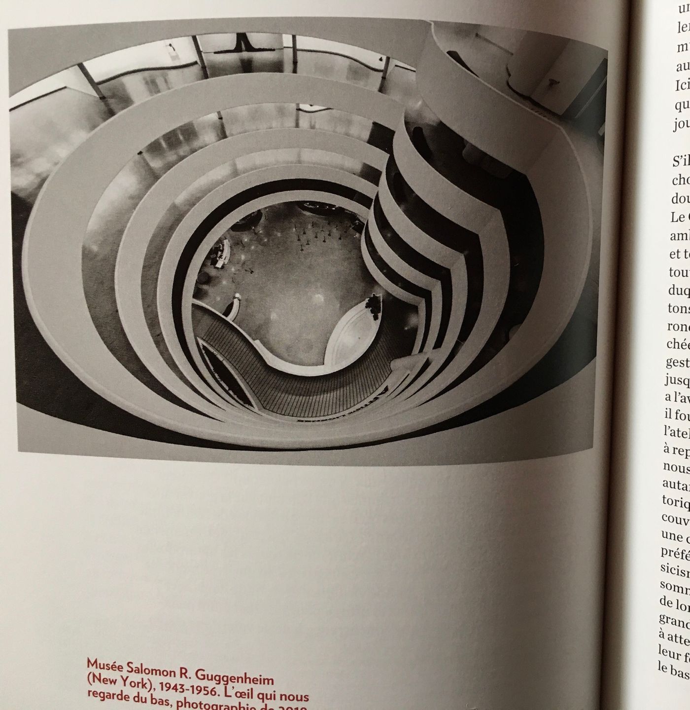
The photographer's composition in 2019 has already implied that the meaning of "eye" has disappeared, and the eye is no longer an eye-the photographer did not understand the existence of "eye", so he did not look directly at the "almond eye".
Why didn't the photographer catch the "almond eyes"? Comparing several photos over time carefully, some subtle but important changes in elements can be said to have completely destroyed Wright's design ideas back then.
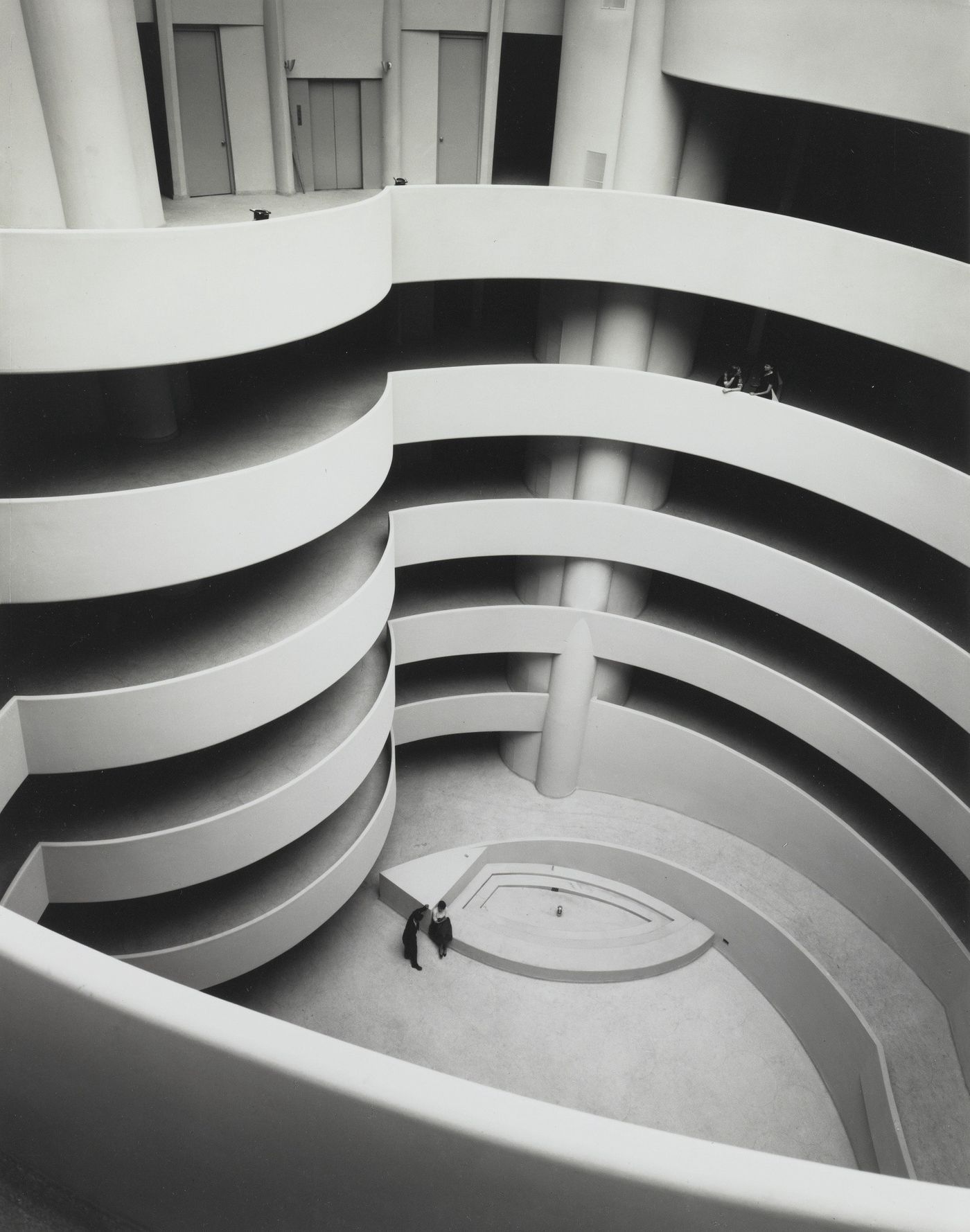
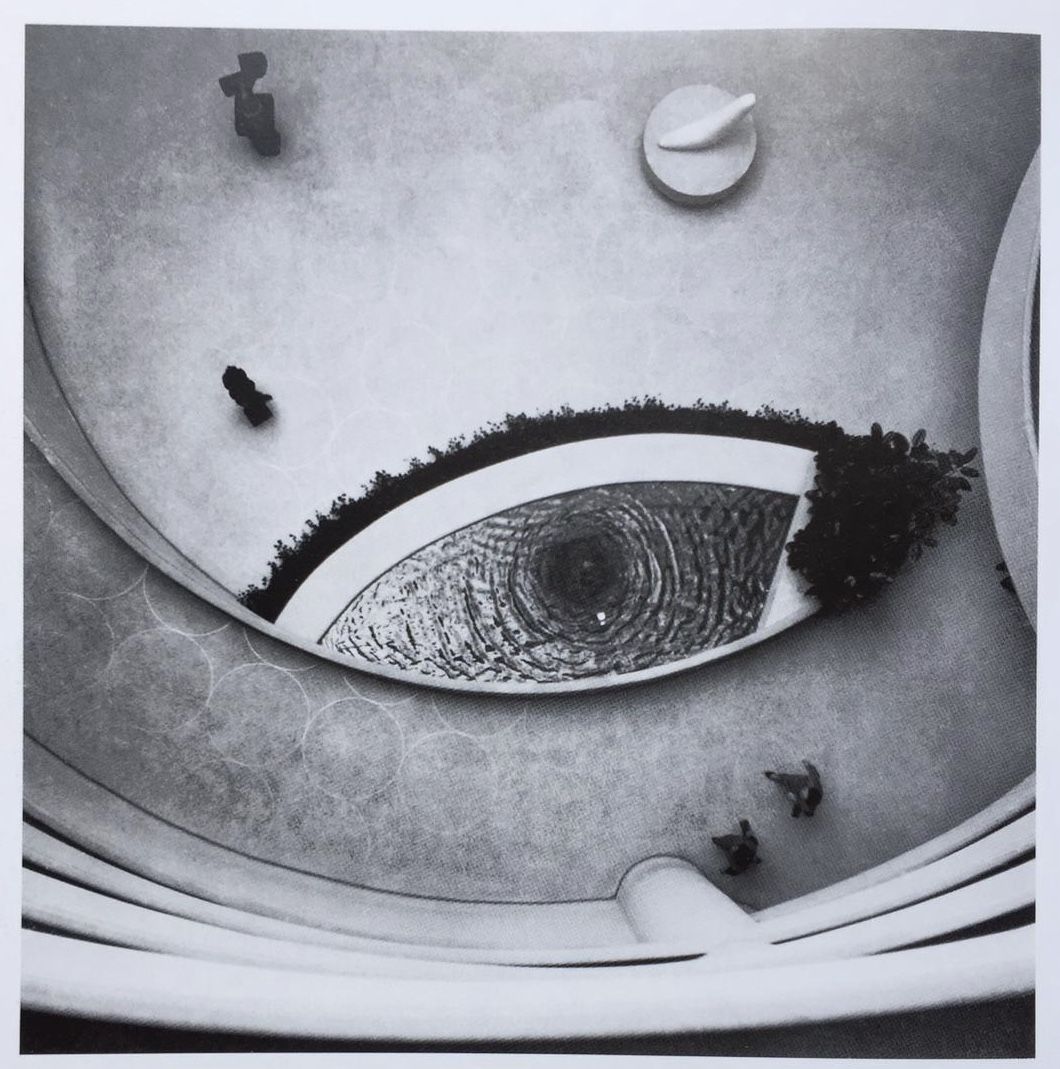
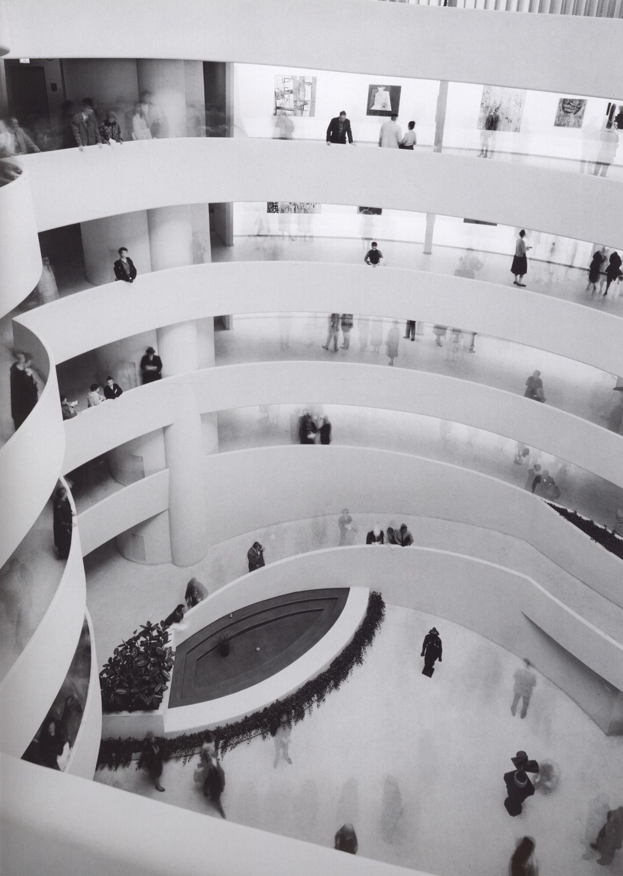
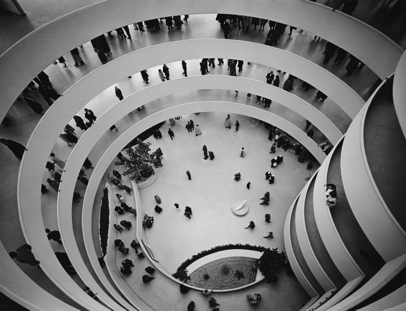
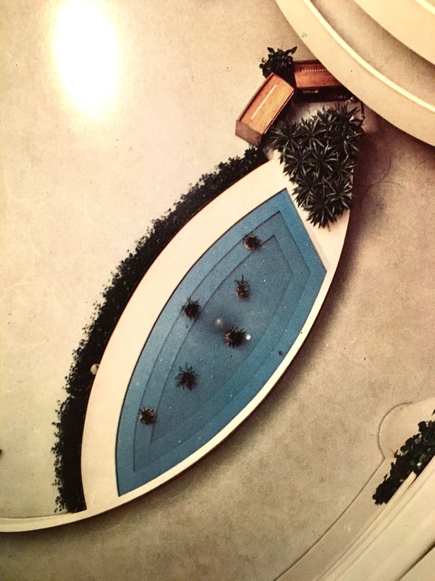
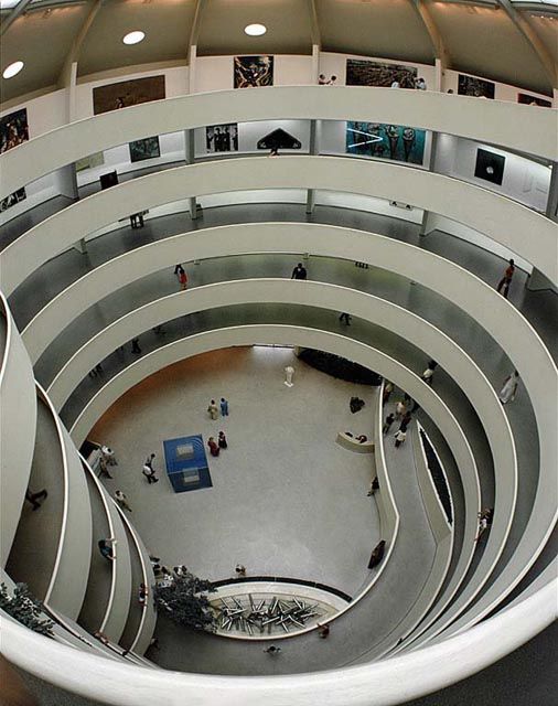
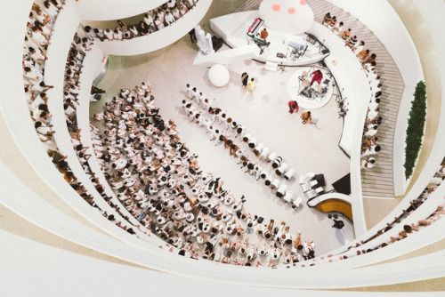
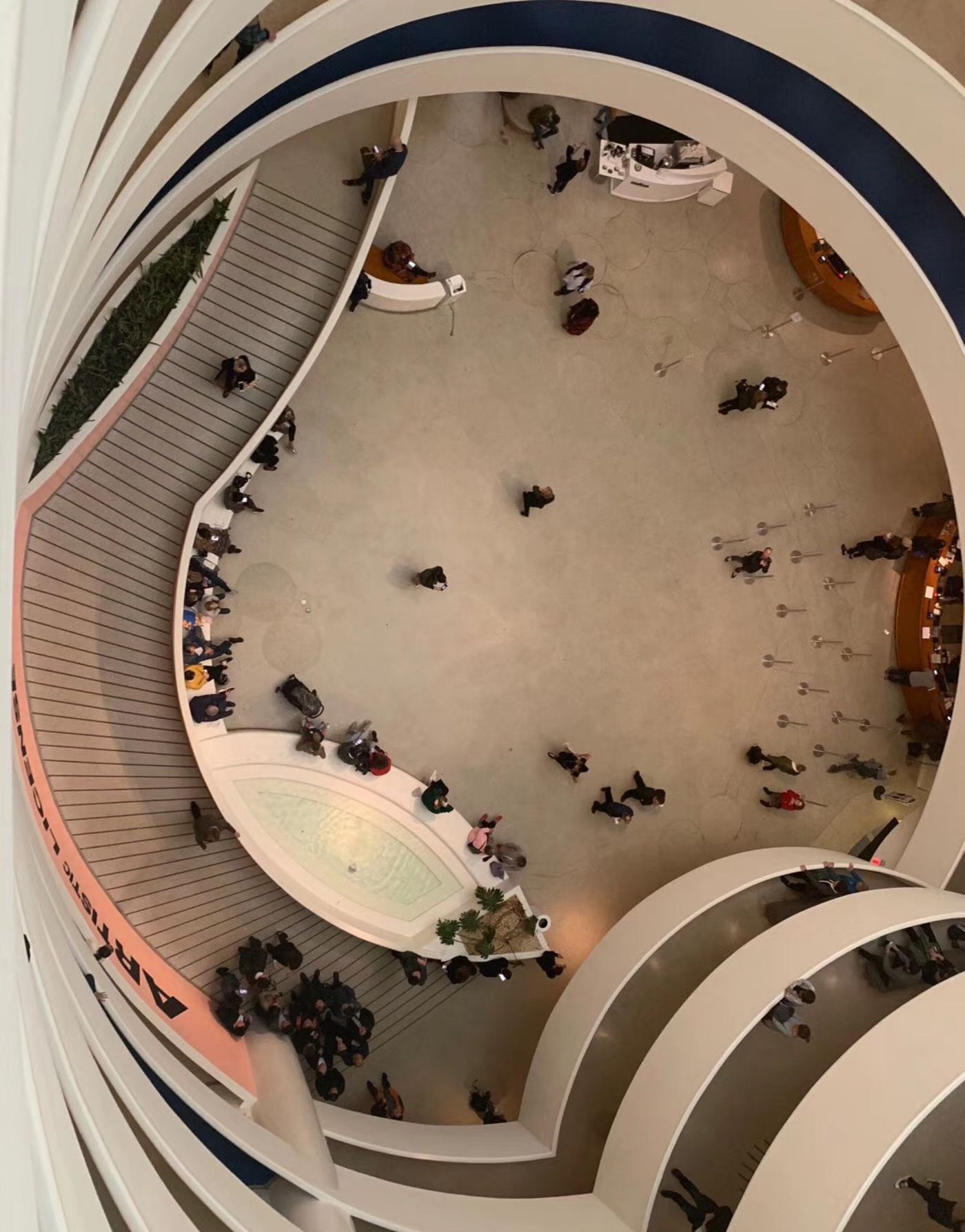
After which subtle elements have been changed, the "almond eyes" no longer exist?
First of all, from Figure 1, you can see the approximate corresponding position of "Almond Eye" and the elevator exit (the highest floor). The perfect "almond eyes" in Figure 2 should be taken after stepping out of the elevator, walking a few steps along the milky white fence, bending over and leaning over.
The book "Wright: Five Ways of Viewing" mentions the viewing route set by Wright: upon entering the museum, visitors are invited to take the elevator directly to the highest floor, and then take the spiral staircase (which is also the exhibition corridor). While viewing the exhibits, slowly descend to the bottom floor.
Then, as soon as you get out of the elevator, the corner where the two arcs meet is also an invitation, a pause—although the corridor continues to extend upwards for almost a circle, it starts from the sudden change of this corner, starting from this "point". From this "point" stop a little forward, look down, and you will see an "eye" facing you.
Carefully observe Figure 2, green plants play a very important role in the composition of the "eyes".
Figure 3 presents the longitudinal structure of the pool. It can be seen that there was a circle of green plants planted around the pool at that time, and the varieties that overflowed and floated down formed a shape of "eyelashes". "Tear Fu". The fountain in the center is deliberately lowered. I am afraid that the strength has also been adjusted, so that the swaying water circle falls slightly to the wall of the pool, and there is not much rebound. The circular water pattern circled in the center is like a pupil, with rippling water and rippling eyes.
It is quite ironic that some managers did not seem to understand the implied image of the pool: at the beginning of Figure 3, a pot of aquatic plants has been placed in the pool; Figure 4 has increased to two pots; Figure 5 shows two rows of six pots ; Picture 6 is a bunch of art installations, the eyes are piercing, and the eyes are sad; Picture 7 is laid as a stage; Picture 8, that is, in recent years, seems to finally let go of this "bare and boring" small pool and let it be quiet. However, looking back at the black-and-white photos in Figure 2 and Figure 1, the bottom of the pool is obviously painted with a certain color, while in the color photo in Figure 5, the color of the bottom of the pool is almost tile-blue. Compared with the all-white pool bottom in Figure 8, blue is obviously of great significance to the composition of the "eye" image: the white eyelids stand out, and the deeper color also makes the water pattern "pupil" clearer. Perhaps, the blue color also corresponds to the slightly blue sky light in the glass dome of the dome.
Picture 8, the "pupil" disappeared in the white pool bottom, the thick and dark "tear caruncle" at the corner of the eye became a single monstera with sparse leaves, and the "eyelashes" floating around the eyelids had long since disappeared, and people just sat there Up—how, how, can you still tell that this is an eye?
Another big change on the ground floor is the surface change of the last stair ramp.
Wright has a special liking for circles. The water patterns form the circles of the eyeballs, which seem to swing out in circles. The ground of the entire ground floor hall is full of circles of light lines, including the slightly inclined ramp (pictured 1), that is a general echo, and even the surfaces of all the spiral staircases are uniformly paved in this way - in each circular metal circle, filled with some Italian terrazzo technology, "Acmetyle Terrazzo". Terrazzo comes from the meaning of "balcony", that is, the floor that is often laid on the balcony. Wright wrote in a letter that he saw the floor laid in this way at the Rome airport, and immediately decided to use it in the project (note the reference source): "When I walked on the floor of the airport in Rome, I said—this is it, the ideal floor for our ramp." Italian terrazzo technology can be traced back to ancient times, and later subdivided into various varieties. The light milk effect chosen by Wright sets off a circle of metal halos.
Unfortunately, starting from Figure 7, we can observe that the ground of the ramp has changed, and the rings disappear one by one, replaced by horizontal ladders with shallow marks. The overall wavy circle atmosphere is completely destroyed.
Those straight lines are more like scars.
Of course, such a change may be due to regulatory and administrative reasons, and may be due to security considerations. In any case, with the disappearance of the "eye" structure, it is obvious that the bird's-eye view of the entire ground is far from Wright's original idea.
———————————————
Original French translation from the book:
"Lorsque de là-haut nous nous penchons par-dessus le garde-corps courbe qui nous retient, du fond du grand vide, un œil miroitant nous regard: un bassin en forme d'amande, avec en son center une arrive d'eau qui trace en surface comme la tache noire d'une puppyle mouvante, œil dont l'amande était en germe dès les tout premiers dessins du project. Un autre œil est célèbre, celui dont Claude-Nicolas Ledoux gratifie son project pour Be sançon; il est plus calmement frontal. Il regarde vers nous (et vers la colonnade placée derrière nous) selon une direction horizontale. Il procède des travaux de la Renaissance, et appartient à l'univers des perspectives dressées pour des acteurs que l' on imagine facilement se tenant bien droits, debout et regardant droit devant eux, portés par une volonté d'action. L'œil wrightien n'est face à nous que quand nous regardons du haut vers le bas; il est bien moins serein, moins stable. Étrange amande liquide , chargée d'une énergie symbolique finalement intense, à la fois bassin blanc et œil noir, béance ultime, point de fuite troublant dans un monde de mouvement et de vertige et tout autant modeste résolution de l'incroyable spirale tournoyant e."
[Reference source for remarks]: https://www.guggenheim.org/blogs/checklist/frank-lloyd-wrights-inspiration-for-the-guggenheims-terrazzo-floor
Like my work? Don't forget to support and clap, let me know that you are with me on the road of creation. Keep this enthusiasm together!
