Part II: Magic Ink - Information Software and Graphical Interface (Bret Victor)
Original: Magic Ink — Information Software and the Graphical Interface
By Bret Victor, an interface designer, computer scientist, and electrical engineer known for his presentations on future technologies. He is currently a researcher at Dynamicland .
Note: This article was published by Bret Victor in 2006. Looking back at this article now, it will be particularly interesting. The information software and graphical interface predicted by Bret Victor at that time have been realized, and he even began to reflect and resist this article. Design for contextual relevance (for privacy reasons) mentioned in . I found part of the Chinese translation of this article on the Internet, and supplemented and translated the following content according to the work of the predecessors, but it was not completely translated, and some of the content was omitted.
intermittent
Case Study: Train Timetables
I recently created a program for planning trips on the San Francisco Bay Area subway system BART, in the form of a "Dashboard widget" (mini-app) for the Apple Macintosh.
The design is clearly a success. Despite a fairly small target audience, user feedback has been overwhelming, and the gadget won an Apple Design Award in 2007, as well as a rare perfect review from Macworld magazine.
As information software, widgets are primarily used as a graphic design project. I'll discuss how its design reflects the ideas of this article, while pointing out where it falls short and where it could be improved. I'll also compare it to the itinerary planning on the official BART website, which follows a typical mechanical pattern of drop-down menus, a "submit" button, and a results table.
BART widgets are designed around three classic forms of graphical communication: timelines, maps, and sentences.
Display Data
Information software allows users to ask and answer questions, make comparisons, and draw conclusions. Some questions are:
- What time does the next train leave? How long until now?
- When will that train arrive? How long until now?
- Which line is that train on?
- Are there transfers on that trip? If so, when, where and for how long?
- What about the train after that? Then?
- How often does the train come?
- How about the train around 7am on a Tuesday morning?
Users use these answers to compare available trains and then come to a conclusion as to which train to take. Of course, this conclusion must be able to appear in the form of a plan: "Which train will I take? I will take the 7:32 train." However, this plan will become a psychological burden for the user. A good design also allows users to quickly draw a series of Boolean conclusions over time. "Should I start walking to the station now? No...no...no...well, let's go."
The choice of diagram depends on what data space is left after context-based filtering. Through what situation?
Users expect to leave around a certain time; therefore, the graph can exclude trips outside of some narrow time windows. Also, the most common time is "soon"; therefore, the software can initially assume that the time window is "the near future". Also, note that all questions implicitly point to a route, a specific origin and destination. That is, the user wants to compare trips along the time dimension, not the spatial dimension. So the graph only needs to focus on a single route and our last value prediction is "same as last time".
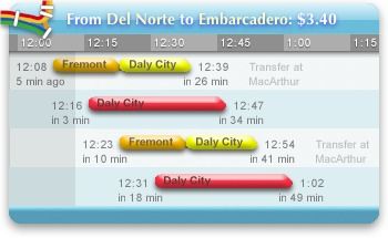
After sifting through the data, we are left with a small number of trips - ordered, overlapping time spans. We need a graphical structure that allows the viewer to compare the start, end and length of each span. A natural choice is a time bar chart, which allows important qualitative comparisons at a glance: when does each span start and end? How long is each span? How close are they?
The most important context, the present time, can be emphasized by shadowing the past. The most important data point, the next train, can be emphasized by keeping it in a fixed position, the second row. This answers the most important qualitative question: is the next train coming soon? Did I just miss the train? For an experienced user, the conclusive question "Should I start walking to the station now?" can be answered at a glance.
Graphs can then be inadvertently annotated with quantitative information, so a closer look answers all questions accurately:
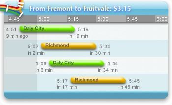
Transfers can be thought of as segments of the entire trip. The question that must be answered exactly is where to transfer. The question of when and for how long is to be answered qualitatively; the exact time will be a murmur of irrelevance.
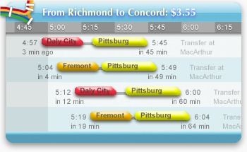
That's it. Although the function of the widget (widget) is obviously more than that, most of the "user experience" is reflected in the above picture. That is, the software is usually "used" by simple viewing, without any interaction. Contrary to the premise of interaction design, this software performs best in non-interactive situations.
Therefore, when the mouse pointer is outside the widget (widget), all interaction mechanisms - buttons and bookmark lists - are hidden. Unless the user intentionally wants to interact with it, a widget looks like a pure infographic with no operational clutter.
Of course, if the predicted context is wrong, the user must correct it through interaction. This involves navigation in the usual two dimensions of time and space.
time navigation
The widget's initial assumed time window is "the near future". There are two situations in which this context is incorrect:
- Users even want to see future trips.
- The user wants to completely plan the trip for other times.
Relative navigation. To view before or after the trip, the user can simply drag the graph. A cursor change indicates this, along with a brief message when the widget first starts. The mouse wheel and keyboard arrow keys can also be used for time navigation. The "underlying" graph is infinite - the user can scroll forever. Therefore, GUI scroll bars are not suitable.
Absolute navigation. To schedule an arbitrary time, the user clicks a button and the time of day is displayed linearly from morning to night. The user can then click anywhere on the mechanism to jump to that time.
The markings for this mechanism are intentionally blurry, so the user will click in the approximate right area and continue to drag left or right until the correct information is displayed on the train timetable. This forces the user to focus on the infographics rather than wasting effort on precise manipulation of the navigation mechanism. Unlike the time of day, the predicted date (today) is likely to be close - few people plan a subway trip weeks in advance. Therefore, date control is relative.
space navigation
The hypothetical context includes where the user is coming from and where he is going. The assumption is "the same as last time"; that is, this comes in an explicit state. There are three situations where the context is incorrect.
Most commonly, the user is on a round trip and wants to go home. The "reverse route" button is suitable for this situation.
In the second case, the user is on an ordinary trip and knows exactly where he wants to go. The bookmark function works in this case. When the user clicks the heart button, the journey will be added to the bookmarks list. From now on, you can select that trip and its reversed trip with just one click. The bookmark list can be brought up without any action - it slides out when the mouse is over the widget.
The most interesting situation is the least common, but the most stressful for the user is choosing an unfamiliar station. Users need information to decide which station to go to; thus, this can be handled as an information software problem in itself. Users may have some questions:
- Where is the station?
- What lines are there?
- What order are the stations on a particular line?
- Which stations are near certain areas?
These problems involve orientation and navigation in physical two-dimensional space. The standard graphics device in this case is a map. Maps allow the user to ask and answer the above questions, compare between available stations, and decide which station she's looking for.
Once the user has made a decision, she must indicate her choice to the software. This can be done in the same graphics domain as the information. "From" and "To" markers appear directly on the map; these markers are dragged to the desired station. Instead of saying the station's name, the user effectively points to the map and says, "There!" While less important in this case, the feedback loop is still tight; the train map is updated as the marker moves .
Configure notifications
Rather than having the user keep asking, "Should I start walking to the station now?", let the software notify her directly. "Go to the station now!" audio works well for infrequent, asynchronous notifications. This widget (widget) can make a voice announcement of the upcoming train.
The design challenge is to allow users to express if and when they want to broadcast. For example, if the user is going home and it takes 12 minutes to walk to the BART station, she would want the software to notify the train that it is leaving within 12 minutes. But if she's going to pick up a friend at the station, she'll want to hear the train arriving in 12 minutes. Of course, under normal circumstances, she didn't want to hear anything at all.
Typical designs use preference dialogs or forms that users can manipulate to tell the software what to do. However, the information design approach starts from the opposite - the software has to explain to the user what it will do. It must graphically represent the current configuration.
For presenting abstract, non-comparative information, a good graphic element is simply a concise sentence.
As with maps, once an infographic is established, it can be manipulated. In this case, some words are colored red and the user can click on these words to change them.

The user always sees the software present the information, rather than directing the software themselves. If the presented information is wrong, the user corrects it in place. There is no "OK" or confirmation button - this sentence always represents the current configuration. The graph fades out when the mouse clicks outside it or when the mouse leaves the widget.
This approach scales well to more complex configurations. Widgets allow voice announcements to be associated with bookmarks and specific times. This is useful for everyday travel, such as commuting to and from get off work. The user thought: "It takes 15 minutes to drive to BART, 10 minutes from the station to work, and I have to be there by 8:00." This picture accurately expresses her thoughts, and the itinerary to get home:

Sentence-based configurations scale well because parameters are given meaning by the surrounding textual context, which itself can be composed of other parameters. Typical configuration dialogs attempt to express each parameter in isolation, leading to intimidating (or confusing) verbosity:
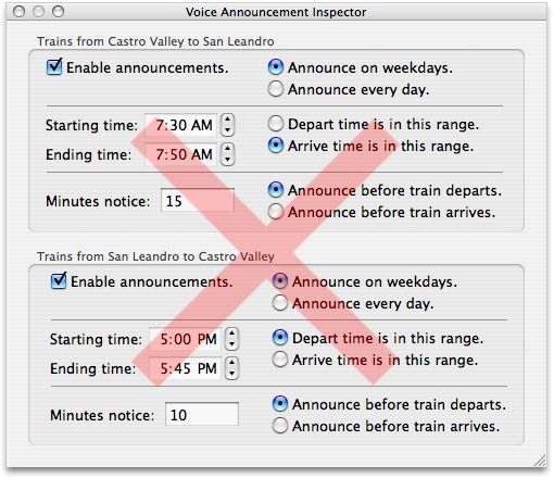
A few extra graphic touches help bring the design together. The phrase is contained in a cartoon speech bubble, which, in addition to looking cute, also implies that the activity is related to speech, with the tail pointing to the button that produced it and the stroke it refers to. What's more, if a voice notification is activated, the button's icon turns into an activated speaker. This avoids a "hidden mode" problem and provides a clear visual indication of where the sound is coming from and how to turn it off.
Compare
The itinerary on BART's official website refuses to reveal anything without a flurry of menu choices and button presses.
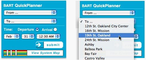
Because the BART system is two-dimensional, the linear arrangement of stations cannot convey useful information. Instead, the stations are listed alphabetically, but because many stations have multiple names ("Berkeley" or "Downtown Berkeley", "Downtown Oakland/12th Street", "Downtown/12th Street" or " 12th Street"?) It's hard to choose even for those familiar with the system. Users can click the link to view the map, but the map graphics are static; selections must be made through a drop-down menu. Information and navigation are completely separated, and the feedback loop is huge.
The resulting screen does not show any useful information:
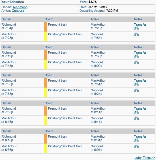
The starting and ending stations are always the same, cluttering the results. Transfers are treated as two separate trips, with the relevant times (start and end of the entire trip) on opposite corners, with distracting chaos in between. Not only is the information out of sync with the current time, there is no relative time information at all. Except for a "later times" link, navigating through time or space requires hitting the back button and manipulating the drop-down menu.
Although it's very interactive, there's very little information here, it's poorly presented, and it's hard to get. However, this design is so typical in software on all platforms that it has almost become an accepted standard. For many people, this is "how computers work".
in conclusion
It's ironic that BART's widgets are so new because the underlying idea is so old. The time bar chart was invented about 250 years ago. Both the map and the written sentence are about 5,000 years old. They are both beautiful and ancient forms of visual communication. These bugs have been resolved. They are universal, intuitive understanding.
Drop-down menus, checkboxes, and bureaucracy-inspired text-entry forms were invented 25 years ago as a response to under-tech devices. They were created for a world that no longer exists.
Twenty-five years later, no one will click on a drop-down menu, but everyone will still point to the map and correct each other's sentences. This is the most basic. Good information software reflects how humans, not computers, process information.
Demo: Trip Planning
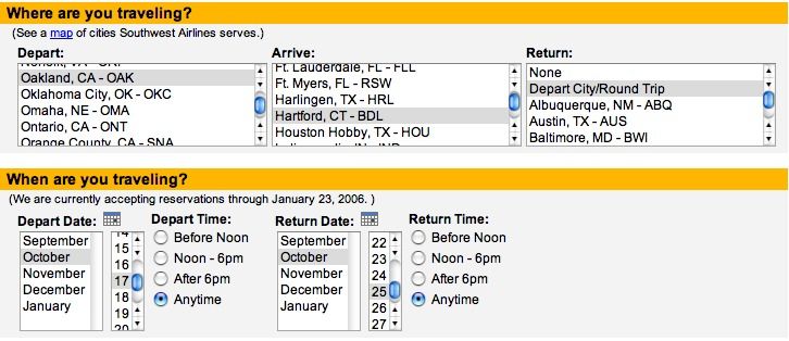
BART's official planning is a bit like a straw man, because BART has no competitive pressure to provide a high-quality website. The airline industry, on the other hand, is fully motivated to provide customers with a smooth decision-making experience. Planning an aerial trip is almost the same as planning an underground trip.
First, the mechanical, uninformative configuration screen.
And then the text result table:

The actual information is condensed into a few columns to the left, and much of the screen is emblematic of Southwest's complex tiered pricing structure. (The additional column on the right is not shown.)
What questions might users have?
- Which cities does this airline fly from? Where are they?
- What flights are there on the days I want to travel?
- When do they take off and arrive?
- How long is the flight time? (This can be confusing in different time zones.)
- How many sites are there? How many transfers are there?
Consider this redesign:
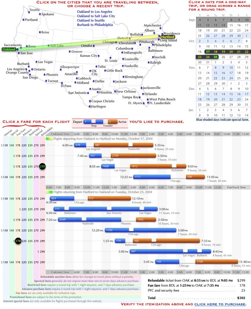
The time and length of flights can be compared visually, as well as the number, time and length of stops and transfers. Flights with no connections stand out because they are completely blue; direct flights appear to be nonstop. Exceptions, such as a 6:50 flight from Hartford arriving later than 7:20, are highlighted. The time can be converted to any time zone simply by referring to the corresponding title bar.
There are attempts to use colors symbolically. On maps, calendars and flight charts, green represents "home" and yellow represents destination. However, it doesn't matter that users notice this.
Interactions are reduced to a short instructional sentence describing each click. At most, users will click twice on the map, drag on the calendar, click twice on the fare, and possibly some page scrolling. Last-value predictions (which automatically select the last purchased route and display a list of recent trips) can eliminate or reduce many travelers hitting the map. A learning predictor that infers that the user always spends the first Monday through Friday of the month in Baltimore, and automatically selects this range on the calendar, eliminating all context-building interactions , leaving only the click-to-fare decision-communication interaction. Of course, since everything is on the same page, the feedback loop is tight, and users can explore different dates and cities and instantly see available flights.
With air travel slumped over the past few years, airlines are desperately trying to grab any passenger. Those who are unsuccessful may even face bankruptcy. With so much at stake, why hasn't any airline tried to improve the ticketing experience with better software design?
The problem is mainly culture. Asking "why isn't Southwest designing better software" is challenging symptoms, not disease. The real question is, "Does software design still exist?" We may need to change a worldview before we can expect better airline websites.
change the world
Planning the Information Software Revolution
Mass production of machines began in the early 20th century. Henry Ford's assembly line approach spread to the entire manufacturing industry, drastically reducing production costs and making machines affordable to the average person. But many products are not easy to operate. Businessmen give requirements, engineers implement them, and the design link does not exist. Decades later, a new industry emerged and filled the void—industrial design.
The next revolution after machine production is software. In the late 1970s, the personal computer began to rise, operating like any other machine—typewriters, calculators, archivers, game consoles—and when it got the right instructions, it started running. Today, building a "machine" becomes burning instructions onto a disc, and production costs have dropped dramatically. But a lot of this software is not easy to operate. Developers give requirements, engineers implement them, and the design link still does not exist. Decades later, a new industry emerged and filled the void— interaction design .
The mass production of information has a very different history from the mass production of machines. Industrial design brought art to existing mass production techniques, but printing brought mass production techniques to existing art.
Before the 15th century, books were so precious and rare that every copy had to be copied by hand. The cost of a book might buy a farm. Books are also exquisite works of art, with beautiful fonts and high decorative charm. In the 1540s, John Gutenberg's movable type printing technology increased book production by a factor of 1,000, making books affordable for the average person for the first time. Fortunately, Gutenberg's movable type and contemporary printers are very focused on the art form and have always retained high-quality handwriting. The explosive growth of various types of books, and the increased proportion of books (the predecessor to posters and newspapers), created a huge demand for the medium for artists, many of whom transitioned from the older medium. A new page in the history of art has been opened - graphic design .
The next revolution in mass production is the Web. Unfortunately, unlike the early printers, the early web technologists didn't care about the artistic accomplishments of their predecessors , but the research they did eventually evolved to approximate what a printed page would look like on a computer screen. Now, distribution becomes the transmission of bits over a network cable. The explosive growth of websites has created a huge demand for the medium for artists, many of whom are transitioning from older mediums. A new page in the history of art has been turned - web design .
From these parallel evolutions have arisen designers working on mechanical interactions (traditional software) and designers working on static page layouts (regular websites). From this point of view, the blending of the two is to be expected. The burgeoning "interactive web" includes a ludicrously hybrid mechanical metaphor on the page—the production of print on virtual paper by a virtual machine. Information is trapped behind interactions and presented as static pages - the worst mix ever.
Good context-sensitive infographics are neither interactive nor static, neither mechanical nor print. Good contextually relevant infographics have yet to be designed. Inherent notions deny the possibility of its existence.
Who can create information software? How to create?
The first step is to reach a broad consensus on the needs of the design. Information software is not a machine, but a medium of visual communication - at this point we should formulate unified standards for all publishers and distribution departments. People continue to pay for ugly and cumbersome software, but demand that books, newspapers, and magazines be informative and professional in design. Even more ironic - all the software's brochures, print ads, manuals, etc. are also beautifully designed. While technical limitations were once used as an excuse for poor software design, this double standard for media is detrimental and should be eliminated. It is the number one obstacle to reform. If there is no consumer demand, design always seems to be a link where there is only investment and no return.
Prominent usability pundits claim that the public is becoming more discerning, but since this claim underlies their consulting firm's sales pitch, it's far from an unbiased observation. I've seen the opposite - as technology advances, people tolerate worse and worse designs in order to use it. The most beautifully designed DVD player won't sell if competing products are priced the same, have S-Video output, or can play MP3s from memory cards. Good design makes people happy, but features make people pay.
I don't know how to cultivate a culture of taste, but I believe it is possible to draw lessons from the advent of industrial design some seventy years ago. At a time when many products compete on decorations, the simplified, functional ideas of industrial designers are too unconventional to be sold on appearance alone. Salespeople make progress by directly promoting the tangible benefits of good design, such as comfort and safety. He would show the housewife how his vacuum cleaner or iron was designed to reduce fatigue and cramps. He would also show farmers how his machinery was designed to eliminate finger cut accidents, which were so common and harrowing at the time. When people clearly understand these benefits, they gradually begin to demand, and then expect, this serious design in their everyday products.
Today, software consumers demand technical functionality because software marketing presents functionality. Consumers ignore design because marketing ignores design. This cycle is vicious, but it can also be fragile - some great new software, whose engineering, design, and marketing are all in sync, may raise the bar for everyone.
The second step is to find people with visual communication talents. Currently, almost all those who work in software design are specialists in computer disciplines, due to their technical work that enables them to enter the field. This implies a huge rejection of potential talent - in this way, graphic designers are left to open print shops! I believe that ideal candidates for software design are those who have experience designing infographics in other mediums. It is believed that there are many artists who are dedicated to the design of commercial graphics, maps or comic strips, as long as they are willing, they can also make a difference in the design field of information software. In recent years, a plethora of artistically valuable websites have emerged, mostly by visually creative people who use simple graphics software to aid their design. But because mature software is always seen as the product of a "programmer" with mysterious technology, other talents lack the confidence to set foot in this industry.
The third step is to combine the talents and skills of designers. The latter can be acquired through education and practice, but without the former, it is difficult for designers to get started even if they are ambitious – they can only accumulate a little artistic perception through continuous edification. Some compensation can be made through effective education: courses, books and cases.
- course. The prestigious Art Center College of Design in Pasadena offers forty industrial design courses. Students study art theory, cartography, and visual communication theory. They learn form, as well as the visual and tactile properties and constraints of materials. They study cognitive and behavioral psychology and explore how users experience products. They track the entire production process: researching the needs of target markets; drafting ideas and proposals; creating detailed renderings; designing virtual 3D models; building physical models from clay, plastic, and fiberglass; building functional mechanical solutions; designing logos and retail package. They learn to design artistic problem solutions, think creatively and critically, invent concepts and critique the concepts of others. They interact with industry representatives and do team projects under corporate sponsorship. The Art Center offers only five courses, which may have some relation to information software. For the most part, students learn to make websites. Nowhere near the breadth and depth of courses offered to physical product designers. The Arts Center knows exactly how to set up an applied arts program. What is missing is an understanding of the applied art of software. There are other schools that offer specializations in "information architecture" , "usability" and other recently created fields, but these subjects deal with software design from a scientific perspective, ignoring the essential artistic aspects of visual communication and how art schools Creative and critical techniques used for centuries. Experimental analysis may be valuable, but only if the artist has created a design worth analyzing.
- books. Once there is sufficient theoretical development to make teaching possible, information software design will require a large amount of teaching literature. Before that, students had few resources—the closest established fields, information graphic design and "user interface design," were severely under-represented. The paucity of literature on infographic design is confusing. Edward Tufte 's book has been critically acclaimed and well deserved. The lack of good user interface design books is understandable because pedagogy needs a working example - the status quo must at least be acceptable. Accordingly, I haven't found a single textbook that does anything for software design; the only books I've found worth reading are the few that challenge the status quo and present fresh, progressive ideas. For the field to progress, we need less repetition of clichés and more cutting-edge research.
- case. In all artistic fields, from painting to writing, from music to architecture, students study the works of masters. (In fact, artists who call themselves "self-taught" usually mean that they learn purely by example.) Since software design wasn't originally considered an art field, it's even worse - The Software Design Gallery's The concept seems absurd to most people. But corpus is crucial to the development of any field of art. Good design must be recognized, collected and interpreted. Also, good designers should be recognized and encouraged to teach, not hidden behind corporate labels.
The fourth step is to use tools and platforms to complement the talents and skills of designers. The two have vague commonalities in usage. I define tools as the communication tools that designers have been able to master, and platforms as the communication tools that will be applied. This is the best demonstration of Claude Shannon 's communication model:
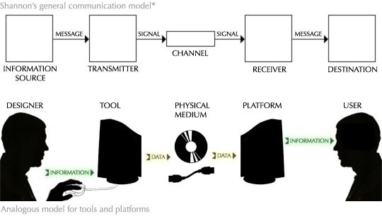
A tool encodes mental information into physical data, which can be transmitted in physical media. A platform decodes physical data into the mind of the recipient. This model is generic because all information transfer other than telepathy requires some medium. If I write you a letter, my tools are pen and paper, and your platform is my knowledge of the written language. If I broadcast a radio signal, my tools are the microphone and transmitter, and your platform is the radio receiver. Generally speaking, my tools are whatever I use to do what I hand you. Your platform is the platform I wish you had.
To deliver the message most effectively, visual designers need as much control over what the audience sees as possible. However, by definition, the designer can only control the tool directly. She is at the mercy of whatever platform implementation the recipient happens to offer. This means that a good platform must be as simple and versatile as possible.
- Simplicity. From a practical (and historical) perspective, we can assume that no complex specification will ever be fully implemented. This in itself is not a problem. However, multiple scattered implementations of complex specifications are incorrect in different ways. Therefore, a platform consisting of all possible unions is unreliable - the designer cannot guarantee what the recipient will actually receive. For a platform to be reliable, it must have a single implementation, or be so simple that it can be implemented uniformly. If we assume that an open, freely implementable standard is actually required, then the only option is simplicity.
- Generality. If we think of a computer as a machine that runs software, then in a sense, all data processed by a computer platform must be "software". For example, the data that makes up a JPEG image can be thought of as the encoding of a program that describes the picture. But the limitations of the JPEG platform resulted in severe "program" sluggishness - they couldn't animate, respond to context, incorporate new compression techniques, or otherwise exploit any of the computer's advantages beyond what JPEG explicitly allows of. The mutilated platform weakens the expression of the designer. In order for designers to take full advantage of this medium, a good platform must provide safe access to everything that is technically possible. An information software platform must provide: input from the environment (i.e. communication with other software and physical sensors), input from history (i.e. storage), input from the user (i.e. interaction); computing resources to respond to input; Limited graphics output. Any inadequacy robs information software of its full potential. The correct way to prevent destructive behavior is to design a good security model, not to arbitrarily cut off the functionality of the computer.
Worryingly, the latest platform forgoes both of these advantages. CSS, a language used to specify the visual appearance of web pages, is a particularly prominent example. So complicated that it was never implemented correctly; however, successive versions prescribe more complexity. At the same time, it's so underpowered that many basic graphic designs are impossible, or very difficult, and context-sensitivity (or anything computational) has to be addressed from the outside. Most CSS knowledge is devoted to describing the tangled little tricks needed to circumvent incompatibilities or approximate the desired look.
One of the reasons for the confusion in CSS is to avoid elegant, flexible abstractions of "1000 special cases", a pernicious approach that precludes simplicity and generality in any domain. The bigger and more important mistake, however, was that the language tried to be both a tool and a platform, so neither succeeded.
For generality, the ideal platform must be optimized for ease of implementation. To be artistically expressive and exploratory, tools must be optimized for the designer's actions. So tools and platforms can't be the same - we have to expect a layer of transition between what designers use and what the platform interprets.
A simple and general platform shifts complexity to this translation layer - the "back end" of the tool - which the designer can control. If a particular tool is not implemented correctly, designers can work around its specific features, or switch to a different tool. (Switching or upgrading tools is much easier for a designer than switching or upgrading platforms for a mass of users.) At the same time, the "front end" of a tool—the part the designer interacts with—can be simple or complex, Generic or domain-specific, depending on the designer's needs and skill level.
The platform must make it possible to create information software. Tools have to make it easy. The next few sections will specifically introduce some information software tools and platforms.
The fifth step is to create an environment where experiments, refinements, and ideas can flourish. Like our geography, an environment for innovation is likely to be polluted by short-sighted business interests.
Before 1786, authors always presented quantitative data in the form of numerical tables. That year, an economist named William Playfair published a book called The Commercial and Political Atlas. To illustrate his economic thesis, William Playfair single-handedly invented the line, bar, and pie charts, thereby inventing the entire field of statistical graphics. Within a few years, his invention had spread across Europe, changing the landscape of visual communication and heralding an era of data-visible discovery. Today, children take these graphic forms for granted; they seem as obvious and basic as written language.
Imagine if William Playfair patented his invention, sued his imitators, suppressing an initial critical period of excitement and growth. Would we be staring at digital tables today, unable to use our visual cortex to unravel their patterns?
This path is inevitable because it is the path of all art media. Books, newspapers, and still visual art have done it, or nearly done it. Film, TV, and published music struggle with step five, but it's only a matter of time before it's done. The same is true for information software, it's just a matter of time. But ten years or a hundred years?
Of course, without implementation, design is nothing. If information software is composed of dynamic graphics inferred from history and environment, it must be possible and easy to create such a thing. The following sections discuss design tools for motion graphics, as well as engineering methods inferred from history and context.
Design a "design tool"
Software tools for drawing still graphics or writing still animations have long been commonplace. However, designers who want to create dynamic graphics (graphics whose properties depend on data) currently have two undesirable options:
- She can learn a programming language. Many designers are intimidated by engineering and may lack the flair or desire to program. They have every reason - painting is a visual activity and working in a literal abstraction is totally inappropriate. Painters, illustrators and sculptors manipulate the artwork directly - no abstraction, visual feedback is instant. If creators had to create with "rectangle.width=17" instead of visible strokes, would we still have any great work of art?
- Alternatively, designers can draw a series of mockups , graphical snapshots of various datasets, and submit them to engineers along with verbal descriptions of what they mean. Engineers are good at working with textual abstractions and then implementing that behavior in a programming language. This leads to ridiculously large feedback loops - it can take a day instead of a second to see the effects of a change. It involves coordination and communication between at least two people and requires the designer to justify herself - she has to convince the engineer and possibly management that every change is worth the engineer's time. This is not an environment for creative exploration.
There is nothing wrong with the concept of mockups. It is a natural, visual way of working that is ubiquitous in many artistic disciplines, from architecture to industrial design. The problem is with the behavior described by the design models (mockups). But think carefully about what exactly engineers do. Engineers infer from a set of models (mockups) the patterns they fit—how the graph changes as the data changes—and code this inferred pattern into a computer program.
Is it really necessary? Can't a software tool be used to infer this pattern?
Going down this path leads to a discipline of computer science known as "programming by demonstration" (PBD) or "programming by example" . This field focuses on implicitly teaching behavior to a computer through a series of examples, rather than through explicit instructions. Researchers have created systems (with varying degrees of success) for building interactive GUI widgets, defining parametric graphical shapes, moving and renaming files, performing regular expression-like text transformations, and other specific tasks in the field. In these systems, the user typically performs several iterations of repetitive tasks manually, and the system then performs the remaining tasks based on the inferred generalization, perhaps asking for clarification or confirmation.
This section outlines a hypothetical but feasible tool that enables designers to create dynamic data-dependent graphs without the need for traditional programming. These dynamic graphics will serve as a visual representation of the user-facing information software. In a sense, this is a "drawing information software" tool.
This tool can be thought of as an extension of traditional vector-oriented drawing programs. Using the same drawing process as traditional tools, designers draw mockups of the graph—how the graph should look for a particular dataset. She then takes a snapshot of the graph and points to the dataset to which it corresponds. She then modifies the graph to correspond to a slightly different dataset, takes another snapshot, and so on. Each snapshot is an example. With carefully chosen examples, the tool will infer how to generate graphs for arbitrary data. The concept of snapshots, probably introduced by David Kurlander 's Chimera (1991), exploits common features in a set of snapshots to infer constraints while drawing a static graph.
This tool is significantly less ambitious than many in the literature for the following reasons:
- Many systems use "programming by demonstration" (PBD) as a means of enabling end-user programming, often by automating repetitive tasks for novices. The tool is aimed at professional designers with specialized skills and training, so it can take on high user complexity.
- Many systems attempt to infer a complete computational process and have the greatest difficulty with computational concepts such as conditions and iterations. As we'll see, this tool is primarily a mapping from one set or range of values to another - a function in the mathematical sense, not a function in the (imperative) computational sense. This might be a lot easier.
- Likewise, many systems attempt to reason about stateful programs. This introduces enormous complexity as the user has to rely on the input and output of a potentially large hidden state. A graph is stateless; its appearance is just a function of the input data. The example does not need a context.
( Some of the content omitted here is not translated )
Engineering through History
The section "Inferring context from history" proposes that software needs to learn from the past. Good information software will try to predict the current context by discovering patterns in past contexts. While such applications are rare, the algorithms required are nothing new or exotic. The discipline of computer science devoted to this topic is called "machine learning" or "learning systems" , and decades of research have resulted in a variety of methods for modeling and predicting behavior. algorithm.
Considering the example introduced earlier, train trip planning can predict the route the user wants to see. A person's local travel plan usually has a daily or weekly pattern. Planning to model these patterns can automatically present the appropriate information to the user, eliminating much of the interaction.
( Some of the content omitted here is not translated )
Engineering by Environmental Inference
The section "Inferring context from the environment" describes some sources of context from which information software can infer context. Hardware-related sources, such as clocks and position sensors, may seem obvious. Software-related sources, such as other information software and documents created with operating software, may seem too far-fetched to be trusted. This section will introduce the information ecosystem , a software architecture that may allow this behavior.
( Some of the content omitted here is not translated )
Since this platform exists to facilitate reasoning about the environment, we take some inspiration from the biological environment . The nature of the biological environment is autonomous transformation. Plants turn sunlight into fruit, large animals turn fruit into dung, small animals turn dung into soil, and plants turn soil into fruit. An ecosystem is a network of individual components that consume nutrients and convert them into abundant forms consumed by other components, and they are autonomous and do not require knowledge of the entire system.
If we adopt this process in software, treating our "nutrients" as information, we have an information ecosystem. Consider this system.

The components on the platform are views . This is the software that users see and interact with. Views interact with the platform in two ways:
- Views specify a topic of interest. For example, if a user is reading an email, she may be interested in information related to the content of the email. The email program will send the email to the platform as the subject. This is similar to "copying", but happens implicitly.
- Views request certain types of topics of interest. For example, maps request topics associated with geographic locations. If a restaurant is a theme, the platform feeds it to the map, and the map displays it. This is similar to "paste", but again implicit.
The components below the platform are translators . The platform provides them with information objects, and they convert the information objects from one type to another and back to the platform. Sometimes this involves breaking up an object into its constituent parts ("digesting" it); other times it involves enriching the object with additional information.
The platform itself acts as an intermediary between the components, trying to satisfy the request by building a chain of converters to convert the subject to the requested type.
( Some of the content omitted here is not translated )
Information and the future world
The GUI that is ubiquitous today grew out of Doug Engelbart 's seminal research in the mid-60s. The concepts he invented were further developed at Xerox PARC in the 1970s and successfully commercialized in the early 1980s with Apple's Macintosh computer, but they have since been largely frozen. Twenty years later, the concepts behind the interface today are nearly identical to the original Mac, despite thousands of fold improvements at every level of technology. Similar stories abound. For example, phones that could be "dial" with a string of numbers were the hot new thing 90 years ago. Today, "phone numbers" are ubiquitous and entrenched despite numerous revolutions in the underlying technology. Changes in culture are much slower than changes in technological capabilities.
The lesson is that even today, we are designing for the technology of the future. Cultural inertia will bring today's design choices to any technology in the future. In a world where science can outperform science fiction, predicting future technology can be a divination-like challenge, but responsible designers have little choice. A successful design outlasts the world it was designed for.
What artefacts will people use to obtain information in the future? I believe that in order for a personal information device to be viable in the long term, it must meet two conflicting criteria: portability and readability .
- Portability. Consider today's ubiquitous information device - the book. We have the technology to make a 5,000-page desk-sized book, but despite the high information content, such books are few and far between. The reason is very simple, that is, you can't carry it with you. Portability will become increasingly important as people increasingly expect information on demand. Today, people can talk to anyone on the planet by reaching into their pockets; future information devices must also be accessible. Like a wallet and keys, a computer goes into a pocket or purse before leaving the house. This means light weight and small size.
- readability. Think again about books. We have the technology to produce books smaller than a business card, but despite the increased portability, such books are still rare. There is no such thing as an ultra-portable, postage-stamp-sized book. Problem: While technology has shrunk the size of what it can read, the human eye remains a largely unchanged thing. To compete with books, future information devices must provide a book-sized surface area. Smaller devices cannot easily read and browse, nor can they support spatially distributed infographics.
To address these opposing size constraints, I predict that a computer will be the size and thickness of a sheet of paper. Like paper, its entire surface is a graphic display. When in use, it's rigid; when not in use, it's folded and can be folded or rolled up (or crumpled!) and tucked into a pocket or purse.
Whether or not I accurately guessed its shape, we can predict the expected characteristics of a device by extrapolating technology trends. Consider capabilities related to context-sensitive infographics : graphic output, history, context, and user interaction.
- Graphical output. As a book, the device must have a large enough reading area and high pixel resolution. As a computer, the device must produce dynamic color graphics. In matching every device of today, the devices of tomorrow will overcome each other's shortcomings. Motion graphics with print resolution will open up a world of possibilities for detailed infographics that are not possible in any medium today.
- surroundings. Since the user will carry the device with them, the environment of the device is effectively the user's own. Assuming a sufficient network model, the device will be able to perceive a wealth of information from the environment - geographic location, physical environment (streets, shops, transportation options, entertainment options), social environment (friends, strangers with common interests, being able to meet strangers in need) and so on. The device will be far more aware of the user's environment than the user itself.
- history. Since its inception, the density of electronic storage has grown exponentially while the cost has fallen. We can fully expect that the equipment of the future will have airborne capabilities that will astound modern people. But, perhaps more importantly, ubiquitous network access would make memory effectively infinite. The device will have a way of remembering everything the user has done, and every environment she's been in. With such a rich history and contextual awareness, software will have unprecedented potential to predict the user's current environment.
- interactivity. Touch or motion-based manipulation is more efficient than a mouse. Eye tracking and speech could be better, although even these are unlikely to match the order of magnitude improvement in capability predicted above. But none of these mechanisms comes close to the amount of information the eye can absorb. No matter what new interaction technologies emerge, the bandwidth between devices and users will not just be asymmetric, but completely asymmetric.
Interaction is already the bottleneck. Things will get worse as graphics, environments and historical experience break through expectations. To me, this means it's clear - as technology advances, the principles of information software and context-sensitive infographics will become crucial.
The future will be context-sensitive. The future will not be interactive.
Are we preparing for the future? I look around and see a generation of smart, creative designers wasting their lives cramming outdated interaction models onto crippled, powerless platforms. I've seen a generation of engineers waste their lives grasping the nuances of the careless design of these dead-end platforms, and carelessly adding more. I've seen a generation of users waste their lives pointing, clicking, dragging, typing, gigahertz processors idling, gigabytes of memory remembering nothing. I see machines, machines, machines.
I predict that in the next generation, the designers who adhere to these models will look like classical physicists, as the world turns to quantization, like Kepler's ellipse, and Galileo standing on top of the tower of Pisa. Ristodians. No matter how hard they tried and how they invented, these designers would not be honored as pioneers. They are making trails in the parking lot.
Our pioneers are those who transcend interaction - their creation is foreknowledge, not obedience. The hero of tomorrow is not the next Steve Wozniak, but the next William Playfair. An artist who redefines the way people learn. An artist who paints with magic ink.
Summarize
Software design includes graphic design (drawing) and industrial design (allowing for mechanical operation).
Information software is used to learn internal models. Manipulation software is used to create external models. Communication software is used to communicate shared models.
Operating software design is difficult, but most software is information software.
Information software design is the design of context-sensitive information graphics. Information software is not a machine, but a medium of visual communication.
Context can be inferred from the environment, which can include data such as physical sensors, other information software, documents created with operational software, and emails that serve as user profiles.
Context can be inferred from the history of past environments and interactions. Last-value predictors provide a basic method. Learning predictors can infer patterns and make dynamic predictions.
Context can be inferred from user interactions , but only as a last resort. The best way to reduce or eliminate interaction is through informative graphic design using context and history. The remaining interactions can be reduced through graphical manipulation, relative navigation, and tight feedback loops.
The information software revolution requires the public to recognize that information software is a medium of visual communication, designers with talents, skills, and tools, a simple and universal platform, and an environment that encourages creation and sharing.
A motion graphics design tool that infers behavior from mockups, enabling creative designs that feel natural without engineering-related distractions.
A learning predictor exists and works. In order for them to be widely used, simple abstractions must be invented.
An information ecosystem of views and transformers may be able to provide all forms of relevant information with minimal interaction. Key aspects include topic requests and conversions, trust, learning through feedback, and a fine-grained modular structure that small software providers can thrive on.
Interaction will become an even more critical bottleneck as technologies related to graphics, environments, and history revolutionize. The best way is to try to eliminate it.
Two centuries ago, William Playfair changed the world by inventing statistical graphics. Another designer invented basic context-sensitive graphic form and changed the world again.
Recommended reading:
Most of the works cited in this article are recommended. The following landmark books deserve special mention:
Edward Tufte . The Visual Display of Quantitative Information (The Visual Display of Quantitative Information , 2001),Envisioning Information (1990),Visual Explanations (1997). Three classic information design books. If you've seen it, watch it again.
Scott McCloud .Understanding Comics ( 1994). Like infographics, comics convey information through the arrangement of words and pictures—they are the "small multiples" that Taft applies to storytelling. Macleod's analysis of how people read and understand the visual language of comics is essential reading for all information graphic designers.
Thomas S. Kuhn . The Structure of Scientific Revolutions (1962). The sole purpose of continually improving the status quo is to expose its flaws. Progress occurs when the status quo is replaced.
Like my work? Don't forget to support and clap, let me know that you are with me on the road of creation. Keep this enthusiasm together!


