Some Mysteries of Taipei MRT
As a map fan + subway fan, no matter which city I go to take the subway, I can stare at the road network map for a long time.
Sometimes, these road network maps can really show some doorways: let's not talk about the design style and the comparison of the advantages and disadvantages of map user experience, just the planning of the road network and corridors, there is a lot to talk about.
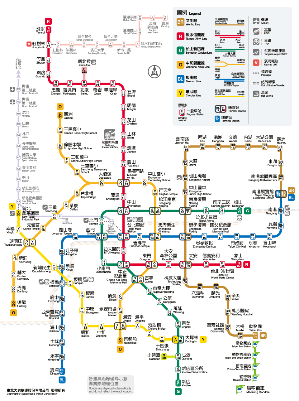
For example, the MRT network in Taipei has a very interesting eyebrow angle: in the first phase of the road network, all routes have more than one 90-degree angle in the urban area.

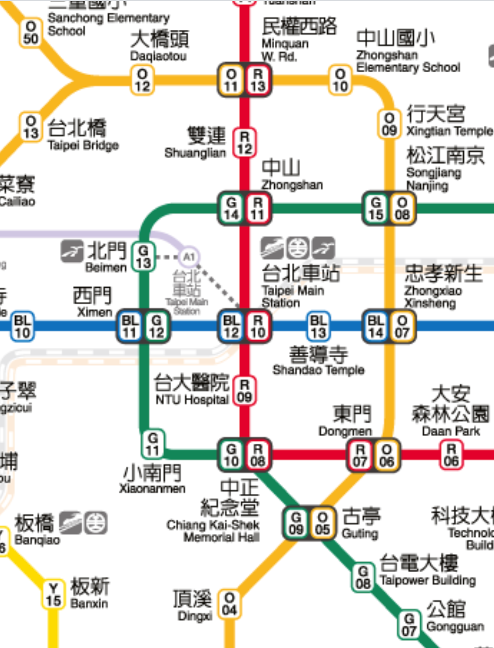
For example, the blue line is a big turn between Ximen and Taipei Main Station, the red line is between Chiang Kai-shek Memorial Hall and the East Gate (and two consecutive super turns), and the orange line is between Xingtian Temple and Zhongshan Elementary School. The green line is even more exaggerated: the Chiang Kai-shek Memorial Hall goes all the way to Zhongshan, turning a total of three turns.
However, this route design is actually not very comfortable for passengers, because the sound of the steel wheels rubbing against the track is always very harsh, and the speed of the vehicle must be slowed down, thus reducing the transportation efficiency.
In this way, why did the people who designed the Taipei MRT network back and forth make the route twist and turn like this?
I later thought that this was actually a very clever design, because downtown Taipei has a very standard chessboard layout. If every MRT line runs straight like a mainline bus, it is actually very inconvenient for transfers.
So from the map, the MRT lines in downtown Taipei are like four "L" shapes, intertwined with each other, so no matter where you go, you only need to transfer once.
(Wenhu Line, which belongs to a different system and has a medium traffic volume, is not included - but the Wenhu Line is really the biggest failure in the initial road network of Taipei MRT.)
If this "L-shaped road network" is compared with the "chessboard" road network, it is easy to see where the benefits are.
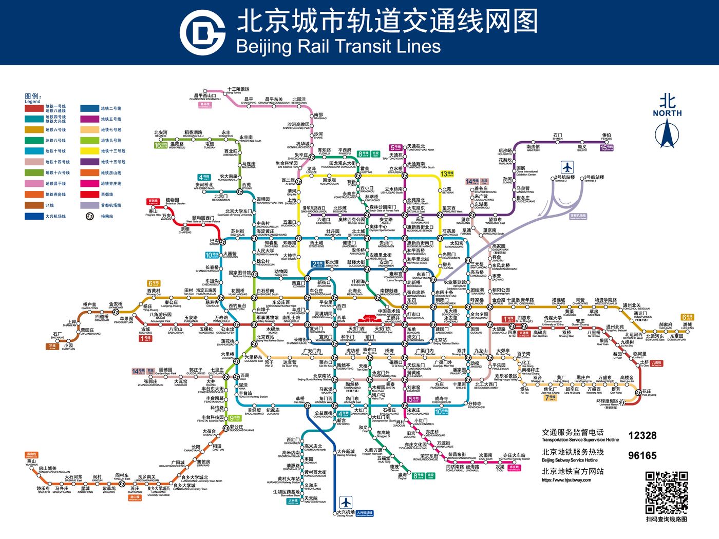
For example, the Beijing Subway is very close to the "chessboard" road network design. Except for the two loop lines of No. 2 and No. 10, most of the routes are straight all the way to the end. will meet.

Suppose one day, you first went to Beihai Park, which was closed during the Cultural Revolution and only for high-ranking officials, and wanted to go to Muxidi to pay homage to June 4th, then from Beihai North Station on Line 6 to Line 1 At Muxidi Station, you have to change trains twice, because Line 6 and Line 1 are parallel to each other and do not intersect.
If the people who designed the Beijing subway back then had each route "turn a corner on its own" and meet each other as much as possible, passengers would have had far fewer transfers.
However, the design of this "L"-shaped route is actually only different for cities such as Taipei and Beijing, which are obviously chessboard-shaped.
Cities like Hong Kong and Busan, which are sandwiched between mountains and seas, have a layout that is very similar to a "corridor", so it is not necessary to do this kind of ingenuity.
But then again, the Beijing subway is so huge that if all the L-shaped routes are adopted, the road network map will probably be as complicated as the Tokyo Metropolitan Railway route map, too complicated to be seen directly, right?
Besides, the route design of the Beijing Subway, which goes straight to the end, seems to be quite able to echo the character of Beijingers...
Another advantage of the Taipei MRT is the design of "parallel transfer": Chiang Kai-shek Memorial Hall, East Gate, Guting, and West Gate four stations adopt this transfer design. As long as the schedule is properly planned, it can be like the following In the film, you can change cars when you walk across the platform, almost seamlessly.
Among them, the three stations of Chiang Kai-shek Memorial Hall, East Gate, and Guting are the big triangle of red, orange and green lines. In the circle of subway fans around the world, it seems to have become a quite classic design.
In fact, a similar "parallel transfer" design can also be seen in Hong Kong - the earliest three MTR lines (Tsuen Wan, Hong Kong Island, Kwun Tong Line), the interchange stations between each other adopt a parallel transfer design, and It also allows different routes to overlap two or three stops (such as Prince Edward, Mong Kok, Yau Ma Tei), and through the "twisted" track configuration, passengers do not even need to go up and down stairs when transferring trains.
In this regard, the Hong Kong MRT is still better than the Taipei MRT: the current "parallel transfer" in Taipei, some transfer combinations still need to go up and down the stairs, such as taking the red line northbound, at Chiang Kai-shek Memorial Hall Station, transfer to the green line New store direction.
Interestingly, if the representative color of the MRT line is linked with the representative colors of several political parties on both sides of the strait, it seems that there are many coincidences.

For example, Ximen Station, where the blue and green lines meet, is right at the back door of the presidential palace, and the power center that once ruled this island of Taiwan is also one of the few things that the blue and green parties have in common.
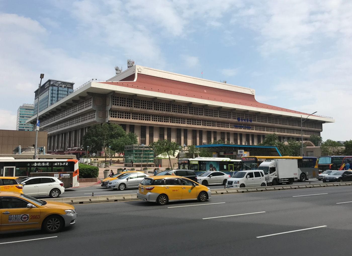
The Taipei Main Station, where the red and blue lines meet, reflects the architectural aesthetics advocated by both the Kuomintang and the Communist Party: "big roof" buildings or "palace-style" buildings - although such buildings appear in large numbers on both sides of the strait in the age, context, The architectural forms are different, but basically they are related to the purpose of promoting "Chinese culture".
As for the Chiang Kai-shek Memorial Hall Station and Zhongshan Station at the Red and Green Trade Fair...
In fact, it is also very reasonable, because in terms of the ideology of the Communist Party and the DPP, the few things they have in common is indeed "hate Chiang Kai-shek", and Sun Yat-sen seems to be a bit embarrassed for these two parties, and praise is not, Neither is criticism.

Like my work? Don't forget to support and clap, let me know that you are with me on the road of creation. Keep this enthusiasm together!
