
半導體外商的小小螺絲釘,遊走於廢青與社畜之間。熱愛閱讀,喜歡透過書本探索外在、內化自我。希望藉由書寫打開與世界交流的一扇窗。 個人部落格:https://maxjamesread.com/
"Full Analysis of 20 Data Visualization Problems": 2 strategies allow you to handle briefings, pictures and texts!

Now that all kinds of pictures and texts are flourishing, "data visualization" is very important and is like nonsense. However, when it is my turn to do briefings and community graphics, it is often unsatisfactory. I can't make the texture on the market, but I don't know how to improve it. If you also have the above problems, I highly recommend reading this book "The Complete Analysis of 20 Data Visualization Problems".
The author of this book, Liu Yiyou, is a briefing paper. Founder of Simple Newsletter . He is an expert in efficient production and information visualization. He has also introduced his "High-yield Ability" before. This book integrates and integrates his years of experience in information visualization, and provides answers to the common pain points of data visualization.
This experience will be divided into three parts, the first part will explain the important visualization principles; the second part and the third part will introduce the visual points of the graphics and charts respectively.
【1. Visualization Law】
Before visualizing information, you must think about 3 questions:
- What is the purpose of the message? Looking forward to the reaction of the other party?
- How can we make the other party have the response we expect?
- What is the content to be presented? How to present?
Visualization is not just about designing beautiful pictures and attracting the attention of the audience, but also about accurately absorbing the message that the audience wants to convey. The book emphasizes that good understanding is always more important than good looks. Visualization is to reduce the cost of communication, and it is putting the cart before the horse to only focus on the content to the point of not being eye-catching.
How to use visualization to effectively "communicate"? The author summarizes three visualization rules:
[1. Sense of hierarchy: point]
The sense of hierarchy is to highlight the focal "point" , so that the audience can see the theme and key content at a glance. The following 2 steps are available:
- focus confirmation
Identify what is the topic , focus and auxiliary content in the information. - Information noise reduction
Use the "contrast" technique to bring out the key points.
[2. Structural: Line]
The structure is to emphasize the guidance of the "line" of sight, linking the information to each other, so that the other party can read the content at a glance.
For example, you can use people's eyesight habits to arrange the elements in the middle, and naturally guide the audience to read:
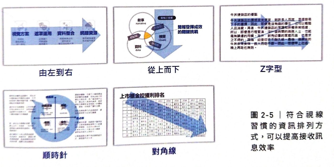
In addition, the use of animation to guide the audience's attention is also a common method in briefings.
[3. Visualization: Surface]
Finally, visualization is to optimize the "surface" of the picture, and improve the texture of the picture by means of color, font, layout and other means, so that people are attracted at a glance.
The author proposes 5 principles of visualization:
- leave blank
Moderate white space allows the layout to breathe and reduce the sense of oppression. - align
The alignment of elements can make the picture harmonious and comfortable. - Compared
Create a sense of hierarchy and create a visual focus. - Intimacy <br class="smart">Use the distance of information to make people understand the connection at a glance.
- consistent
Through the unity of color, font and other elements, create a sense of overall picture.
From the above, the author divides efficient information visualization into two strategies:
- Organize information context
Use strips or mind maps to organize the logic of information expression. - Realize information visualization
Achieve results with hierarchy, structure and visualization.
The book provides detailed explanations and a large number of examples for the above concepts. I highly recommend that you read it carefully. In the next two paragraphs, I will select two points from the book to share with you about the two major types of information: graphics, text and charts.
【2. Picture and text small steps】
[1. A lot of text tuning]
I believe everyone is familiar with the text column-style briefing picture below. Content is fine to read carefully, but audience absorption is often poor. How should it be adjusted?
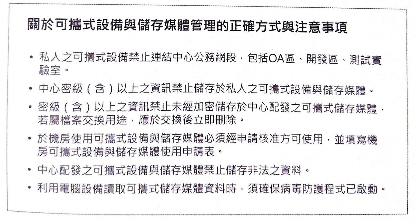
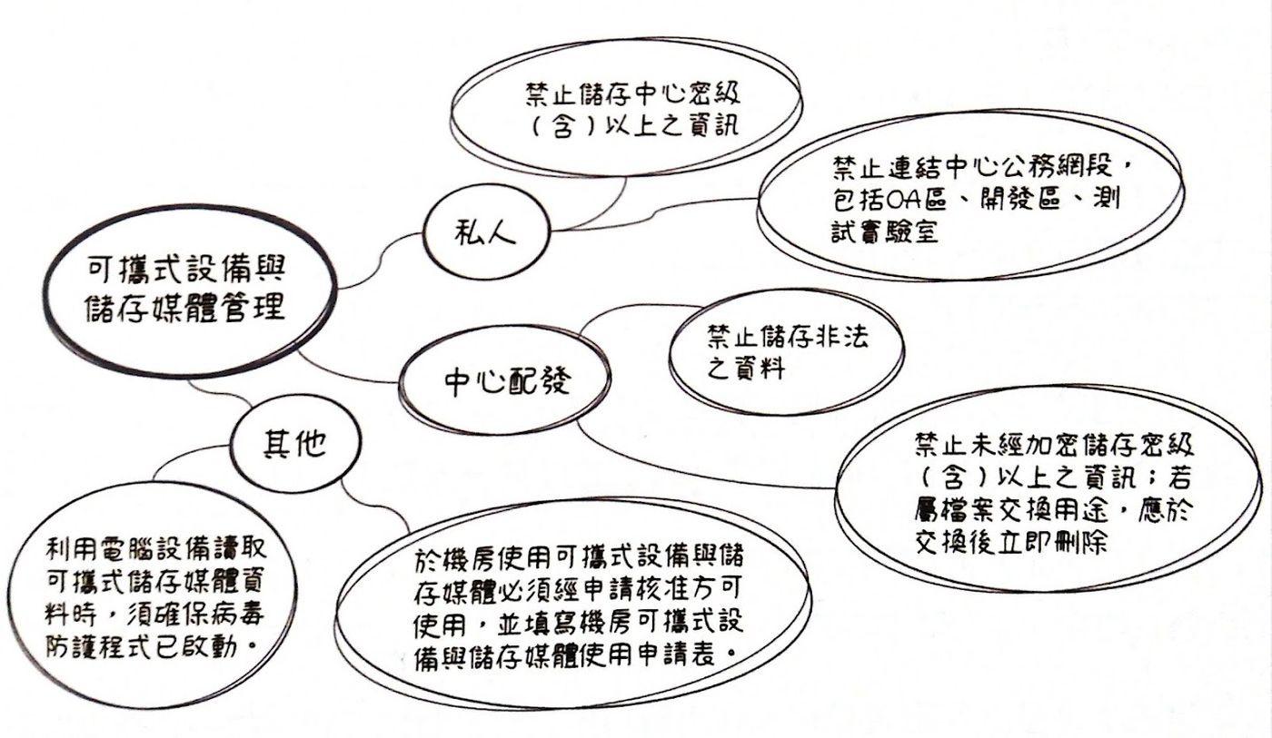
In fact, as long as the above two strategies are used, the briefing can be easily read and absorbed even if it is full of text. First, we must sort out the information context . Information can be rearranged using a simple mind map like this:
Then comes when information visualization comes in handy. First confirm the theme and focus:
- Topics <br class="smart">Rules for Portable Device and Storage Media Management.
- focus
Differences in "Private" and "Central Distribution" rules, plus other scattered considerations.
With the whitespace, alignment, contrast, intimacy and other techniques mentioned above, the content can be rearranged as follows:
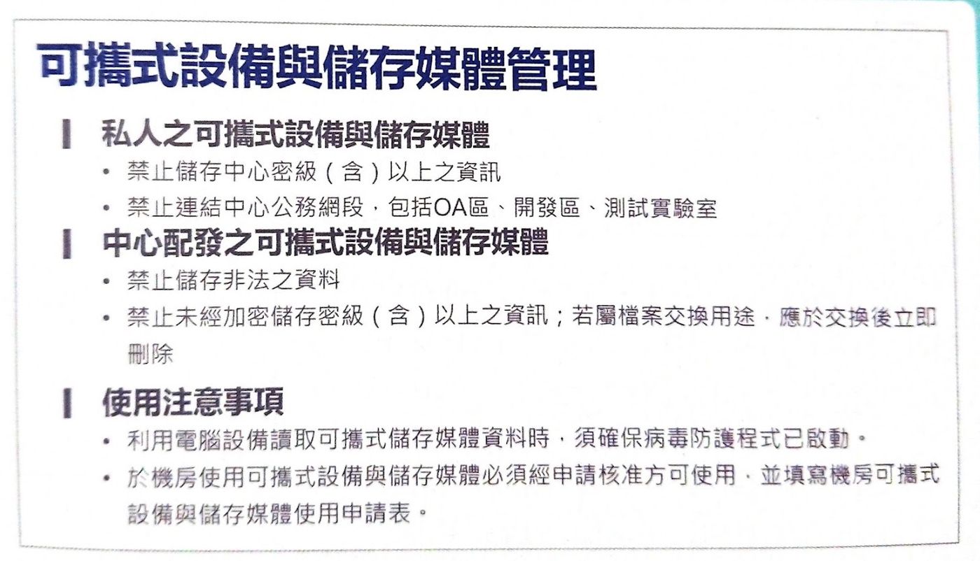
How, is it clearer?
[2. Mask Focus]
Generally, when we want to emphasize the key points of the picture, we often use a red frame to circle the content. But this often makes the picture more cluttered and makes it difficult to see the key points, as shown in the text table below:
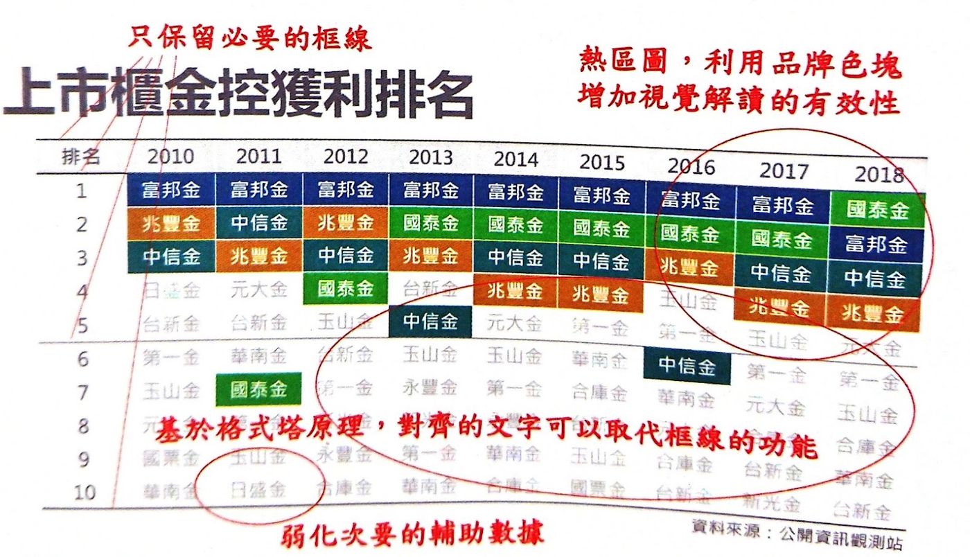
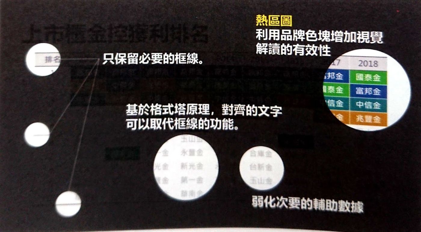
There is actually a better way to focus: masking . In addition to framing the important points, toning down the unimportant will have the same emphasis effect. Using a translucent mask like the image below will highlight the information you want to explain, and the effect will be better.
【3. Chart small steps】
[1. Charts]
Charts are a fairly common element when making a presentation. However, which chart to use to present the data is often quite confusing, so the author once again brought out the principle of " points, lines and planes " so that everyone can follow the indicators:
Dots: show the relationship between data
- Scatter plot :
Presents the association or distribution of two sets of data. - Bubble Chart :
Presents the association or distribution of three sets of data.
Line: Shows the trend of the data over time
- Polyline:
Show the trend of single or multiple groups of data. - Slash:
Changes in data at two time points are presented.
Facet: Show scale comparisons between data
- Strip:
Presents size comparisons of single or multiple sets of data. - Round cake:
Shows the proportion and size comparison of multiple sets of data. - Fall:
Present the process of increase and decrease between data. - radar:
Present a comparison of one or more groups of data in different dimensions.
As for how to visualize the relevant charts, there are many practical examples in the book, and you will have a better understanding of how to apply them in practice.
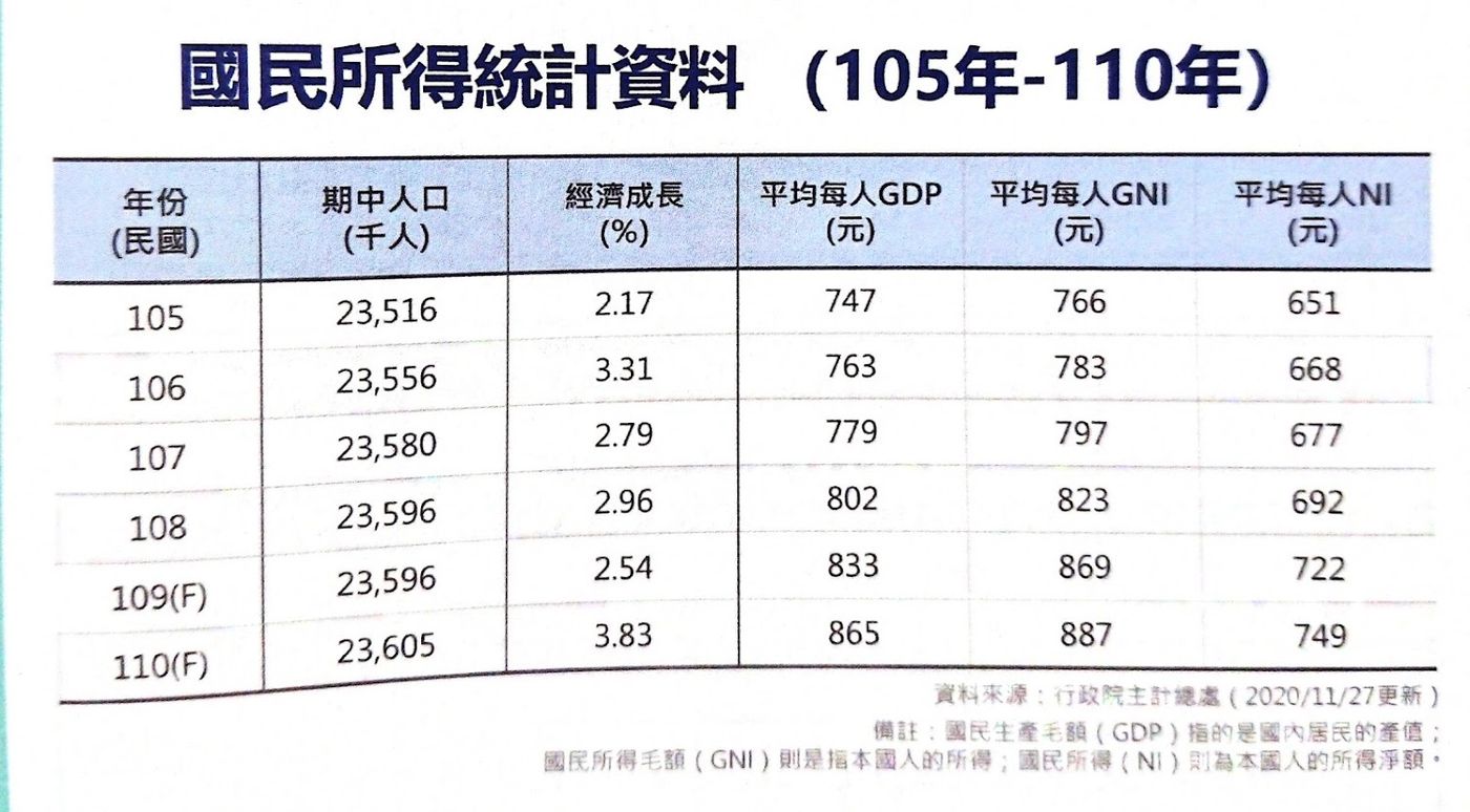
[2. Form]
Tables are also very idiomatic elements of expression. However, if you just copy and paste the Excel table, the readability is actually very poor, as shown below:
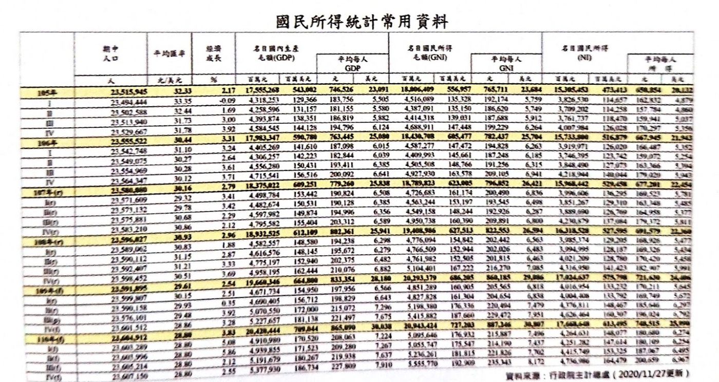
In the face of such a problem, the 2-strategy rule can be used as well. First, clarify the context of the data, and capture the necessary parts.
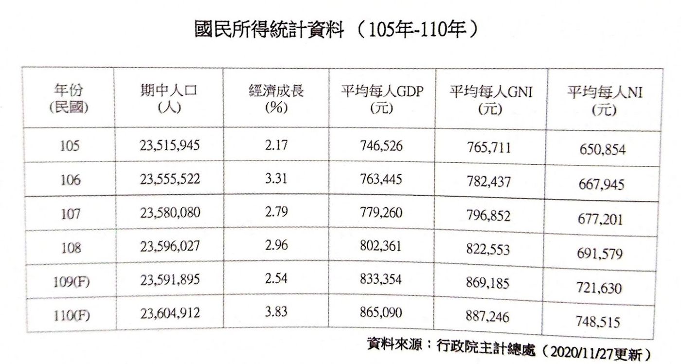
Then start visual, use alignment, contrast and other methods to optimize the table, the details will not be repeated here. With the final result attached, you can think about how to adjust the table to look like this.
【Summarize】
A quick summary. First of all, before visualization, you must use your brain, sort out the purpose of expression, and sort out the structural logic of information expression; then use the three rules of dots, lines, and surfaces to visualize information; whether it is text, charts or tables, you can use this second-order strategy to manage , to make the content easy to read and understand.
This book is the most complete and comprehensive visualization tool I have ever read. The author can be said to have collected the essence of his battles in the market, not only telling the mental methods and concepts, but also using as many as 35 examples to explain how to visualize information. Whether you want to do a work briefing or a community graphic, I believe you can find a lot of inspiration from it.
It is quite recommended that everyone can buy it as a desk book, and refer to the content of their own production from time to time. I believe that with time, I can make visual content that people can understand at a glance!
Articles you may also be interested in:

↓↓You are also welcome to follow the Facebook and mourning of "Mrs's Reading Space"↓↓
James' reading space FB
James' reading space IG
Like my work?
Don't forget to support or like, so I know you are with me..
Comment…