副業是在香港中文大學教書,主業是玩貓。
Pneumonia epidemic map making teaching
There will be no New Year greetings this year, and even university classes have been canceled. The only way is to switch to online teaching. Let’s learn to make maps together. I've taught you how to make street maps and country location maps . Let's make some basic statistical maps this time. As always, I'll introduce some free and very low-tech ways to make graphs. Data is not magic. My principle for making data graphs is that if you don’t agree, you can do it yourself, not when I say “big data” and explain the source of the data, you have to believe it. Come, let's take Low Tech Infographics to the end!
1. MS Excel
The first method to introduce a map is Excel. That's right, in addition to bar charts and line charts, Excel can also do some very basic and basic maps. Here we use the infection figures across the country announced by the Hong Kong government yesterday as an example. Note that my use of these numbers as a demonstration does not mean that I agree with the reliability of these numbers.
First, put the numbers into a table:
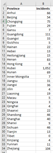
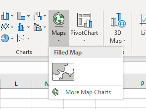
Select the data range to be mapped, then select Insert, and then select Maps on the menu:
In this way, a national epidemic distribution map is ready:
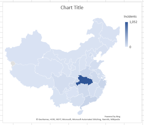
The advantage of doing this is that there are zero technical requirements. The computer will recognize the name of the province you enter and make a map. If you enter a country name, the computer will automatically make a world map, and so on.
However, the above picture has obvious characteristics, that is, the number in Hubei Province is too high, and it seems that the differences between other provinces cannot be seen. Depending on your purpose, this expression can be an advantage or a disadvantage. However, if you insist on seeing the differences between provinces clearly, you can first sort all the data yourself: for example 0 is 0, 1-9 is 1, 10-99 is 2, 100-999 is 3, 1000 or The above is 4, let the data become like this:
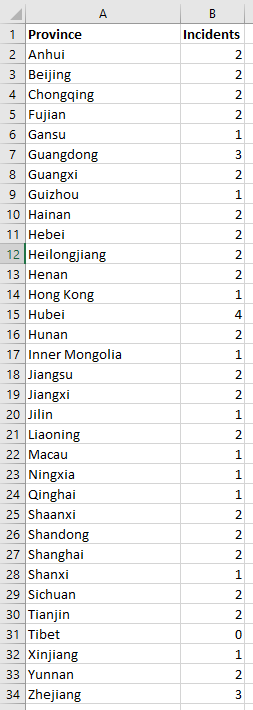
Press again to make a picture, and the result is:
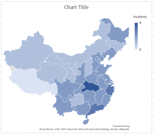
Of course, this can't be the final product, and you have to get the title and legend before you can go out on the street, otherwise people think that there are only 4 cases in Hubei and it will be troublesome.
2. mapchart.net
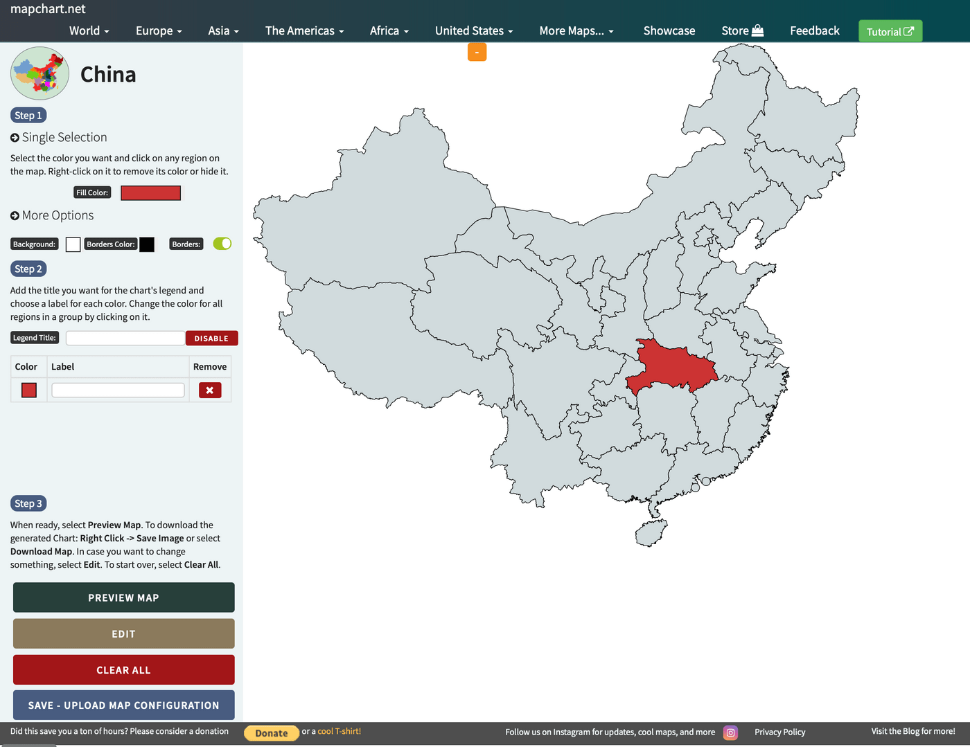
If the above method is too complicated, we can use some existing online map websites, such as mapchart.net . The technical requirements here can't be lower, just click on the map as if it were filling in the color:
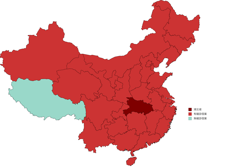
Of course, if you do it seriously, it can actually be very good:
3. QGIS
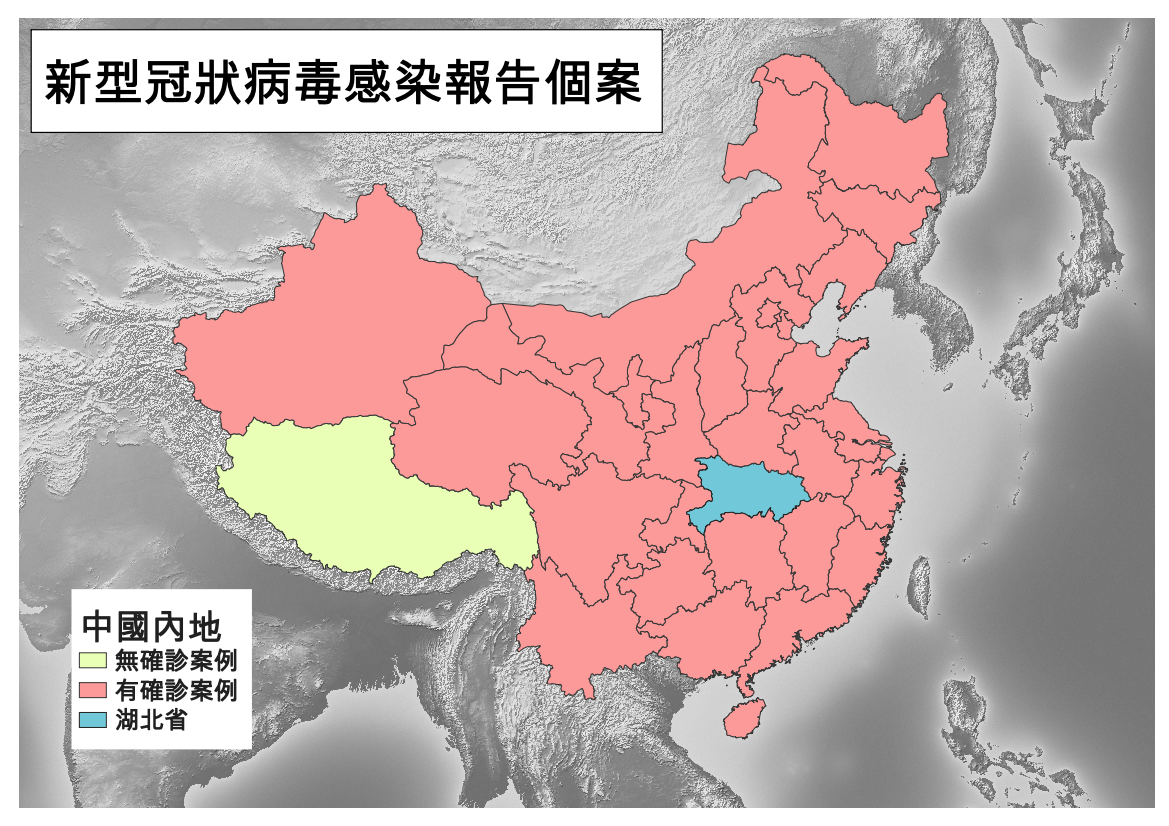
Of course, any off-the-shelf approach will have its limitations. If you want to have the most freedom to design, you still need to use special graphics software, such as QGIS, then you can do whatever you like. For detailed QGIS teaching, please see the two links at the beginning of the article. Here is the finished product I made in three minutes:
(Original first published on the Medium page)
Like my work?
Don't forget to support or like, so I know you are with me..
Comment…