Gamification UX Design for Social Good on Skill Exchange
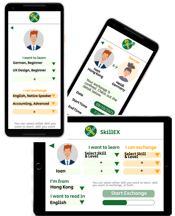
UX design project no 3, what should I do this time? How about “Pay it Forward” and do some Social Good?
This is my 3rd and final project for Coursera’s Google UX Design Specification. I’m using Figma again. I love its handy features, which is perfect to design a simple user flow in a short period of time. Believe it or not, it took me less than a day to complete all the design artifacts.
Let me wind back a bit. The project was an assignment for a series of courses on Coursera, called “Google UX Design Professional Certificate”. It is designed for beginners who have no prior design experience like me. You can also check out my other two UX design portfolios here.
Same as in previous projects, user feedbacks below are hypothetical for demonstration purpose only. Let’s take a look.
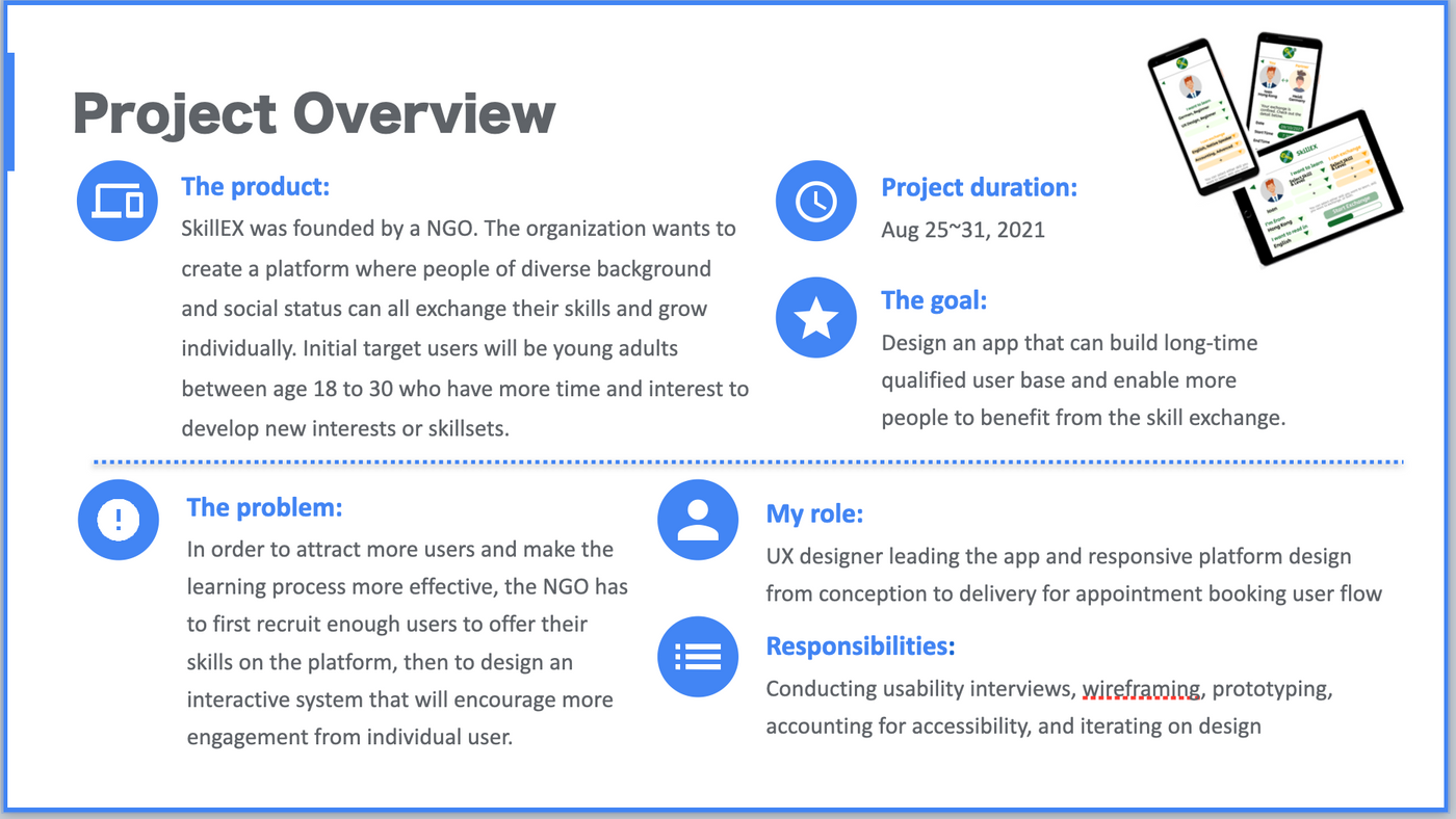
Project Overview
Today I’m going to create a platform for the benefit of social good.
I always believe education plays an important role in eliminating poverty and social imbalance. Here education refers to a broader definition beyond academic system. It can be any organization or agency that offers knowledge, skill, or even artistic cultivation. In this article I’ll share a skill exchange app designed for a NGO (Non-Governmental Organization). The demo will be focusing on the user flow of making an exchange appointment.
Understanding The User
User Research — Summary
As a non-profit NGO, SkillEX believes the power of education. Apart from traditional classroom learning, it believes that the best education should be a combination of cultural cultivation, art education, technical readiness, and continuous interest exploration. Creating a platform for free skill exchange can benefit young adults; who may want to learn certain domain knowledge, but didn’t have the resource to do so in the past.
Features that are appealing to early-adopters may include a powerful search engine that could match users with mutual interest, seamless booking system, and easy tracker for learning progress.
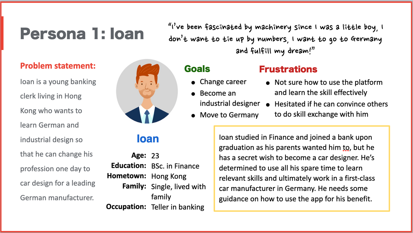
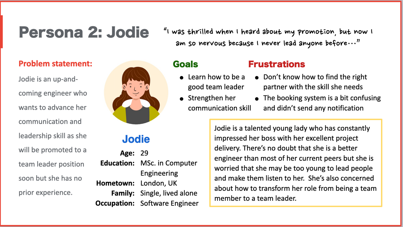
User Pain Points — Persona of Ioan & Jodie
Below personas are reflecting the app’s early target user segment, which are young adults between age 18 and 30.
Ideation & Close-up Storyboard
Currently there’re very few apps in the market that offer different skill exchange service on the same platform, so I came up with some quick ideas with reference to other language exchange apps such as HelloTalk and Tandem, as well as social app like Meetup.
I have incorporated their general design concepts and chipped in my own proposal to address possible pain points and gaps. My ideations focus on creating a concise platform with gamification mindset.
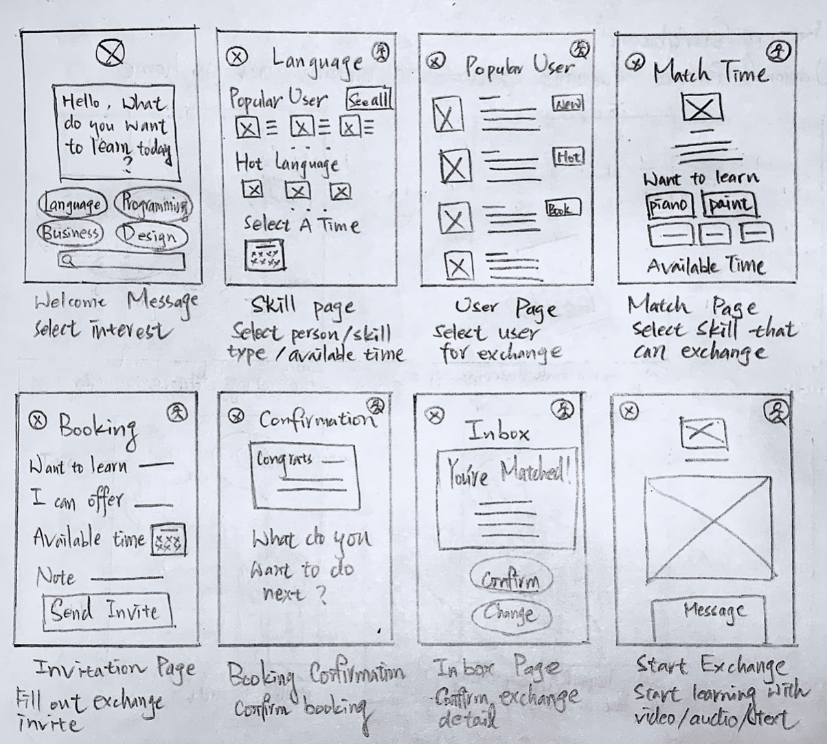
Starting the Design with Figma
Digital Wireframes
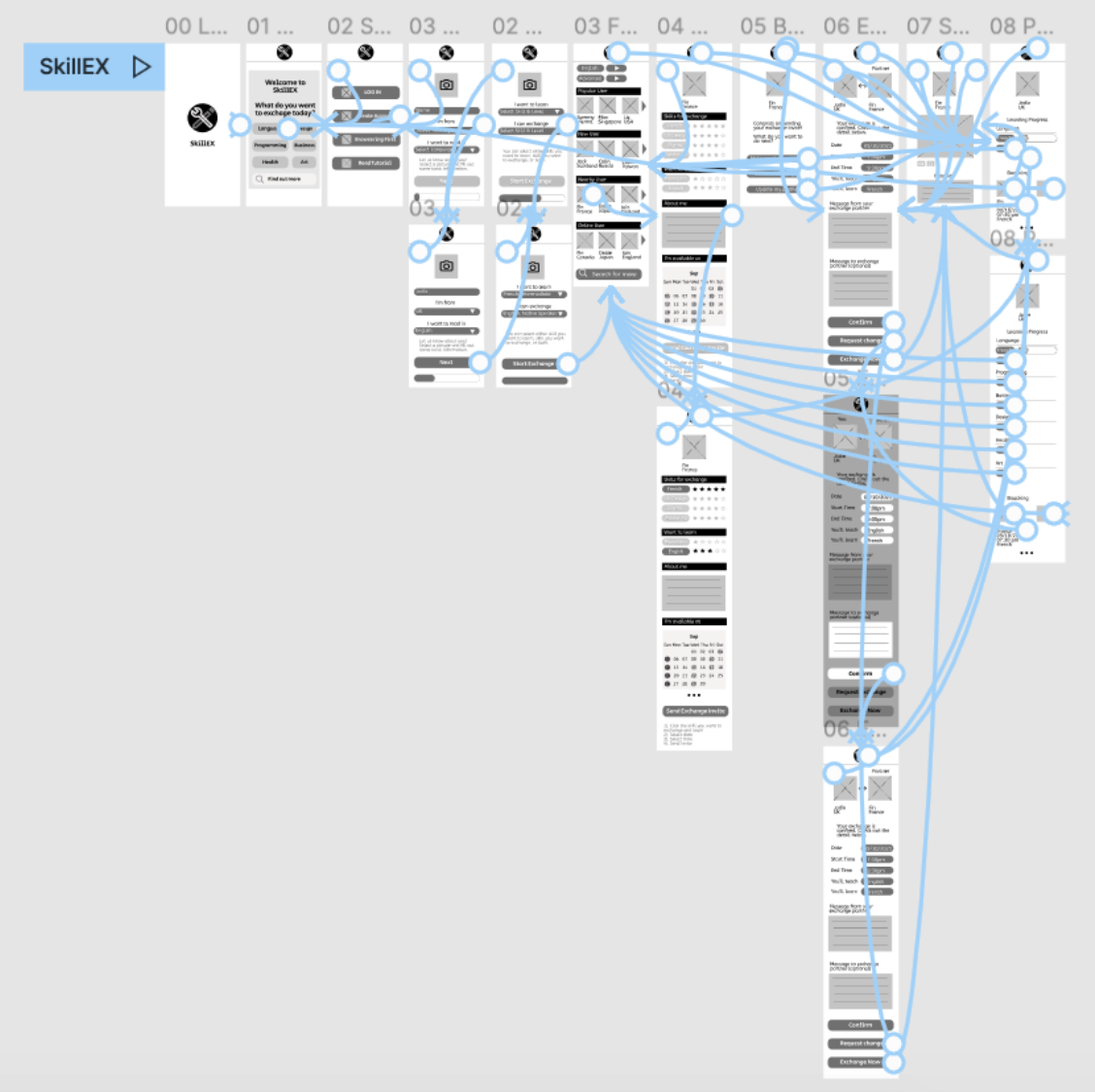
After ideation phrase, it’s time to create digital wireframes. I designed an initial user flow for making exchange appointment with a partner on the SkillEX app.
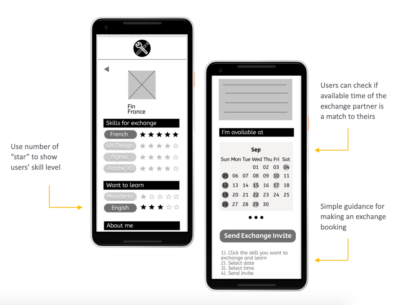
Low-fidelity Prototype
SkillEX’s low-fidelity prototype connected the user flow of skill exchange appointment. It starts from skill browsing, partner selection, to the final appointment page; where users can choose to communicate via video, audio, or texts. There is also a progress tracking function embedded in users’ profile page.
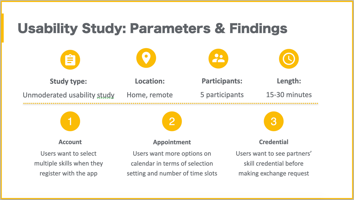
The prototype will be used in a later unmoderated usability study to monitor user operation when no support on scene.
Usability Study with Findings
During usability study, I found that users demand more customized interface when making exchange requests, which align with my initial hypothesis at research phrase.
Refine the Design
Call out for color master, let’s do some painting.
Mockups
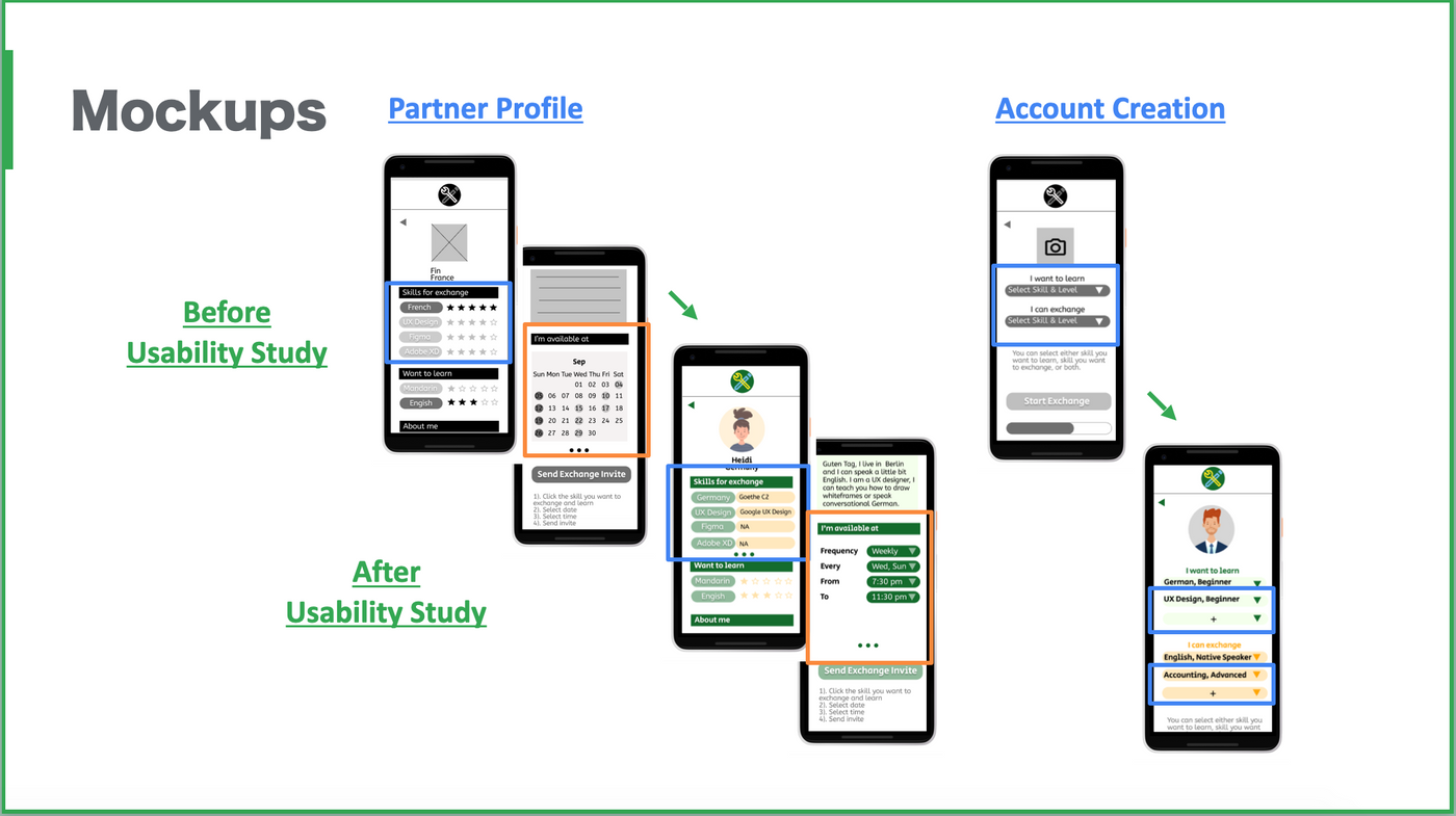
Based on feedbacks from usability study, I updated overall mockups. Here’s to share two featured pages.
- Partner Profile
The partner profile page is designed in a way that users can review partners’ profile and make the booking at the same time.
As some users expressed concerns over appointment time and partner credential, I used the 3-dot carousel icon to add a section where users can self-input relevant skill certifications, and another section to include different time selection options.
- Account Creation
The design concept for account creation page is to encourage new users to set up their skill preference from the very beginning. After usability study, I added more rows for both skills to learn and skills to exchange.
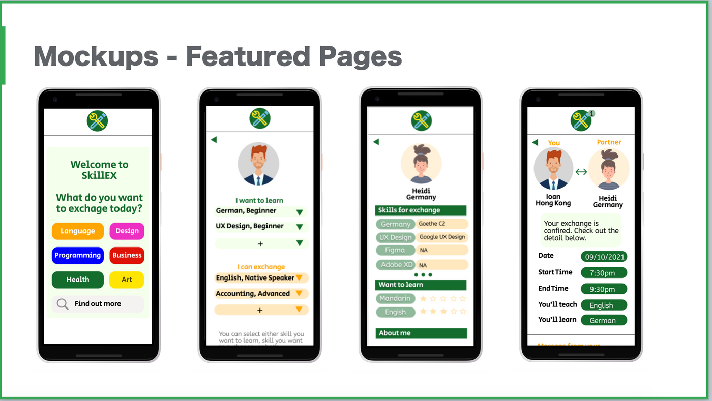
Featured mockups in the sequence of “Welcome Message”, “Account Creation”, “Partner Profile”, and “Appointment Confirmation” from left to right:
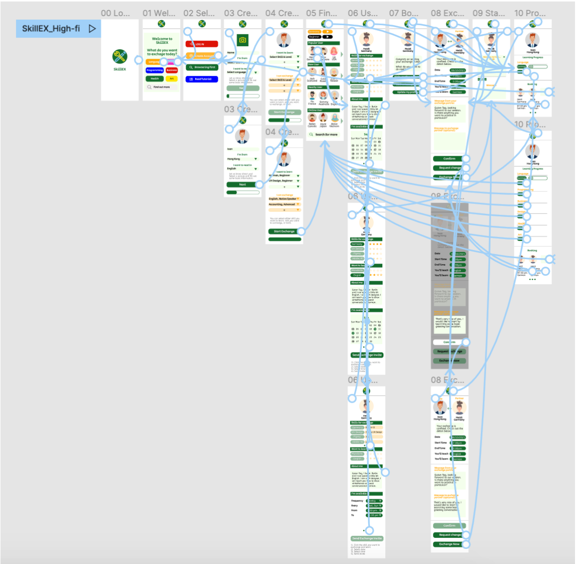
High-fidelity Prototype
The final high-fidelity prototype followed the same exchange booking user flow as previous low-fidelity prototype. Overall animation and visual design was updated per feedbacks from more usability studies.
As for accessibility, SkillEX’s design is focusing on creating a gamification style with interactive icons and contrasting colors for visually impaired or amblyopia users.
View the high-fi prototype here:
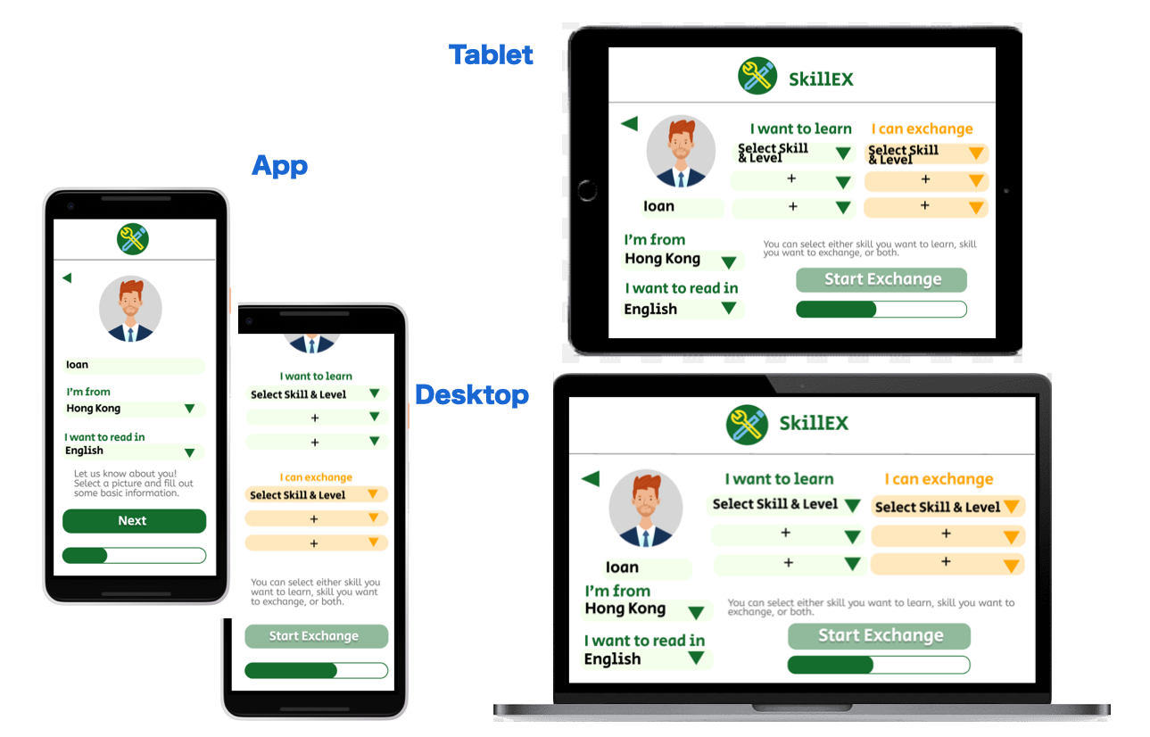
Responsive Design
The design for SkillEX’s screen size variation includes original app plus separate tablet and desktop versions. You can see the app’s 2 steps Account Creation pages were merged into 1 for both Tablet and Desktop screen.
Takeaway and Next Steps
My design concept for SkillEX is to give users a chance to learn new skills from people around the world. I’m hoping that some users will even have the opportunity to explore different career options after taking some time to advance their new skills.
During ideation phrase, I realized how difficult it is to incorporate different skill genres into one platform. Also was it challenging to design with a gamification mindset. Even so, I believe it’s an important factor to both retain users and help them achieve their personal goals.
Next Steps
I enjoy every step of this social good project. I would thrilled if someone willing to launch similar service in the near future. That being said, I do have some ideas about how to make the app better:
- First, continue to do market research and usability tests to improve interactive design on different devices
- Second, add more features on user page. It can be either partner comments or rating, users’ own learning feedbacks, medals for achieving certain learning goals, or verification from professional certification organization
- Third, include more incentives. Example are learning progress tracker on users’ own page, and other physical incentives (ie, coupons from partners who sponsor the app’s operation) to reward users’ continuous learning and achievement for pre-defined goals
Hope you enjoy my UX design project, until next time.
If you like my article, feel free to give me a clap below or follow my account. If you are a fellow self-learner on UX design, don’t be shy to leave your comments! Find more case studies and business stories here.
What’s more, you can always give me some “Likes” if you are a Liker on Liker Land.
Liker Land is a place where you can register for free to be a “Liker” and support content creators. Without the intervention of mass corporate ads, this blockchain application is a great invention to support individual creators. If you’re already onboard, welcome to show your support via the link below.
喜欢我的作品吗?别忘了给予支持与赞赏,让我知道在创作的路上有你陪伴,一起延续这份热忱!


- 来自作者
- 相关推荐