How to design a memorable leaflet
Does your leaflet design fail to highlight your company's personality? Customers flip through and forget? A memorable leaflet design not only clearly conveys your company's products and services, but also leaves customers with a deep impression of your company. The most important thing is that when customers need to purchase, your company is the first to come to mind.
When a customer receives your leaflet, it's like meeting a new friend.
First impressions are critical when meeting someone new. How are you dressed? How do you speak? What kind of person are you? Amplify your strengths and finesse your weaknesses a bit. Whether warm and kind, stylish and confident, or professional and successful, we want to leave a positive impression that is memorable.
It's the same for a company. From the moment a customer picks up your leaflet, first impressions are formed. An effective leaflet conveys your company's personality, positioning, pricing and more. Identify your company's character and qualities, and reflect them in the leaflet design. This will naturally attract customers who share similar values and beliefs. They'll not only notice your company and buy your products but also become loyal to your brand.
Leaflet design for memorable impact
Leaflet editorial and design styles
Leaflet layouts generally follow one of two design styles: photography-led or illustration-led.
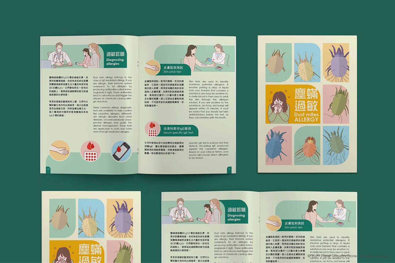
For photography-led leaflets, layouts can utilize photos to create a more professional, stylish impression. They can also convey a sense of sophistication and atmosphere, and are suitable for companies needing to showcase real environments or products.
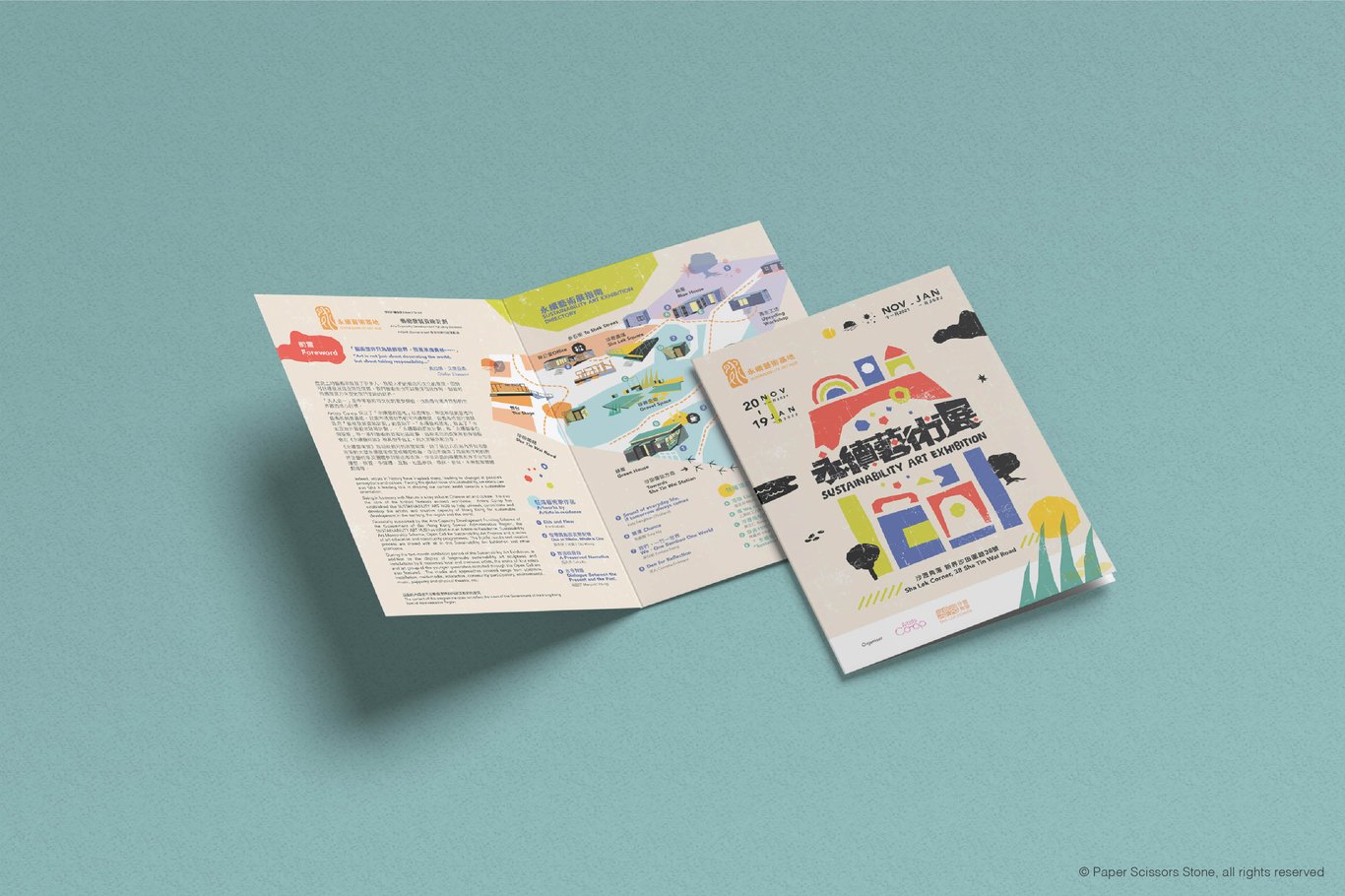
Illustration-led leaflet editorial design can be more imaginative and unrestrained. This style is ideal for companies wanting to convey energy, vibrancy and joy. On the other hand, illustrations can also portray a friendly, gentle and accessible side.
Price Budget Control Tips:
Photo-Oriented Leaflet - Hiring a Photographer
Price 💰💰💰💰💰 Effect ✨✨✨✨✨
Hiring a photographer can yield a series of photos in a consistent style. Adjusting photo effects to suit different needs may require additional expenses to engage the services of a photographer.
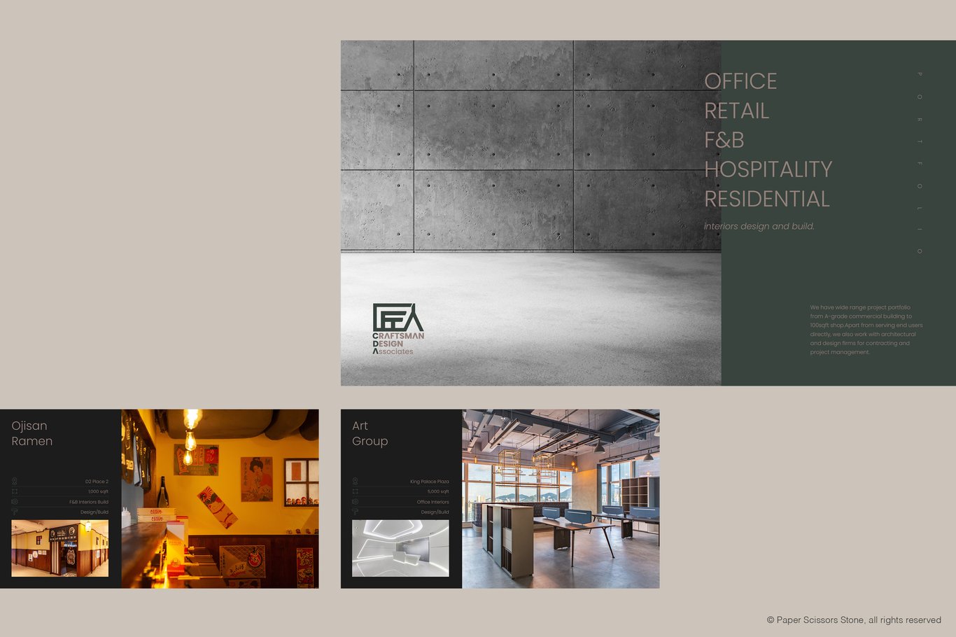
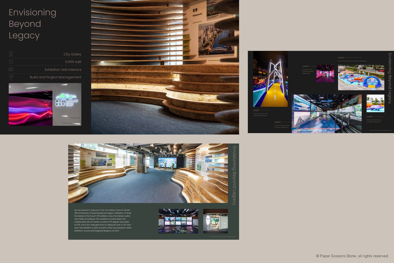
Photo-Oriented Booklet - Purchasing Photos Online
Price 💰💰💰💰 Effect ✨✨✨✨
For those without the extra funds to hire a photographer, buying photos online is an alternative. Photo prices vary across platforms, generally costing less than hiring a photographer. Designers will select photos of similar series and styles for design purposes. The downside is the limitation of online photos; finding a perfect match is not guaranteed. Additionally, there is a risk of inadvertently selecting the same photos as other companies, leading to awkward situations.
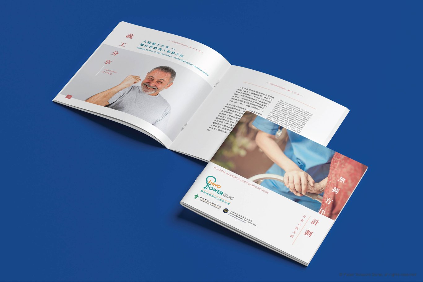
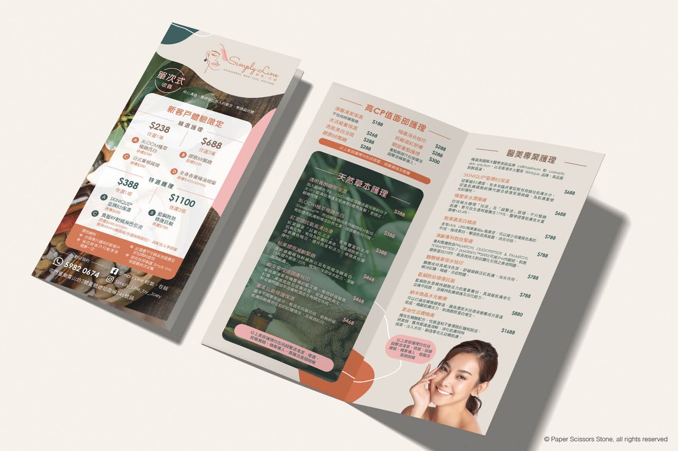
Illustration-Oriented Leaflet
Price 💰💰💰💰 Effect✨✨✨✨✨
Leaflets relying on computer-generated illustrations depend entirely on the designer's illustration skills. Illustration styles set the tone for the entire leaflet. They can create beautiful leaflets without the need for photos but may not be suitable for companies that require visual product images to enhance purchasing intent, such as those in the food, jewelry, or fashion industries.
Color Palette for Leaflet
Which colors can enhance the recall value of a leaflet? I recommend starting with one primary color and then selecting one to two secondary colors for complementing.
The primary color is often derived from the logo, serving as the title color and accentuating important sections.
The first secondary color can be used to highlight less crucial information or as a color for subheadings (complementing the primary color).
The second secondary color can be a lighter hue like pale apricot, gray, light yellow, light blue, etc. (complementing the primary color). It can be applied as a background color in larger sections to harmonize the overall feel of the leaflet.
It's essential that these three colors harmonize with each other. I look forward to sharing more about color combinations in upcoming articles.
Printing Techniques for Leaflet
Touch, one of our five senses, is how we interact with the world. When a customer picks up a leaflet, touch carries the essence from fingertips to the brain, translating a company's identity and beliefs into tangible sensations that leave a lasting impression.
Therefore, the choice of paper material, thickness, and finishes can significantly enhance how customers remember a company.
In terms of paper material, using matte paper for leaflet printing can introduce a subtle reflective effect, conveying a commercial and mainstream feel. Textured paper, on the other hand, offers a rougher feel, suitable for themes related to culture, nature, and sustainability. Various specialty papers with unique textures can evoke different emotions.
Additionally, the thickness of the paper directly influences how customers perceive the leaflet, affecting its quality and texture. Thicker paper exudes a sense of luxury, while thinner paper feels more lightweight. Thin paper is more cost-effective for mailing leaflets, as it helps save on shipping costs and postage.
The finishing touches for leaflets play a vital role as well. Techniques like foil stamping, spot UV, varnishing, die-cutting, embossing, and debossing can showcase a company's personality, increase interactivity, and leave a stronger impression on customers.
Different printing techniques enhance the customer experience and help them remember the company better. These techniques vary in cost, so it's important to consider factors like the audience reach of the leaflet, customer retention rates, budget allocation for printing, and then request quotes to decide on the most suitable printing methods.
In summary, designing a memorable leaflet centers on showcasing the essence of the company. Through design style, colors, and printing techniques, the aim is to create a profound impact on customers, fostering not just purchases of products and services but brand loyalty, transforming them into long-term clients.
喜欢我的作品吗?别忘了给予支持与赞赏,让我知道在创作的路上有你陪伴,一起延续这份热忱!
- 来自作者