Understanding Your Podcast Analytics: A Study Case
Below is an analysis of Anchor team members using our updated version to understand her audience and grow the podcast.

We recently added some exciting new insights from Spotify: demographics by age and gender, and data on episode drops. Once I start applying them to my own podcasts, these analytics are really appealing to me, and I want to share some of the stats I use that allow me to better understand my audience and develop better marketing strategies , making each episode of Podcst better than the last.
Audience Demographics
Anchor's analysis now includes graphs showing Spotify listeners aggregated by age and gender. These metrics are useful approximations of listeners across all listening platforms, and they can help you determine who exactly is your podcast reaching? And who hasn't discovered your show.
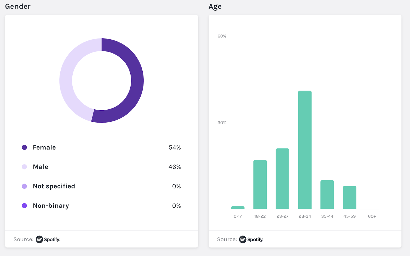
In terms of gender demographics, Blood On their Hands audience is 54% female and 46% male. This information is of immediate help in developing my marketing strategy and in communicating with my current or potential audience.
After knowing that women are more likely to listen to the program, by understanding the audience situation, I can promote my program with more goals and intentions, and see if the adjustment will increase the overall audience. I'm going to keep podcasts broadly appealing by understanding the "snippets that cover all demographics," the "methods to promote content," and balancing the two.
What surprises me about our audience demographics is that more than half of our audience is in the 29-34 age range. Most of the voicemails we get are from college students. In fact, in the years we've been doing podcasts, we haven't received a single voice from a listener in their 30s. Digging into the data made me wonder: Who are these 30-year-olds? Why are they more inclined to listen and less engaged in interaction?
My partner and I are very serious about audience engagement. This is the main measure of our show's success, and we'd love to see more interactions and messages with Blood On their Hands.
After looking at my audience demographics, I have some new ideas for marketing strategies that can increase metrics and increase engagement.
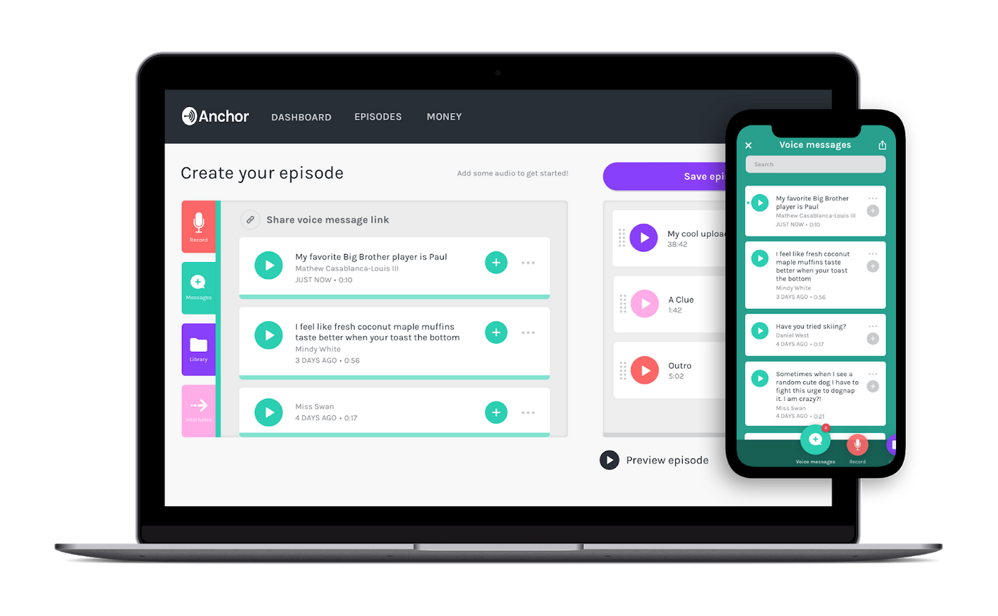
Next season I will try to play some of my 30+ friends on the podcast to encourage more listeners to participate. Beyond that, we'll be testing out a few posts on social media, targeting older listeners, and focusing on show interactions to see if we'll drive more viewers to our shows.
Program traffic declines
Anchor will show your show's downlink data, how many listeners are listening to your show in a given number of seconds, so you can gauge which segments are the most engaging and which may need improvement.
In my Podcast Time Share, my partner and I sat down with friends to talk about our favorite book, the 600-page sci-fi epic "Children of Time." After a few minutes of each episode, we'll give a spoiler alert for those who haven't finished the book to stop listening. As we expected, this little reminder led to a massive loss of listeners:
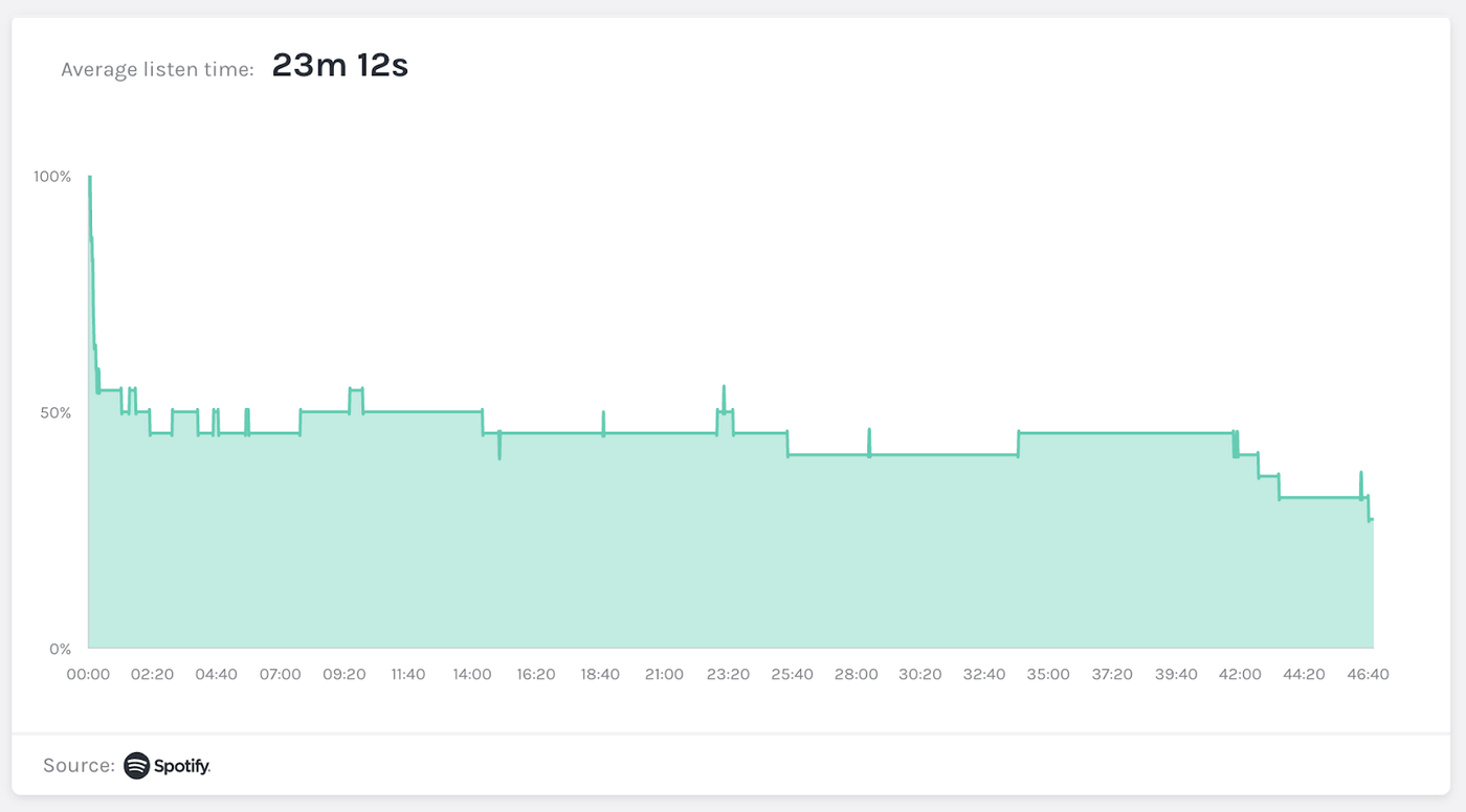
This is a typical program chart. Audience numbers began to drop sharply when we issued a spoiler alert, but the remaining audience engagement remained steady until the end of the show.
When I compared this episode's chart to other episodes, I noticed that the initial dip was more pronounced for this episode than for certain episodes:
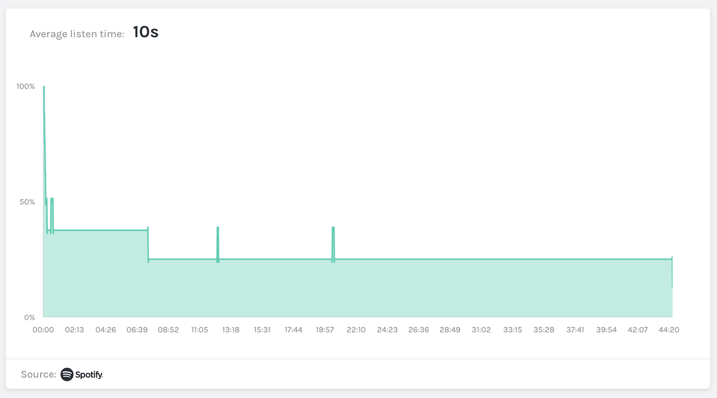
In this episode, more than half of the audience went offline within a minute of the show, with an average listening time of just 10 seconds. Regarding the occurrence of this anomaly, I wonder if there is something wrong with the introduction of this episode, which in turn caused so many people to stop listening.
Sure enough, I went back and listened to this episode, and it didn't start out so well. The sound quality wasn't good, my partner and I didn't play as well as usual, and we didn't take the time to frame the entire podcast for new listeners. We have learned from this lesson that our audience loves the introduction of high-profile productions, and now I know to use the more successful episodes as a template for production.
By looking at trends and anomalies in declining data on the show, I can spot the thoughts of viewers listening and know what next steps to take to keep viewers engaged.
Here's an example of an interesting drop in data from another episode of Blood On Their Hands:
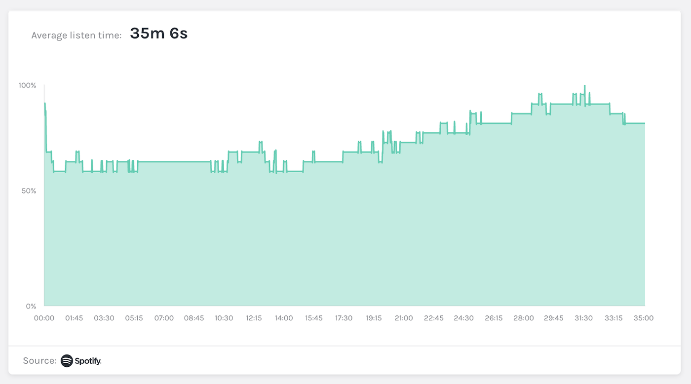
There was a sharp drop at the beginning of the show, while retention rates rose at the end of the show. We can watch other episodes of Blood On Their Hands, and the pattern is very similar. So why?
Every episode of Blood On their Hands follows the same basic format: a quick introduction, followed by a live reaction section to the latest episode of Big Brother, and finally my partner and I talk about the cast's strategy and speculate on what's going to happen next week thing.
The episode drop chart above shows the audience skipping the live reaction at the start and jumping right into the part where we speculate and talk about strategy. I've always found the live reaction to be the funniest part of our show, but I never realized how much it really resonated with the audience.
Understanding your audience's values is critical to making shows, helping to balance your creative preferences with material, engaging your audience and attracting new followers and subscribers.
My takeaway from this episode's data is that Blood On Their Hands might get better performance if we reduce live reactions or exclude them from our show model altogether and focus only on shows that follow - Listeners will also be happier. I plan to try this mode in the next season of the show. However I will keep an eye on the graphs and ask for feedback from our listeners to make sure they don't miss the live response.

I hope this will be a helpful article to learn about Anchor's new analytics data and provide you with inspiration on how to use data to engage your audience! As you drill down into your own podcast analytics, I bet these graphs will confirm your intuition about the content while pointing out ways to make the show more engaging.
To explore your own podcast analytics, head to your Anchor page. Scroll down to see your age and gender graph, then click on an episode from your show listing to see how your declining traffic is doing.
Like my work? Don't forget to support and clap, let me know that you are with me on the road of creation. Keep this enthusiasm together!
