From Apple's system update, understand "control" and "freedom" in design
A really good design motivates other designers to do better designs. For Apple's design philosophy, there are both enthusiastic pursuit and fierce criticism, but as designers, we at least cannot deny the reference significance of Apple's product decisions.
We try to use Apple's system update as a starting point to briefly talk about the trade-off between "control" and "freedom" in design thinking.
Syracuse University architecture professor Richard Rosa (Rhichard Rosa) believes that "the essence of design is control and freedom." This sentence is very concise but directly involved in the core of design - the act of design is chaos and disorder. Order gives order, so that it can carry controllable human behavior; but design must not be absolute control, it must reserve some freedom for users.
If the Android system is more like the representative of "engineering thinking", and the Apple system is the embodiment of "designer thinking", then we may be able to see from the latter's series of decisions to build its own products, their focus on "control" and "control" and "designer thinking". "Freedom" trade-off.
Apple's WWDC (World Developers Conference) this year garnered a lot of attention like in previous years. They launched the fourteenth generation of the operating system at this conference, a series of updates including iOS for mobile phones, iPadOS for tablets, and MacOS for computers. As many tech reviewers have responded, it appears that many of these new additions are becoming "more similar" to Android.
Apple's obsession with "control" in design thinking dates back to the Steve Jobs era. This strong and persistent "author's will" and the "paternalistic thinking" of helping users make decisions have long been imprinted in the minds of Apple's platform builders. The decision to move slightly closer to Android at this year's developer conference seems to be interpreted as Apple 's reduction of control and relaxation of freedom to a certain extent.
The most visually prominent updates and changes in iOS14 seem to come from the features implemented in the Android camp in the early years-
1. Home Widgets are already available on Android phones;
2. The App Library seems to reference the similar App Drawer on many Android phones;
3. Picture in picture (picture in picture) can be said to be a revised version of the split screen function on Android phones;
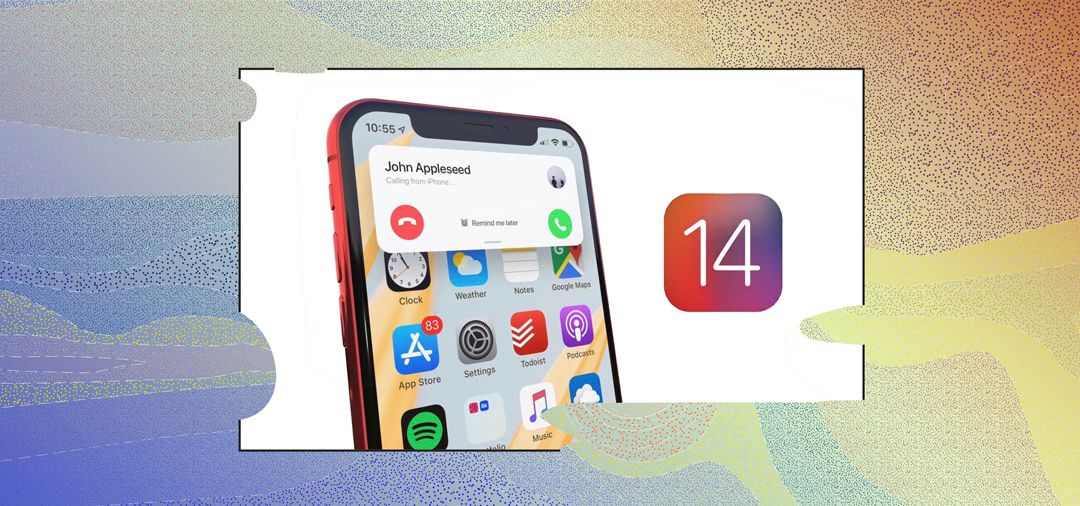
4. The pop-up window for incoming calls is placed at the top of the screen instead of occupying the full screen. This is an update made by Android phones when the system was updated a few years ago;
5. The default app (default app) for opening browsers and emails in Apple's operating system can finally be set by itself, which is also a relatively open source Android system that has been delegated to users from the very beginning;
...
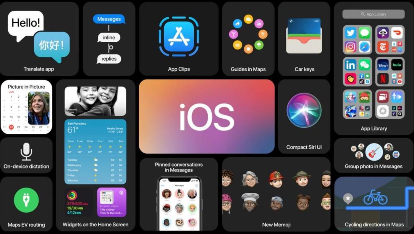
Whether it is visual or interactive design, in the decision-making of these product updates, we seem to see Apple's long-standing "helping users make decisions" and "letting other competitors to catch up and imitate" authority figures slightly lower their stature, Start listening to some developers, tech reviewers, and users. In this update, Apple is more like responding to the needs first created by Android, rather than purely the "creator of needs and usage" in the past.
But just as many tech commentators have responded-as long as we digest the information from this conference, we can still realize that Apple has not become "more like Android" in terms of real construction logic. From the designer's point of view, we will also find that even if a certain amount of "personal customization" is given, Apple still has a strong control over the overall order. This is the designer's grasp of control and freedom.
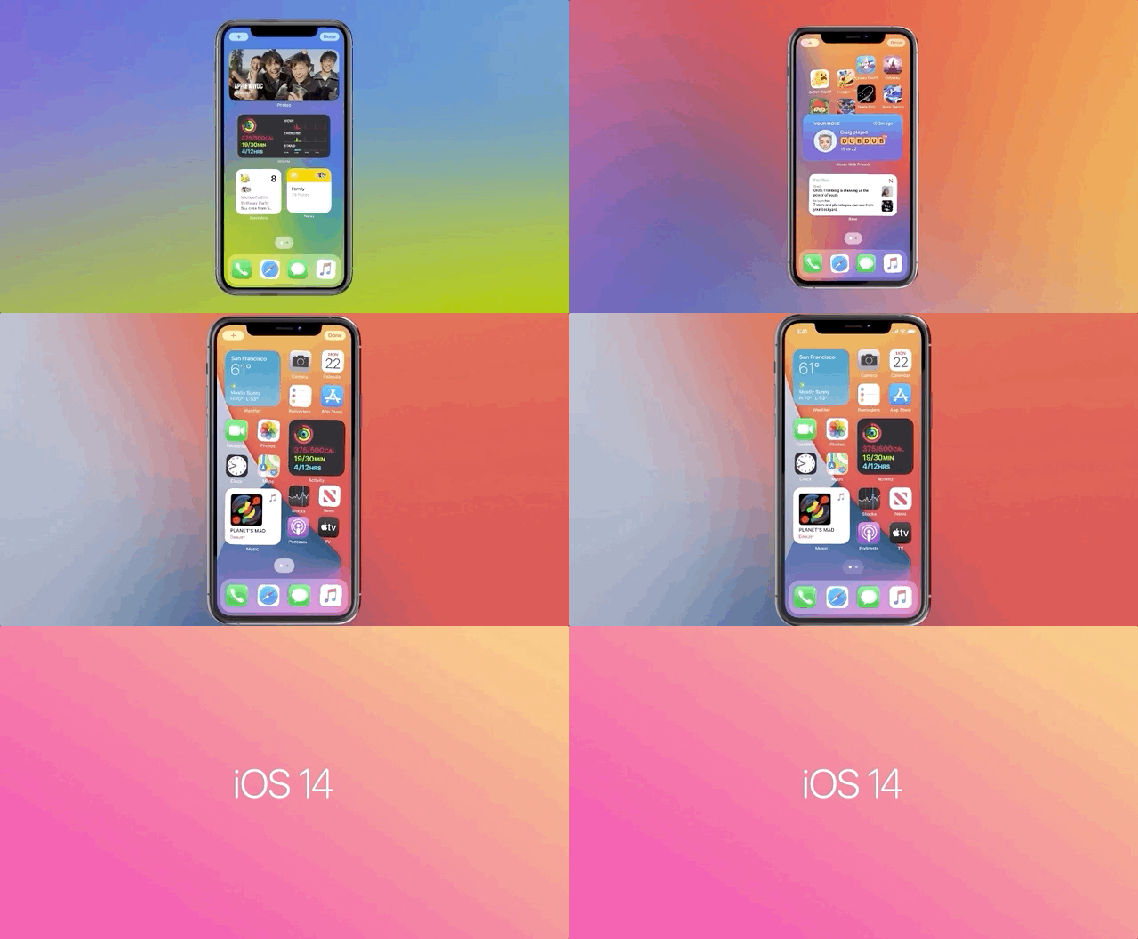
The first and fifth points listed above are the best examples. In the first point, the intervention of desktop widgets on the mobile desktop still needs to follow clear and strict rules - its modules are controlled in "2×2", "2×4" and "4×4"; widgets and all Like other icons, they remain snapped to the top of the screen; widgets cannot be centered, but must be placed on the side. These preset rules ensure aesthetic and visual neatness and order, and also reject the possibility of true "self-customization" like Android phone desktops.
The same logic can also be seen in the default software customization of browsers and emails in the fifth point. Since the birth of iOS, the default browser in Apple's mobile phone and tablet operating systems can only be Safari, and mail sending and receiving can only be the built-in Mail App. With this update, users can finally set third-party software like Chrome or Firefox as the default browser. However, these personal customizations are still not free to do as you please - the software that can be set as default also needs to be carefully selected in advance by the Apple platform, and not every little-known software can enter the setting list.
MKBHD, the most influential technology reviewer in North America, and Craig Federighi, Apple's senior vice president of software engineering (and the keynote speaker at this developer conference), had a remote interview on June 24. During the talks, there were also discussions on these issues.

Craig's answer once again reflects the importance and even obsession of "control" in the thinking of Apple designers:
Q: Since Apple chose to relax the customization of "Browser" and "Mail" this time, why didn't it further relax more software, such as "Maps"?
A: We have definitely considered that, and maybe one day we will. But we've certainly been very cautious in moving forward on these things. We know (if left unchecked) how easy it is for platforms to slide into chaos.
We proceed very cautiously on these things. We know how easily platforms scan descend intochaos.
Strict order and open freedom are not simply opposites. As we tried to explain in our previous article "The "Creation" of the Internet Platform, Still Rooted in the Spatial Metaphor of Ancient Buildings" (click to jump) , the platform's formulation of rules is also a prerequisite for "freedom of order" . In his answer, Craig also briefly explained the considerations of the platform builders- there is quality under constraints . If the default settings of the software are completely released, it is very likely that a large number of irregular software will emerge that claim to be browsers, thereby diverting users or jumping to advertising pages, or stealing users' private information.
Many times, the designer's confidence in aesthetics will end in the coercion of details. The "control freak" trait in designers' thinking is by no means limited to the scope of Internet products. Many master architects are also arrogant egoists. They influence (or offend) their working partners with their crazy controlling personality. The decision of the details is transferred to others.
Ieoh Ming Pei is a gentle and harmonious mainstream designer, but the Mixiu Art Museum in the eastern suburbs of Kyoto also reflects the designer's emphasis on "control". On rainy days, the management of the museum requires every visitor to claim an umbrella of the corresponding color at the reception before entering the museum-because if people are allowed to freely bring their own umbrellas, the cluttered colors will destroy the overall beauty of the building complex .
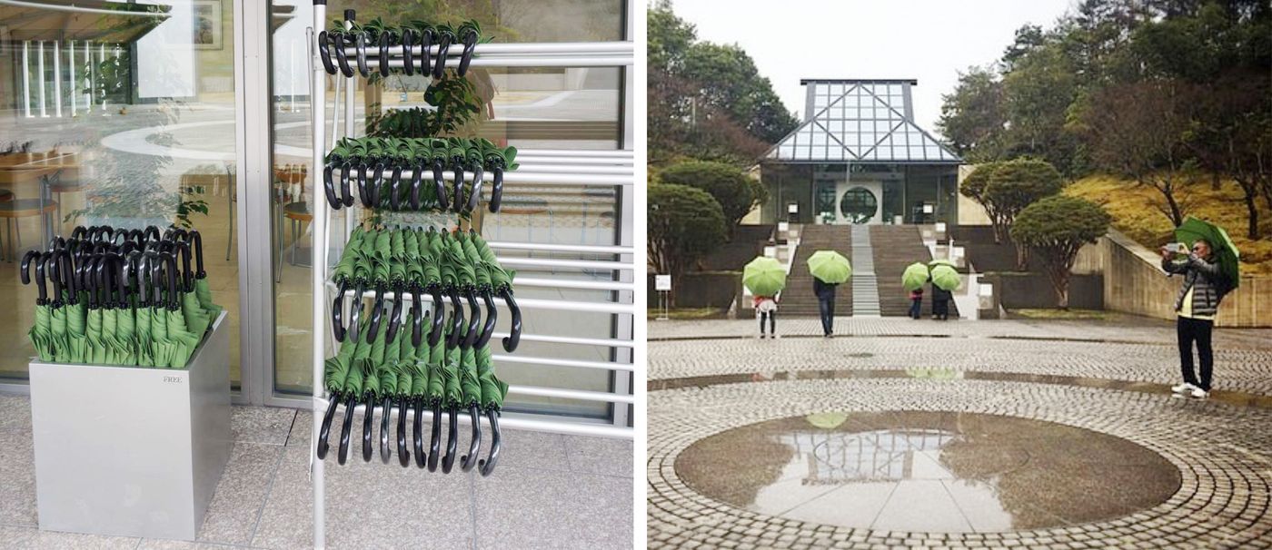
Meixiu Art Museum is like an architectural metaphor for the Apple ecosystem. To varying degrees, they practice the logic that if you want to enter the beautiful world I built, you first need to learn my way and follow my rules.
Another similarity is that this wonderful world requires a considerable degree of independence and isolation . As numerous architectural critics have dubbed Miho Art Museum "Japan's Peach Blossoms", this massive earth-covered complex is tucked away in the mountains, unspoiled by the noise and chaos of Kyoto or other surrounding towns,
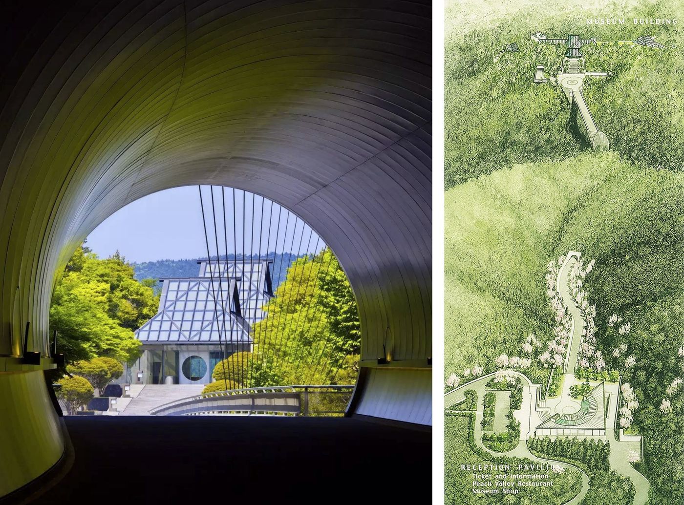
Apple's ecosystem is also a "walled garden", from the iPhone to the iPad, from the MacBook to the AirPods, from the iWatch to the HomePod, the Apple empire provides consumers with a world of introverted beauty.
In the product world, the Apple ecosystem is probably the most successful closed loop ever. This is not only because of the seamless and smooth connection between Apple's mobile phones, tablets, computers, and watches, but also because the system has built a very high outer wall for itself. As a result, outsiders can’t get in, and insiders can’t get out—as long as they don’t let go of the random access from the outer wall and the control of the internal order, Apple’s ecosystem must be safe, controllable, beautiful and beautiful. This may be very similar to many political games outside the product world, whether it is the "unit-run society" of the Chinese unit compound in the last century, or the United States of America in 2020.
That's why we think that, on a deeper level, this developer conference must not mean "Apple is becoming more like Android." A more important news than the visual and interactive update just introduced is that Apple will spend two years gradually transitioning its computer product line to its own chips (A12Z and others) instead of relying on Intel's core.
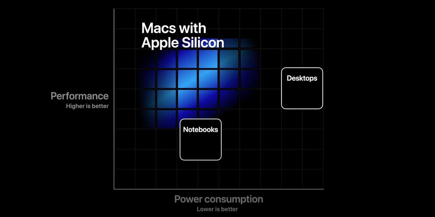
It can also be seen that the newly released MacOS Big Sur operating system makes the computer experience more similar to the iPad. This is the real signal that should be paid attention to - the completion of the "unification" of Apple's internal ecosystem in the future. When Apple can more completely control the production and connection of hardware and software at the same time, they will be able to create an amazing product experience with more "designer will", and further close its own product ecology to ensure the "designer's will". Freedom of strict order".
Jobs left the world with his "legendary desire for control." The builders of the platform - the developers of the products - the users, which party is more able to determine the appearance of the system? Apple still holds most of the weight in its own (platform builder) hands.
Some people say, "Give consumers what they want." But that's not my way. Our responsibility is to figure out what they want in the future one step ahead. I remember Henry Ford saying, "If I originally asked consumers what they wanted, they would have told me, 'A faster horse!'" People don't know what they want until you put it before them. Because of this, I never rely on market research. Our task is to read what is not yet on paper.
People don't know what they want until you show it to them.
This paternalistic "alternative decision" logic has shaped Apple's success as an advanced capitalist player, but it also almost implies a fascist behavior trap. Apple's designer thinking is a template that is very worthy of continuous observation for us - design must need control, but it must not be absolute control. The builders of the platform need to reserve some freedom for developers and users, and the overall takeover of the order will eventually lead to a bottom-up rebound of public opinion. Of course, where there is control, there is resistance to it. For a long time, the "jailbreak" behavior of the user terminal is essentially a resistance to this "walled garden" - I recognize the world you built, but I also recognize that as a user, I can have more freedom.
"The essence of design is control and freedom." Whether it is a product, a building or a city, the designer controls the proportion of the proportion, and the proportion belongs to the user's freedom. The trade-off and wrestling between them will always be the core issues that cannot be ignored in design philosophy.
The first-hand content is published on the WeChat public account "Dune Research Institute". Click here to jump to the original link of this article.
Like my work? Don't forget to support and clap, let me know that you are with me on the road of creation. Keep this enthusiasm together!



- Author
- More