"The First Step of Brand Digital Image" - Founder and Design Director of Block Studio / Li Ming
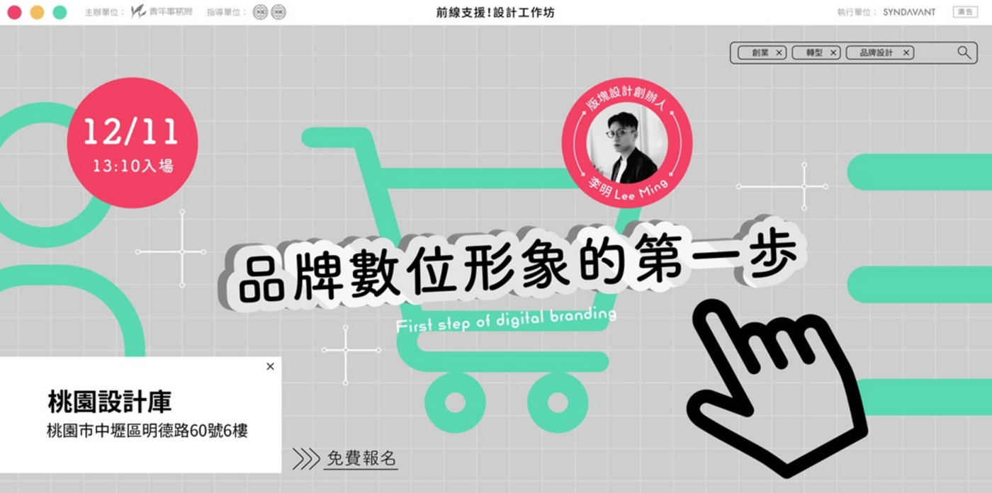
Without the concept of "brand", the website is just an empty shell!
How to communicate your brand core values “online” and create a digital brand experience that impresses consumers? How to differentiate from competitors' brands and establish their own characteristics?
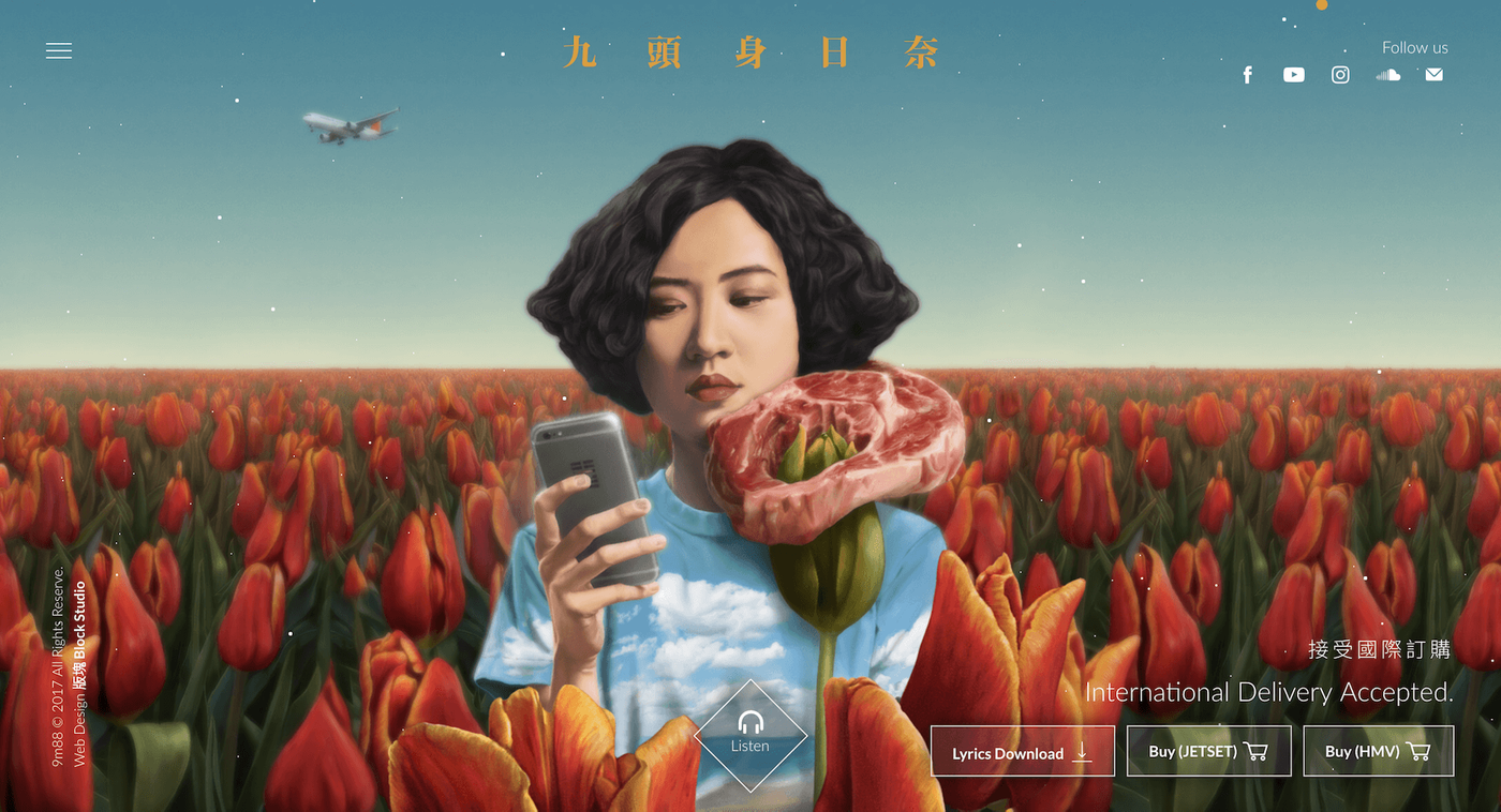
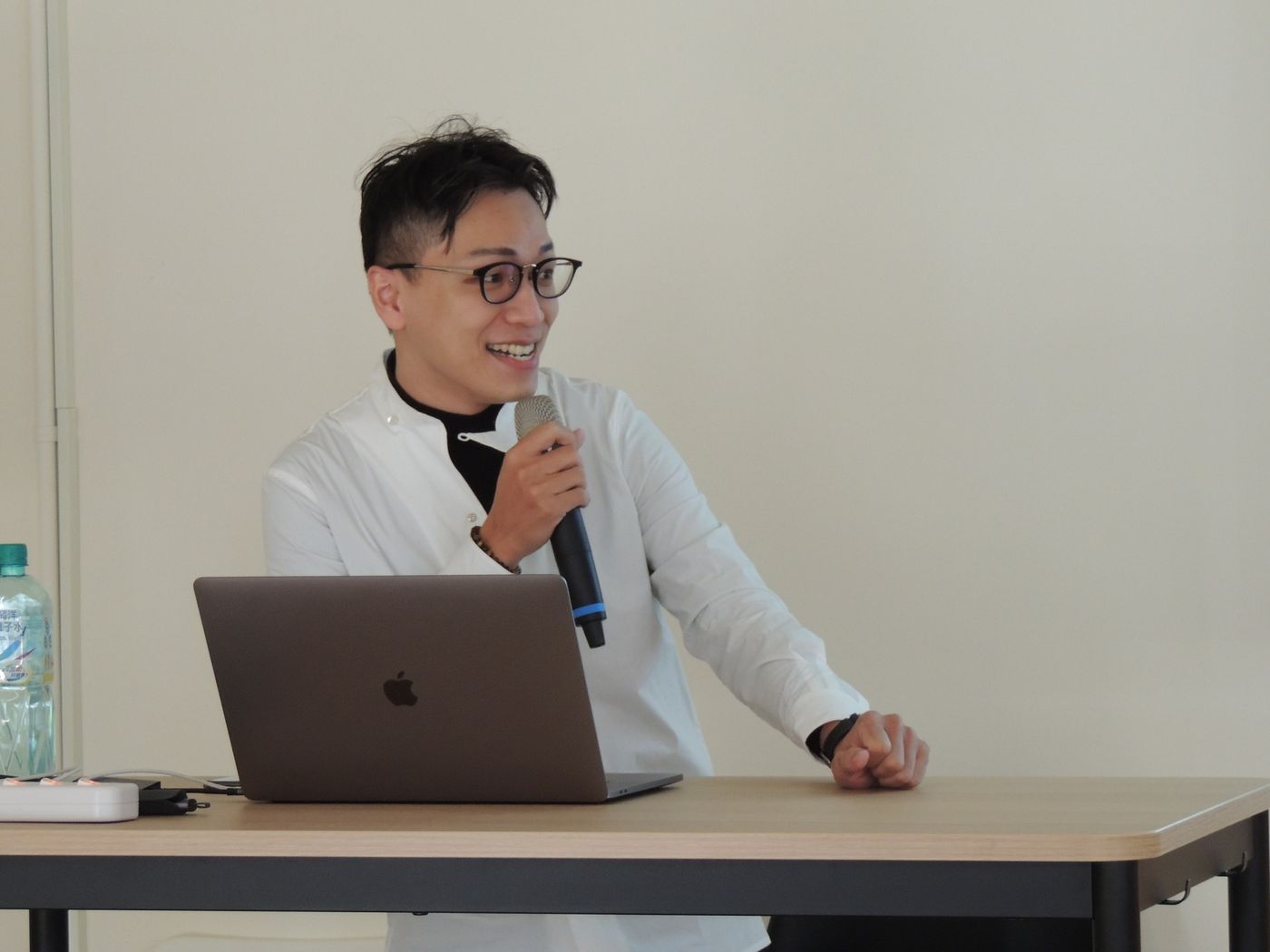
Taoyuan Design Library invited Li Ming, the founder and design director of Block Studio, to share how to present his digital image through brand identity and website interface. If you remember the wooden sailboat and the dark blue background of the black tea, or the large turntable on the official website of the singer 9m88's "Nine Head Body Rina" album, these are the works created by Li Ming and his team!
What is "brand digital image"?
"Using the website to build a unique digital image is to help the brand tell a story through design and dynamic special effects." The director gave a simple and clear definition at the beginning. However, why should we care about the "digital image"?
A brand already has a clear tonality, and it can be effectively communicated in the physical display, but when it comes to setting up an official website, the director said: "Most customers say that the website is 'good-looking, easy to use, clean and simple'. But I never thought that the official website can also be a part of the brand.” And the mutual extension between the brand entity and the online is the focus of this lecture.
Purpose: To shape the audience's perception of your brand
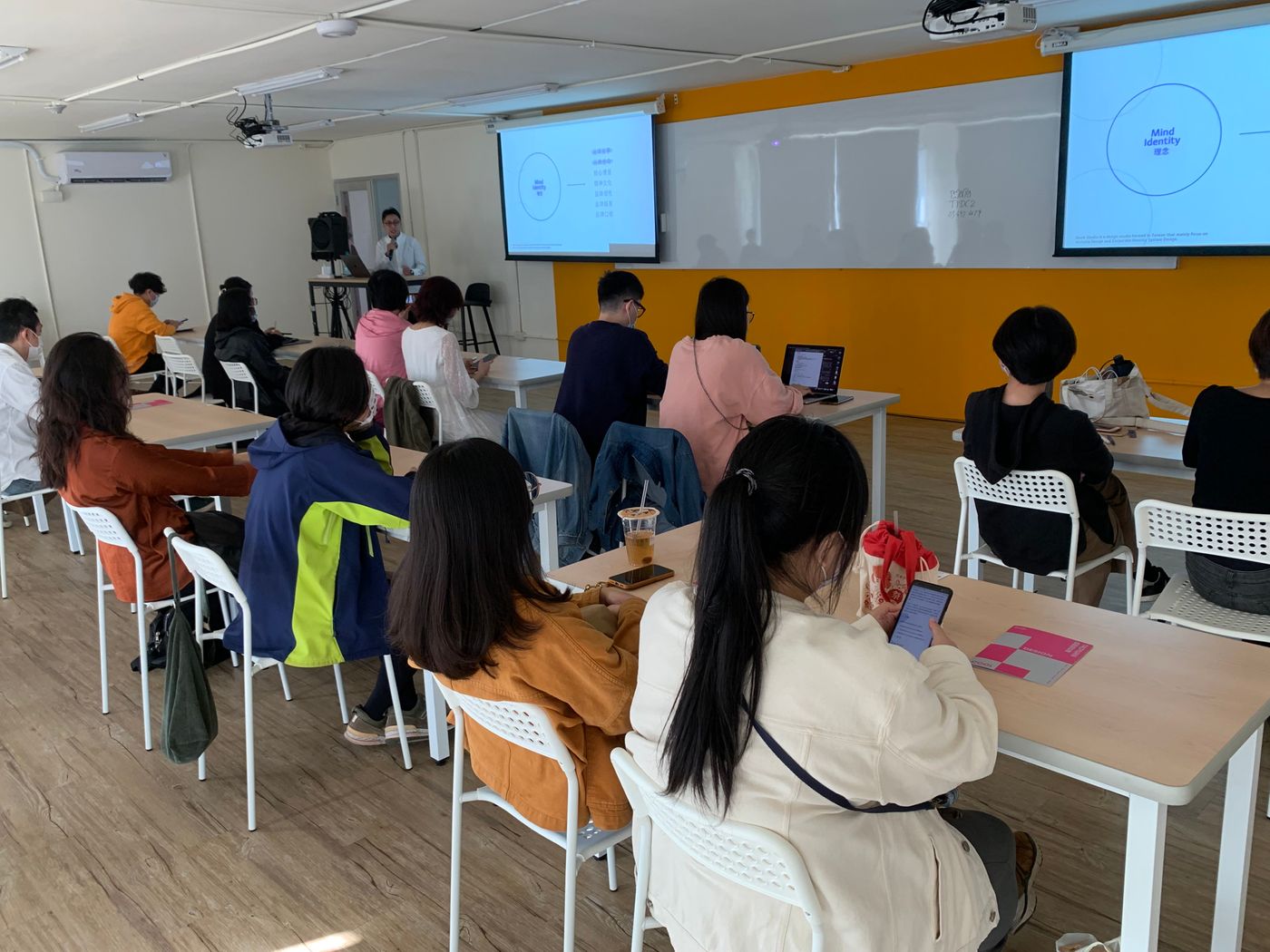
A good website can make an impression on the eyes, and then generate an association with the brand, which may become an important role for potential customers or word of mouth in the future. Before setting up a website and building a digital image, it is very important to "build the DNA of the brand", that is, to implement VI (visual identity system), MI (idea identity system), and BI (behavior identity system). Three foundations. The DNA of many brands is not precise enough because they have not established the identification of the above-mentioned corporate philosophy.
As long as these three items are done well, a stable foundation and shared value will be laid in future proposals or operations. The director also gave a good example: when the company encounters a fork in the road and people don't know how to make a decision, they can use the core value of the brand as the mechanism for discrimination, and the problem is easily solved.
The first step of brand digital image: website construction
Any brand can describe the value or image through the website and make contact with potential customers for the first time, and the advantage of the website is the coexistence of "plane" and "dynamic", interacting with users, and can also increase content and content through embedding and jumping. The breadth and depth of form.
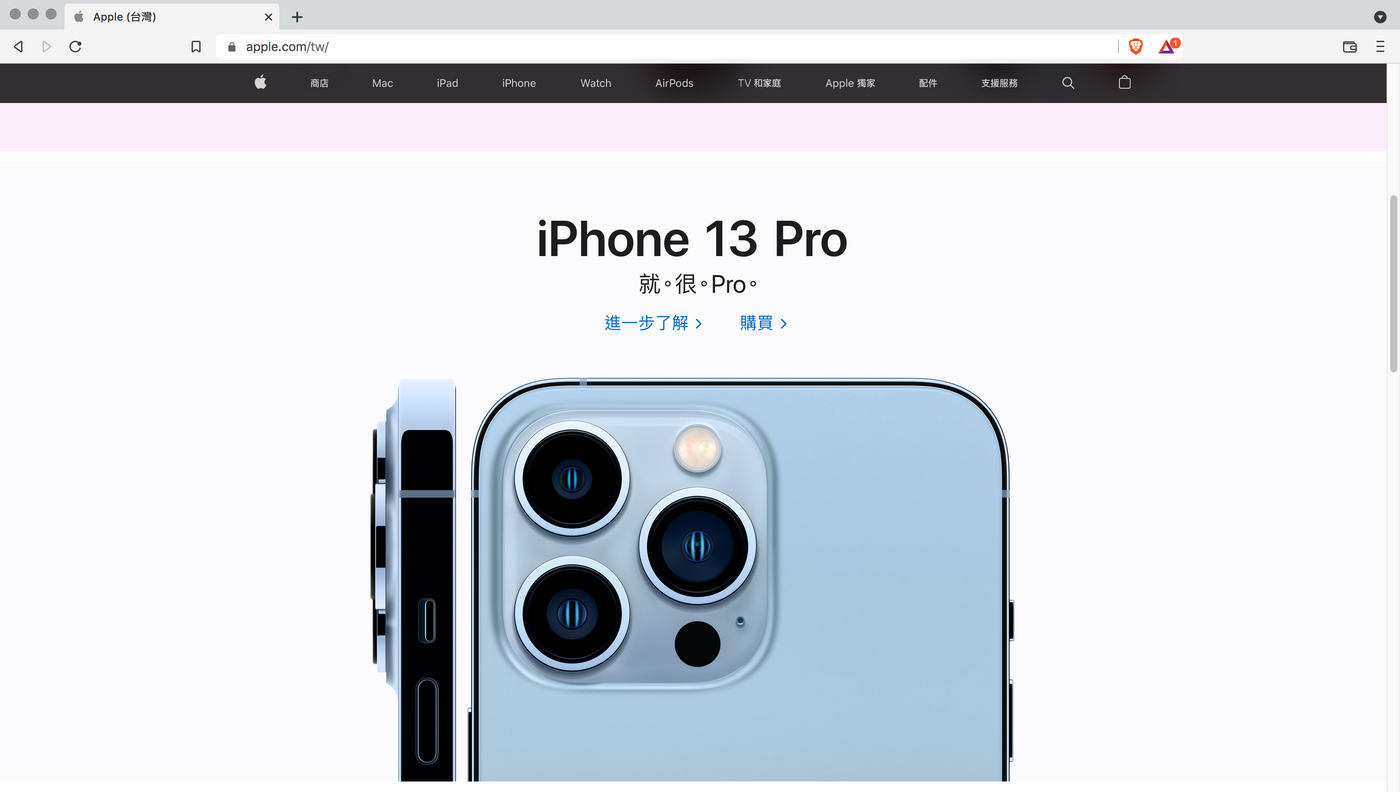
Generally, websites are divided into three types: information type, visual type, and process type. The purpose and characteristics of the three types are different. The choice of type should go back to the brand DNA, rather than simply applying the existing format. Take Apple's "event one-page" official website as an example, as soon as we open the home page, we can quickly understand the product, enter the key points, and be attracted by the exquisite images. With a short introduction text, we can finally guide us to the brand's brand. Purpose: "Place an order to buy a mobile phone".
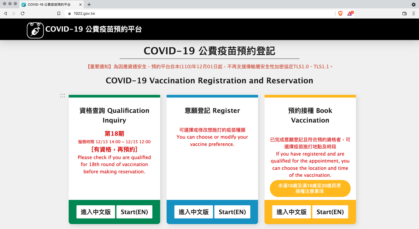
As for shopping websites or COVID-19 public-funded vaccine reservation platforms that are close to our daily needs, they are all official websites of the "system platform" type. The purpose of the platform is purely to ask users to "complete a certain task", so the process is clear, prompt, and user experience is the characteristics of this type of official website. The above two types of official websites are closely aligned with the brand DNA. The director then introduces practical examples of visual official websites.
Visual official website: dynamic is to solve things that plane can't do
There is not only one way to play a website. In fact, as long as it conforms to the brand DNA, it can be converted into an interesting dynamic form and placed on the official website. The standard official website is only a qualified and conservative choice. If dynamic entry, scrolling, cursors and different click appearances are added, it may be possible to more vividly convey the value of the brand and enhance its persuasiveness.
Dynamic special effects not only present angles that planes cannot express, but also enhance a good user experience, and even increase hidden interactions, so that the sense of surprise remains in the user's impression. You can click on the official website of the section design to experience the login page:
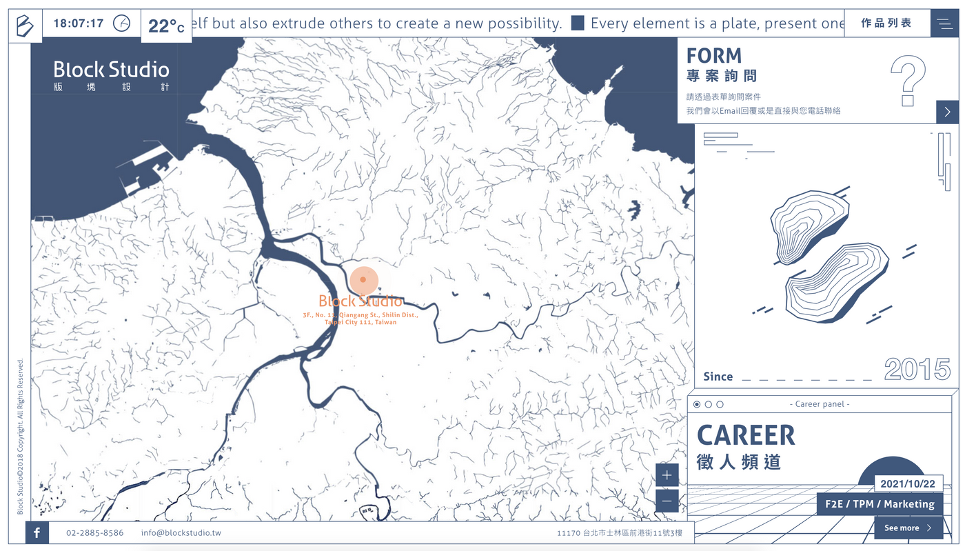
When entering the home page, I believe that you have been attracted by the simple but rich visual lines. Try to see, if the home page is a static flat illustration, our eyeballs may not stay for more time? Whether it's icon drawing, dynamic buffering, easy-to-understand indicators, comfortable color selection, etc., if you just turn on the computer, you can even reach the next page horizontally just by turning the mouse.
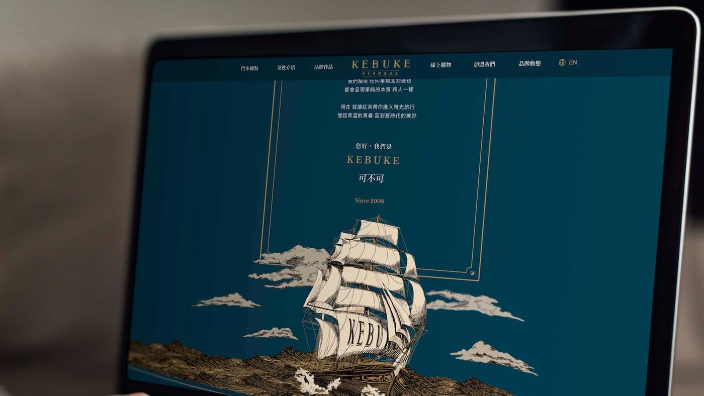
Still unfinished? Let's take a look at the dynamic official website of the work "Can you ripen black tea", which is also a section design:
"Drinking tea is like an adventure. We are with you, so that you can taste the early adopters without stepping on the thunder, and every sip is a good taste." The section design positions the website as an image website type with "brand vision as the mainstay and information transmission as a supplement". Starting out, I summarize keywords such as: all over the world, tea boats, waves, adventure, etc. The depth of the drink and the experience behind it are shown through the water surface, side, and perspective of the hand-cranked drink. Is this case easier to understand? what?
The above two cases are the delicate interaction and experience that cannot be achieved by the layout type or one-page website. The director and the team use well-designed works to tell everyone: a website that conforms to the brand DNA, the influence it brings to consumers is not enough. Underestimate!
Start building a digital journey!
Clarify and establish one's own brand DNA, find a suitable digital facade, build an exclusive digital image from it, and start to leave traces on the digital media online. This is the spirit that Director Li Ming wants to convey in this lecture.
In 2022, the Taoyuan Design Library will have more diverse and in-depth courses with different themes and specialties, and regularly invite seniors with rich design experience to share, making the base the forefront of Taoyuan's design, and continuing to make Taoyuan's design talents more popular. See, you are welcome to pay more attention!
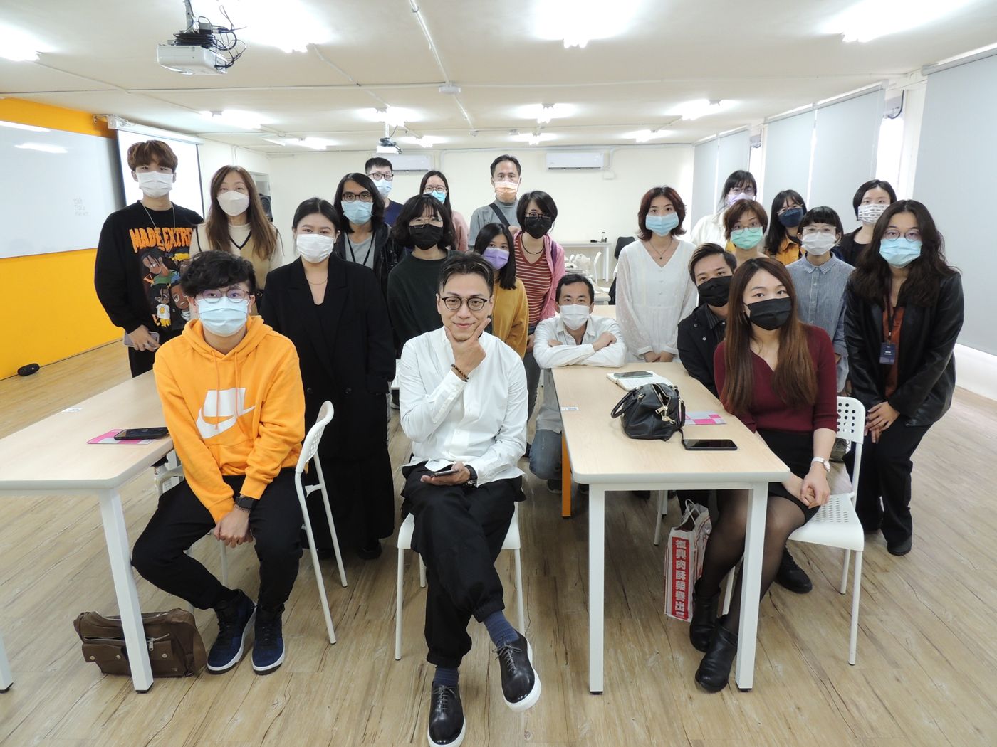

Block Design Founder and Design Director of Block Studio / Li Ming
Li Ming is currently the founder and design director of Block Studio, the co-founder of Liushixuan.
With more than 10 years of experience in the design field, he has profound knowledge and experience in website special effects. He is good at starting from the core value of the brand, assisting "dynamic special effects" as a bonus, and using the website as the main medium, constantly producing works that subvert imagination.
Section Design was founded in 2015, and has won many domestic and foreign awards in just a few years, including iF Design Award, German Design Award, Golden Pin Design Award, CSSDA, Awwwards, etc. The works are available on the official website of Kaohsiung Pop Music Center and the official website of Taipei Pop Music Center. , TDRI digital introduction website, Keqiu mature black tea website, Mei Dengfeng brand identity reconstruction, Golden Melody Award GMA29 event website... etc. The fields include art, music, public issues, finance and information technology and other diversified brands, enterprises, activities and other image website planning.
SyndAvant brings together creative people who are willing to apply their creativity and expertise to transform and advance society. We call them Avantists. This series of interviews will show you how these Avantists manage their professions, use their talents and influence, and then form a positive influence on society.
Editor: Han Yunqing Image courtesy: Block Studio
Event Photography: Huang Zhengwei
Like my work? Don't forget to support and clap, let me know that you are with me on the road of creation. Keep this enthusiasm together!

- Author
- More