Color Practice - Newcomer Punch
First time posting here...!
After setting up a station, although it is very convenient to record mood notes, there will be occasional loneliness...
This is the first time I know matterers, and I feel that it is very suitable for the blog body I like! So I will also post some production notes.
Maybe there will be like-minded friends...! I will also think so in a small way.
This year, I am going to open an original story pit and copy some photos to prepare.
The source of the picture is [Color Squad Leader], which is the mechanism of punching cards every day. K University also opened a human body punching card once before, and I like the atmosphere of netizens punching cards together.
But it's only been 20 days...
Below are pictures and notes.
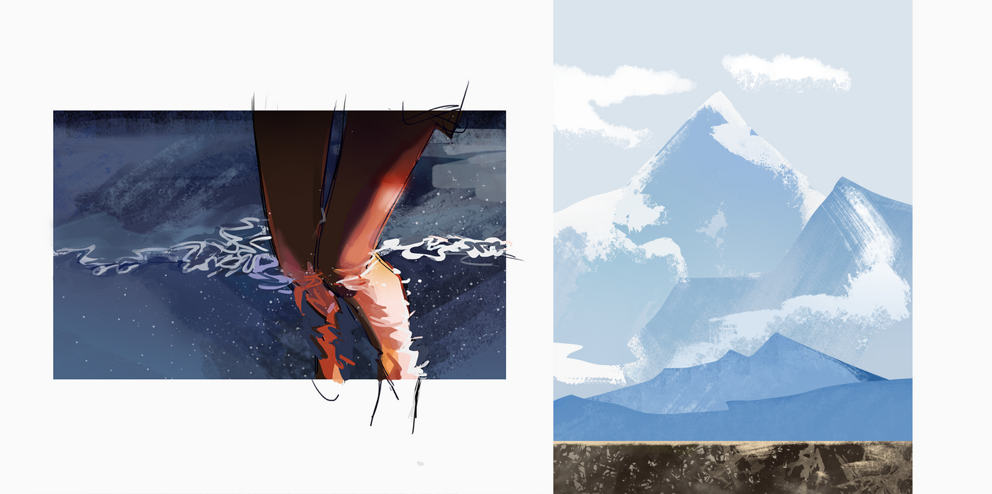
The first and the second.
I thought about the water pattern that I chose by simply practicing my hands.
Although there are not many colors, it is really hard to be seen by the water pattern.
The processing method is to use the custom gradient tool to create a gradient pure background, and then brush a little brush. (The idea is to get the color first and then brush the brush)
The soft light on the thigh is also difficult.
It can be seen that the airbrush is used for the thigh, and the calf is still in the usual color block type summary.
The snow mountain is also the same, I can't find a brush that generates the bump texture on the snow mountain with one click.
Later gave up (…).
The imitation of materials is indeed... time-saving and flavorful, but it is impossible to imitate completely in the first place.
You have to find a balance between generalizing yourself and imitating the material.
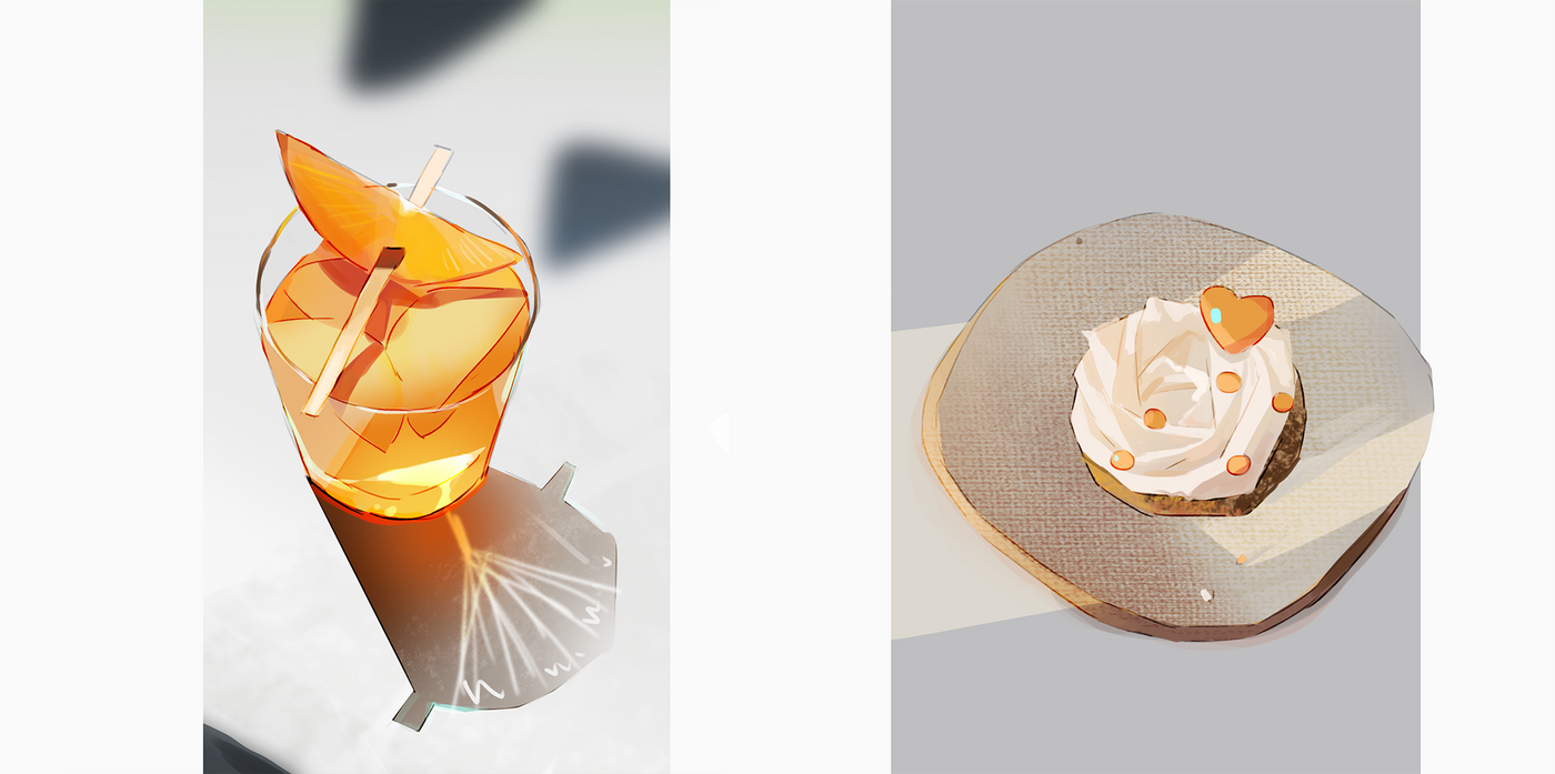
Two of the easier ones.
Although the orange picture has a color cast, but the glowing feeling is very interesting.
The color saturation in the glow is really high.
The original image of the shadow is a bit more transparent.
The color shadow on the stick is also very interesting, the shadow is pure.
The picture of the dessert is bright, and it feels like the dessert is not on the plate.
I like the texture of the canvas on the plate.
Shadows always hide a little bit of color in the grey, a little bit of light, and a little bit of darkness.
(gradient tool is really silent flavoring agent)
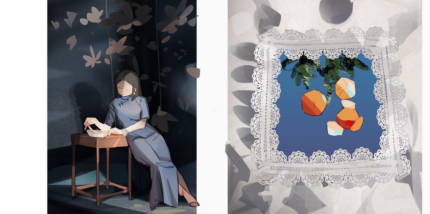
I thought it was easy but very difficult.
It's a soft light that I've never been able to draw.
I have used the method of p photo before: copy the layer, blur it, and stack it back with soft light.
It doesn't work very well in my painting...it will be blurry.
This time I used an airbrush to brush the shadow, and the effect is much better than before. (Although it is still a little fuzzy!)
The background painting material is pure white, so I added red because I didn't want to overlap the color.
The light in the original picture is very beautiful, and it hits the hands of the characters in vain.
The overall light is gray and white, and it also hides a little red (not too red!)
But the color of this cheongsam is too dirty.
Orange, tree and cloth.
Originally, I wanted to find a simple and go to bed early. I chose a simple and clear color.
The pattern is the material of csp. The pattern of the original image is complex enough so that the bright and dark sides cannot be seen. After making a few fake bright and dark sides, the material does not feel like an abrupt texture.
(Use light to distinguish the amount of added information.)
The hard part is the weave.
I adjusted a brush that can be lightly brushed, and this time I mixed it.
Tried the blur, the blur is really blurry, it can't imitate the soft shadow of the cloth.
The original image of oranges is very pure, and adding blue is a habit (actually, the effect is not good).
This time the proportion of trees is very small.
I used the brush to first erase the shape of the tree, and then use the leaf brush to brush some leaves in the locked area.
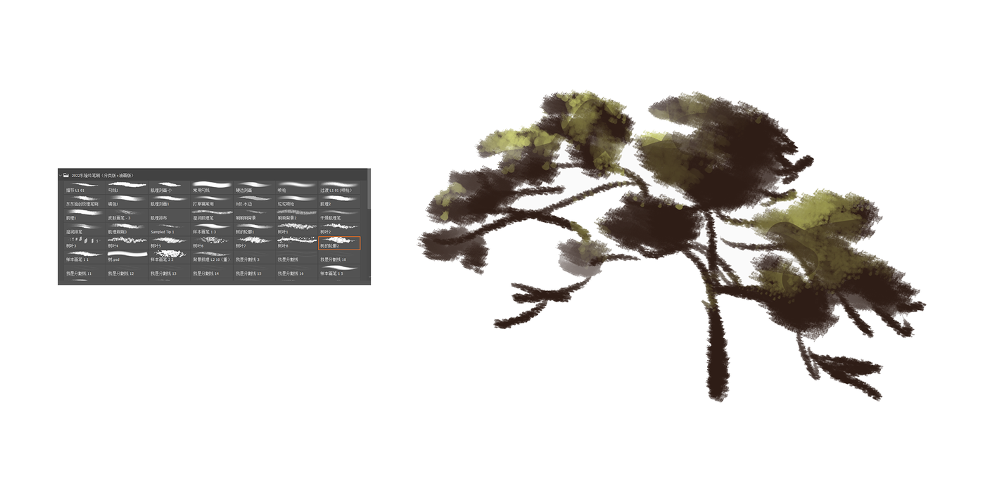

A little water and a little cloud.
The one on the left is a light night.
There are many kinds of clouds! The score is considered! It can't be generalized! <-Sigh after three tries.
The faint cloud is sprayed out by the airbrush, I think that effect is enough. The clear cloud brush is better than the one on the right.
The water lines in the original picture are mixed, and a striped pen is used.
The results found that the stripe pen has a bad compatibility with water, and has a good compatibility with the selected color.
The liner on the right is a little better but too hard.
Malu added a little noise, and then brushed a few more strokes.
I haven't found a suitable brush for brushing on the color of [Already Gradient], the subject is to be studied...
Lazy on the beach, I used a block to mean it.
(Actually, I think it's fine. In some places, the shape can be omitted to save time...)
The water on the right has more waves than on the left.
Although the waves are only a few strokes of white, the effect is very good! It is also a key message to tell "this is the bright side of the waves".
The original image of the character's clothes shadow is a saturated orange (leather), but my personal preference still chooses the relative color (blue), and the orange border line color.
By the way, in this bright sky, the light of the pants is not orange at all, but the gray and white of the original color of the pants. The white shirt is also.
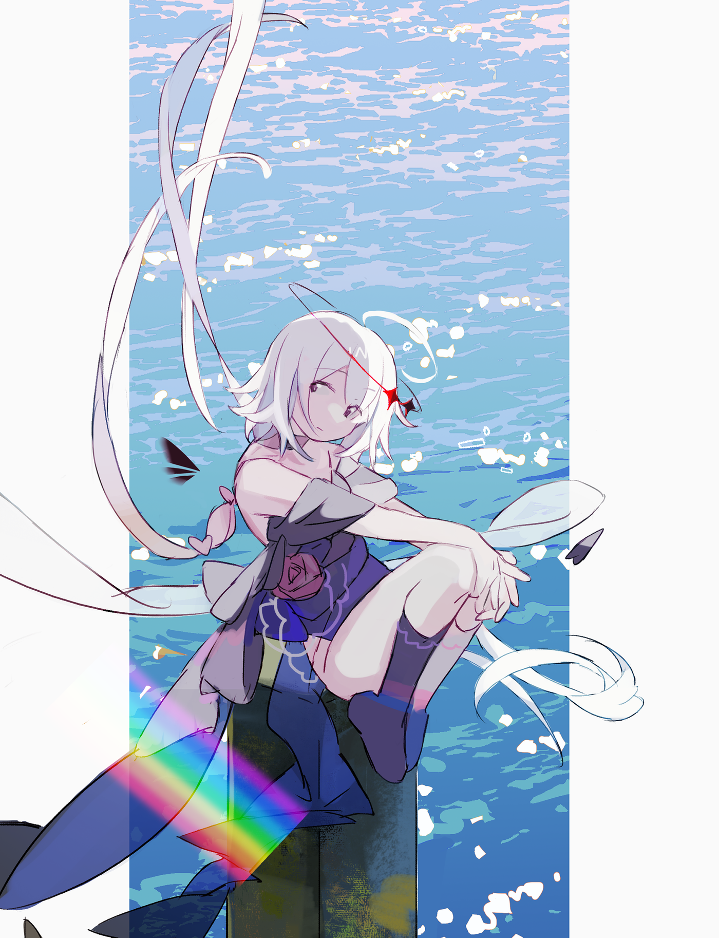
This cutout used ps.
It is to cut out irregular color shapes on the original image, and then select the color to fill.
The water splash is cut out, the new layer is adjusted with gradients, and the strokes are also superimposed.
Just like the previous one, add white spray of suitable shape to make the water look like water.
But I can't find a suitable brush for the shape of this white spray... I don't want to use a round brush, I want to use a polygonal shape, I found the built-in stone brush in csp, and used the stone shape + a little round head Brush connection.
Because it is an OC picture drawn for others, a rainbow is added vulgarly.
By the way, the color of the wooden stake in the original picture is very beautiful. The blue-gray background is added with emerald green, and the feeling of moss is difficult to imitate...
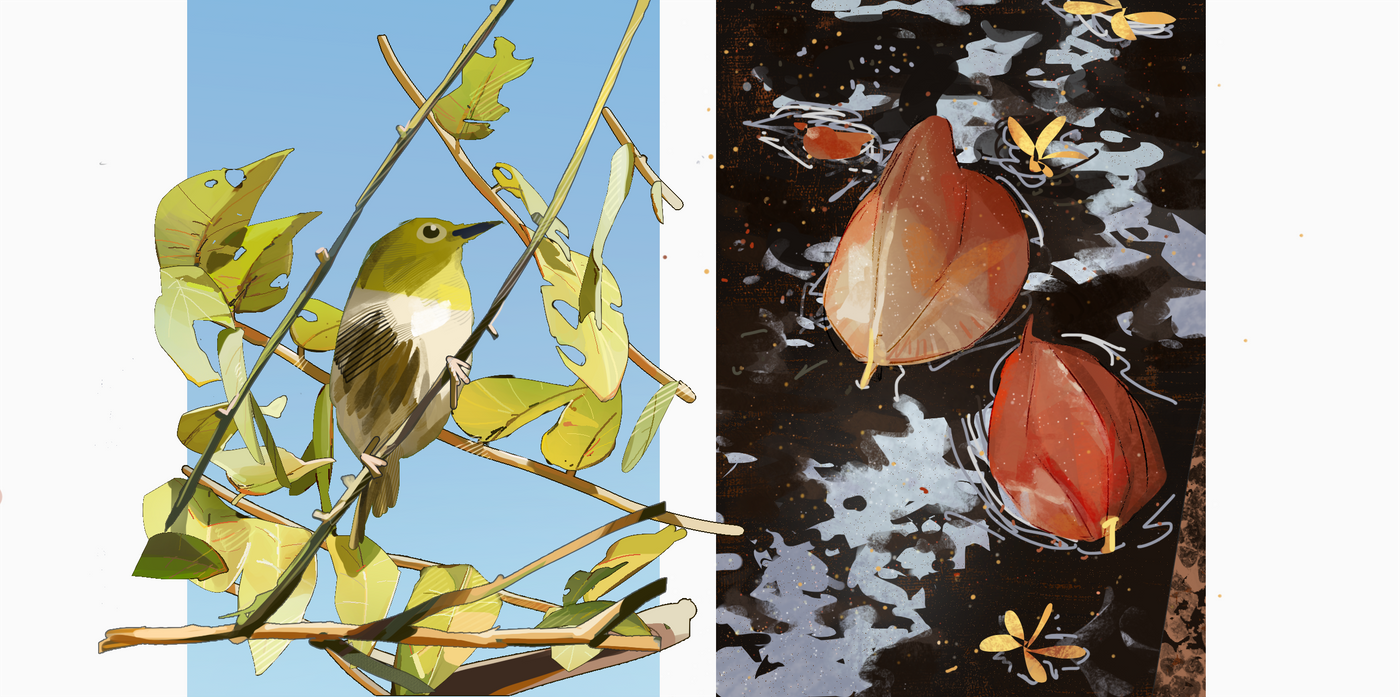
Two pictures that I wanted to paddle and got stuck in the quagmire of photos…
The first one wanted to be lazy from the beginning, so I used the selection stroke.
It turns out that thinning the leaves is also dealing with the structure...!
The advantage of opening the layer stroke is that the leaves of the original image are also bumpy, so a little bit of addition and subtraction is done, and the degree of completion comes out.
The shape of the leaves does not need to be very accurate, and it does not need to be as accurate as a portrait.
Because the brain is too familiar with the shape of the portrait, it can be felt immediately if it is crooked (or not handsome enough), but not the leaf. As long as the leaf can draw the amount of information of "this is a leaf", it will do.
color.
When I copied the color, I found that the color of the original image is quite bright and quite green . Paste it to the far right of my palette and it is bright, I have never used such a saturated grass green...
And I am accustomed to using the saturated bottom and the saturated high, one for the bright side and the other for the dark side, and found that the high saturation of yellow and the high saturation of green, the brightness of the two is different!
This is troublesome!
The wavelengths of yellow and green are very different!
I can't turn the color circle for granted, I have to adjust it slowly...
detail.
Out of the details outside the stroke, I used the pencil function of ps (the function is the same as the binary pen) to draw the texture of the leaves.
It's because the stroke has its own gear shape, and so does the binary pen. The effect is okay, but the ps pencil is too difficult to control. I hope to find a binary pen instead.
What's interesting is that although the two-value pen is very thin and there are not many things to draw, the effect of "painted" and "not drawn" is also much worse.
Including very thin tree trunks, a light and shadow dichotomy was also made.
There is also a lot of difference between not doing a two-pointed trunk and doing it!
The little yellow edge of the leaves, the very thin and thin thickness and the bright surface, are all small but very informative parts...
The bird is the last to draw, and I don't want to detail it at the end, so I used a line.
For the overall feeling, I also added a little line to the leaves.
The leaves have already been buckled, so adding them back will cover up the amount of detail.
It turns out that the line has to be added to the map with a completion degree of about 30%.
The one on the right has a lot less workload (the small broken flowers are not deducted at all).
This challenge is the reflection of trees in the water.
The reflection of the original image is blurry, here I used a brush eraser to blur it slightly.
I used a hard brush to brush some red lines into it, and then clicked on my favorite yellow, red, dark green dots.
I haven't done this operation for many years, and I have forgotten how happy it is.
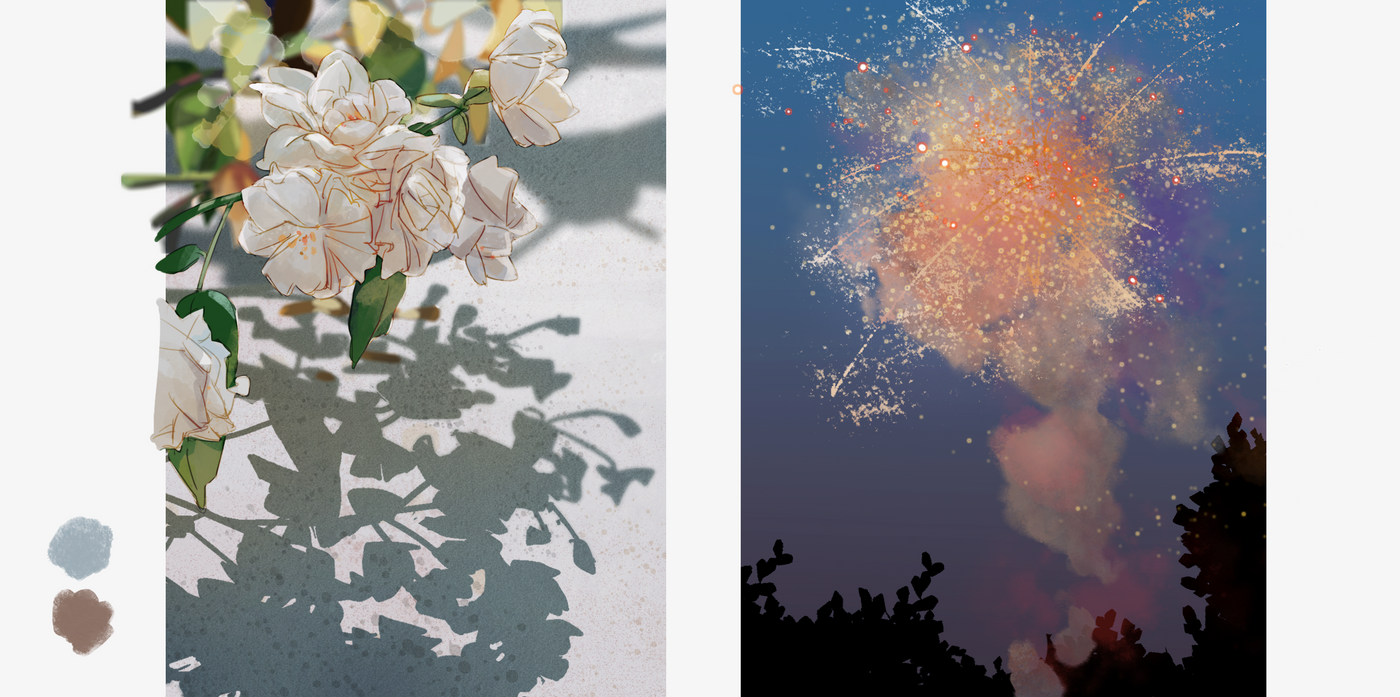
This picture of white flowers is old and tangled.
The first is the line. My line is a layer of overlay and a layer of normal stacked under the overlay.
The line will follow the color of the edge to make a gradient, it will not be too monotonous.
But this works well on a monochrome background, but on a complex background...not so good.
The flowers in the original picture are very fresh and elegant.
But my thread (and the yellow behind it) lost its subtle flavor. I added a little white highlight afterwards to save it.
This time, the first layer of the line is the vivid light, and the other layer is the overlay.
The punching itself took a long time...
Then there is the color.
Because of the light transmission, the center of the flower will be a little orange-yellow, and the edge of the petals will be a little blue.
The white color again makes the deviation difficult to control.
A layer of blurred flowers and plants for the background.
It is found that the details of the painting are blurred and the original is very grassy and blurred... quite different!!
Blur itself is subtraction.
Because there is no time-saving to depict the flowers and plants in the background, I used a stroke brush to brush a few white points and stack them up to gather some information.
shadow.
The shadow original image also has blurred distances and very detailed nears.
In order to make up the amount of information, I used blind contour that I haven't used for a few years.
The blind contour type is not allowed, but it is enough as a shadow!
Finally, there are mottled marks on the road.
If you don't copy it and you haven't found it yet, add a layer of pattern to the road, brush a little brown, and finally add a lot of noise.
The coloring I am used to is the gradient tool to make over-color, but this alone will be oily.
After adding these, it will not be oily (because the amount of information has gone up).
The fireworks picture draws the scatter like an overturned millet (laughs).
The pink and purple filters are added by myself, not in the original image.
Because I still can't imitate smoke, and I can't draw beautiful fireworks.
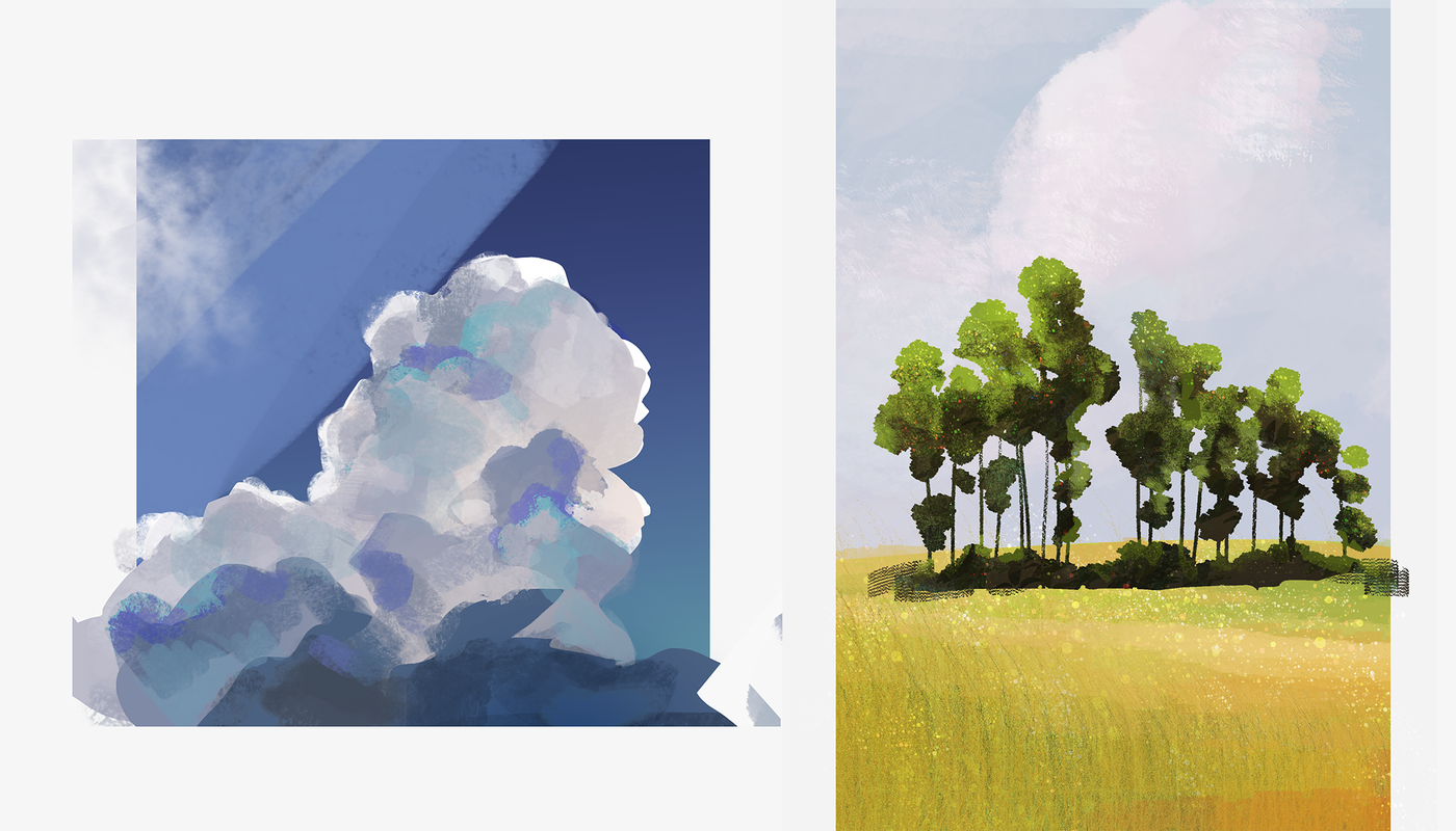
here it is, cloud.
Originally there were two clouds, but the second one is really ugly. Before repainting, I chose a simple paste progress.
At first, I was not comfortable with the brush, but because I couldn't grasp the delicate gray and white changes, it was a basic skill problem.
The cloud in the first picture couldn't help but add a little blue...
The second picture is actually the color of the leaves is not realistic, just sprinkled with dots, and the cute (...) pasted.
I also used a little brush to paste the grass, and the degree of completion is not high.
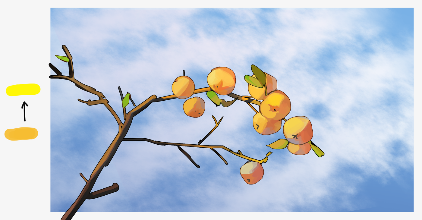
Who would have thought that this thin cloud was all tricked out by the csp galaxy brush.
This unexpected find is a highlight on orange.
It was also mentioned last time when I put green and yellow:
"Yellow and green have very different wavelengths."
Same with orange, yellow is very dazzling and bright.
Orange has been adjusted to the highest saturation point. If you want to make it brighter, you can go to lemon yellow to brighten it up.
I used to go to white, or go to blue, which is a contrasting color, and it will turn gray and not brighten up.
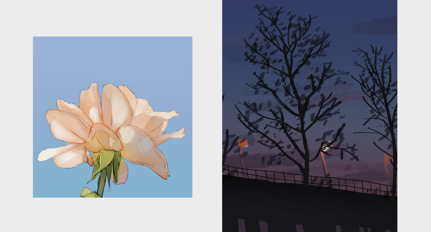
Gradually understand plants…
The first one is for punching, the second one is for touching.
In this flower, the method of drawing thin lines can be retained. It is especially used in the foreground, where there is a subject.
This piece of light is difficult to grasp, use the spray gun to paste the bright surface, be careful that the spray gun will paste too much.
Although this tree is simple, I really like it.
The orange of the light in the original image does not dye so many street lights, and the white is more obvious.
But I think abstract things, the meaning of the shape can be conveyed on the line.
The tree is also, slowly cut out the shape, add some leaves and it's ok.
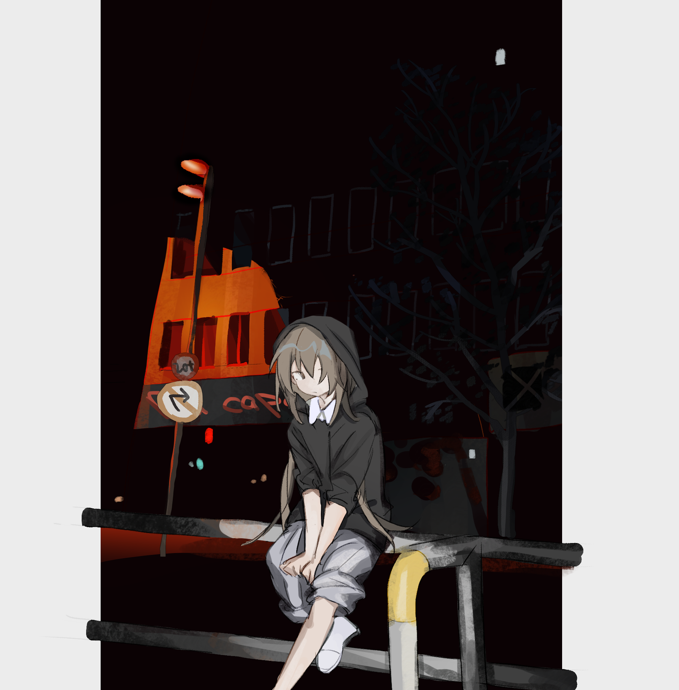
The last one took my own oc! Come to an end for the time being, and have a chance to continue!
Because I don't draw for the sake of being good at drawing... I only draw when I want to draw my own things.
So if you only practice in one breath, you will feel lonely...
Like my work? Don't forget to support and clap, let me know that you are with me on the road of creation. Keep this enthusiasm together!
