The exhibition experience is very different — Taipei Design City Fair APP
Harmony in Taipei - 2018 Taipei Design City Exhibition
Android: https://pse.is/taipeidesigncity2018Android
iOS: https://pse.is/taipeidesigncity2018IOS
Software system development consultant: https://consult.revtel.tech/
With the development of science and technology, the richness of modern exhibitions has also increased. If the information technology that can be seen everywhere can be properly integrated, the entire exhibition experience can be extended in a wider and deeper way.
For an exhibition with multiple types of exhibits, how can we use the APP to provide more exhibit information?
In addition, if you are interested in our past development experience, you are also welcome to visit "Case Sharing" .
origin
The "Taipei Design City Exhibition" is regularly organized by the Cultural Affairs Bureau of the Taipei City Government. From 09/26 to 10/21, 2018, it will be held at the No. 4 and No. 5 warehouses in Songshan Cultural and Creative Park. Taking communion as the main axis, I try to present "Taipei" - a city populated by citizens of different ages, occupations and genders, how people interact in a friendly and cordial manner.
The organizer specially designed five themes of "Together", "Senior", "Games", "Green Living" and "Street Building", allowing the audience to experience, stimulate creative thinking, and understand the inclusive value of urban living.
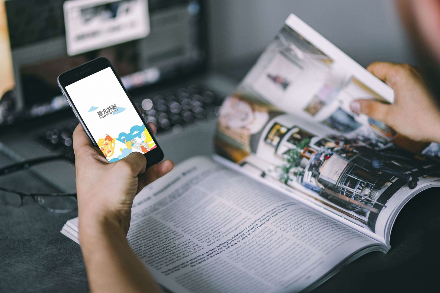
challenge
This is an exhibition that focuses on being close to the public, so the design of the APP should bring out a sense of liveliness, and the overall UI/UX design should have a certain liveliness and intimacy.
Considering that exhibitions tend to have relatively concentrated visitors on weekends and holidays, there will be obvious differences in peak and low peak visits for the backend. In addition, the exhibition venue is basically a metal warehouse, and the mobile phone signal may not be good in certain fixed areas.
Finally, we have to think about users who are unwilling to install APPs, and they should also be able to obtain exhibit information.
solution
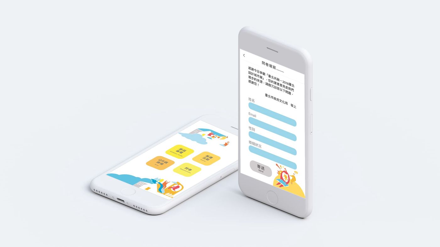
In response to the theme of "Communication" of this Taipei Urban Design Exhibition, we used clean and bright white as the base for UI/UX, and matched with warm colors such as orange, light yellow, butter yellow, sky blue, lake blue, and light gray to draw "interpersonal". "Interactive" vignette, so that the navigation app synchronously echoes the theme of the exhibition.
After entering the homepage of the app, you can directly see the four main buttons of "Exhibition Area Tour", "Promotional Activities", "QR Code Scanning" and "Questionnaire". The simple and clear design avoids dazzling design, allowing users to get started quickly.
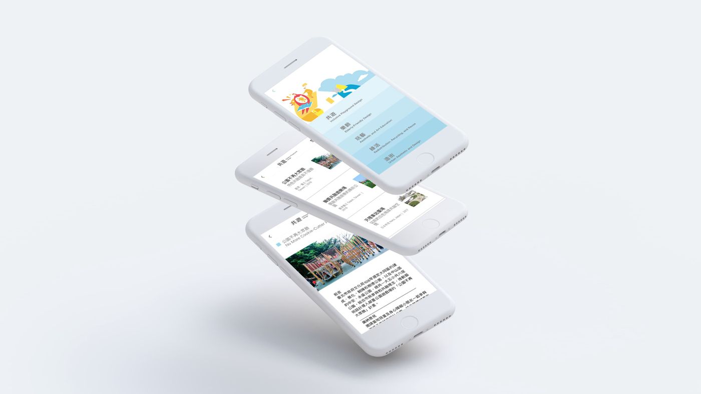
In order to highlight the value of the exhibits, each exhibit in the "Exhibition Guide" has its own independent page, and the organizer can personally put the title, high-quality pictures and descriptions in Chinese and English of each exhibit on the shelf.
In order to pay attention to the number of users in the exhibition hall on weekdays and holidays, try to import CDN and other technologies to save users' waiting time for downloading high-quality pictures. "Promotional Activities" adopts a list-style collapsing design, listing the topics of lectures and workshops, holding time, and speaker information. The organizer can list the latest event introductions at any time.
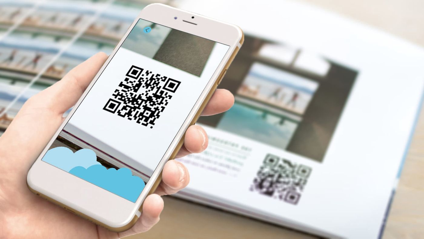
In order to enhance the interaction between the exhibition and the visitors, the organizer can paste QR codes in each exhibition area. If the app is not opened, you can use a general QR code scanner to connect to our exclusive guide website!
Scan the QR code in the app to quickly search for the exclusive introduction of the five themed exhibits of "Inclusion". We also added a like function to each exhibit page, allowing users to like the exhibits they like!
The "questionnaire" provides a communication channel, and the on-site staff can encourage the public to fill out on the spot, so that the organizer can receive the first-hand information feedback from the audience.
At the same time, in response to emergencies such as weak signal, interruption of network connection, and temporary lack of network connection in the exhibition hall, we specially provide an offline version of the App to automatically connect when the situation occurs, allowing users to browse the exhibit information smoothly. Not affected.

Epilogue
There are still many functions that can be added. For example, QR code is based on optical form, and the effect will be related to the distance between the user and the exhibits and the local lighting conditions. If sensing devices such as iBeacon are imported, it should be able to provide a more seamless information experience.
Do you have more different ideas? Welcome to contact us!
RevtelTech Xinlv Technology https://www.revtel.tech/
email: contact@revteltech.com
facebook: https://www.facebook.com/RevtelTech/
Like my work? Don't forget to support and clap, let me know that you are with me on the road of creation. Keep this enthusiasm together!
