Python Reading Club - Public course reading club notes - Python data visualization - Basic usage of Matplotlib - Setting coordinate axes
Hello, everyone!! Since I have recently been appointed as a lecturer to hold a reading club, and this reading club is based on Mo Fan’s Python open course, everyone hopes that I can take them to see Mo Fan’s Python related series of courses. Therefore, this book club series is mainly based on Mo Fan’s Python public series course explanations and notes. Of course, I will also find additional information and supplement it for everyone. Also, because it is based on the notes of the public course, I will clearly record the source. If there is any violation Author's rights, please let me know, I will delete this series of articles as soon as possible. Thank you all, and of course, special thanks to Mo Fan for such a powerful public course on Python, so that everyone can have a painless first exploration into the magical world of Python!!
I started the Mo Fan Python reading club with other excellent lecturers, so I won’t have notes for every chapter XD!!

1. Basic usage
Source of public course content: https://www.youtube.com/watch?v=4Y7f0znUT6E&list=PLXO45tsB95cKiBRXYqNNCw8AUo6tYen3l&index=3
draw a line
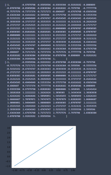
#### Import package import matplotlib.pyplot as plt import numpy as np ## Construct data## From -1 to 1, take 50 points, and the cutting points will be equally divided x = np.linspace(-1, 1, 100) print(x) y=2*x+1 print(y) ##Visualization## Draw the first line plt.plot(x, y) ## Display image plt.show()
Results of the
Draw two lines in the same picture
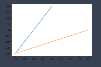
 ## Construct data## From -1 to 1, take 50 points, and the cutting points will be equally divided x = np.linspace(-1, 1, 100)
y=2*x+1
##Visualization## Draw the first line plt.plot(x, y)
## Draw the second line plt.plot(y, x)
## Display image plt.show()
Results of the
Draw a line between two pictures
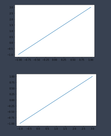
 ## Construct data## From -1 to 1, take 50 points, and the cutting points will be equally divided x = np.linspace(-1, 1, 100)
y=2*x+1
##Visualization## Draw the first line plt.figure()
plt.plot(x, y)
## Draw the second line plt.figure()
plt.plot(y, x)
## Display image plt.show()
Results of the
draw a curve
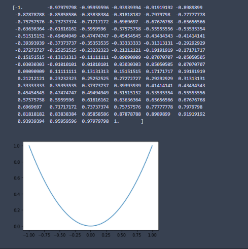
#### Import package import matplotlib.pyplot as plt import numpy as np ## Construct data## From -1 to 1, take 50 points, and the cutting points will be equally divided x = np.linspace(-1, 1, 100) print(x) y=x**2 ##Visualization## Draw the first line plt.plot(x, y) ## Display image plt.show()
Results of the
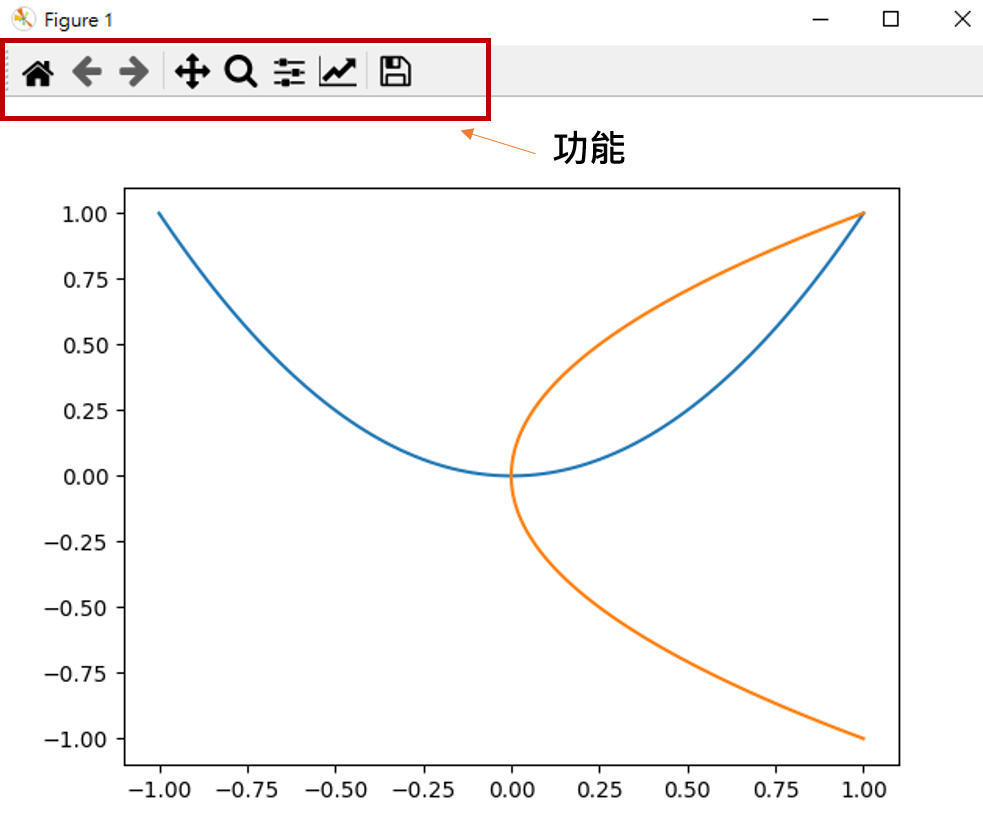
Using the Python compiler, you can directly provide you with some functions to manipulate images.
Function
You can see that there are various function keys above the picture to help us operate the picture, such as zooming the picture, adjusting the picture size, adjusting the x-axis and y-axis size range, archiving, etc.
 >>> import matplotlib.pyplot as plt
>>> import numpy as np
>>> x = np.linspace(-1, 1, 100)
>>> y = x ** 2
>>> plt.plot(x, y)
[<matplotlib.lines.Line2D object at 0x00000255D897FE88>]
>>> plt.plot(y, x)
[<matplotlib.lines.Line2D object at 0x00000255D8999288>]
>>> plt.show()
Results of the
2. Use Figure to draw different pictures
Public course content source: https://www.youtube.com/watch?v=5IuawGiZ7_0&list=PLXO45tsB95cKiBRXYqNNCw8AUo6tYen3l&index=4
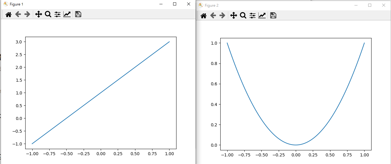
In order to help you see the difference, we use the Python compiler to execute it.
Draw two different pictures
 >>> import matplotlib.pyplot as plt
>>> import numpy as np
>>> x = np.linspace(-1, 1, 100)
>>> y1 = 2 * x + 1
>>> y2 = x ** 2
>>> plt.figure()
<Figure size 640x480 with 0 Axes>
>>> plt.plot(x, y1)
[<matplotlib.lines.Line2D object at 0x000001B13E843448>]
>>> plt.figure()
<Figure size 640x480 with 0 Axes>
>>> plt.plot(x, y2)
[<matplotlib.lines.Line2D object at 0x000001B140DA4848>]
>>> plt.show()
Results of the
Define the name of the image
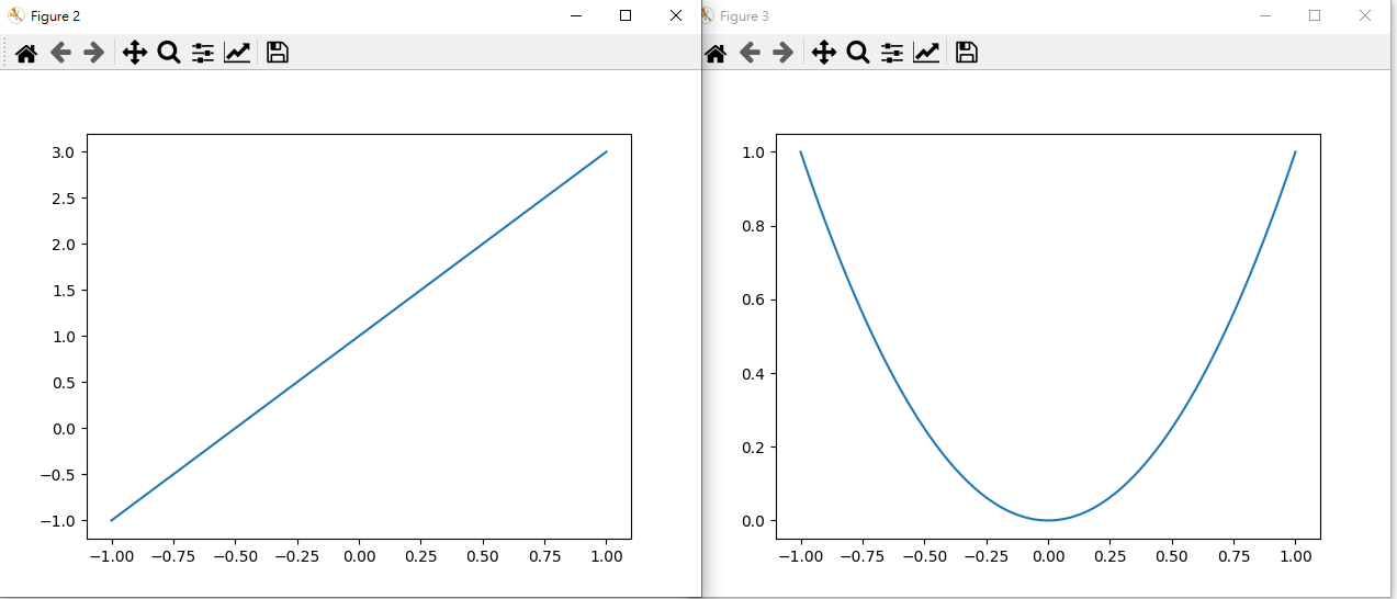
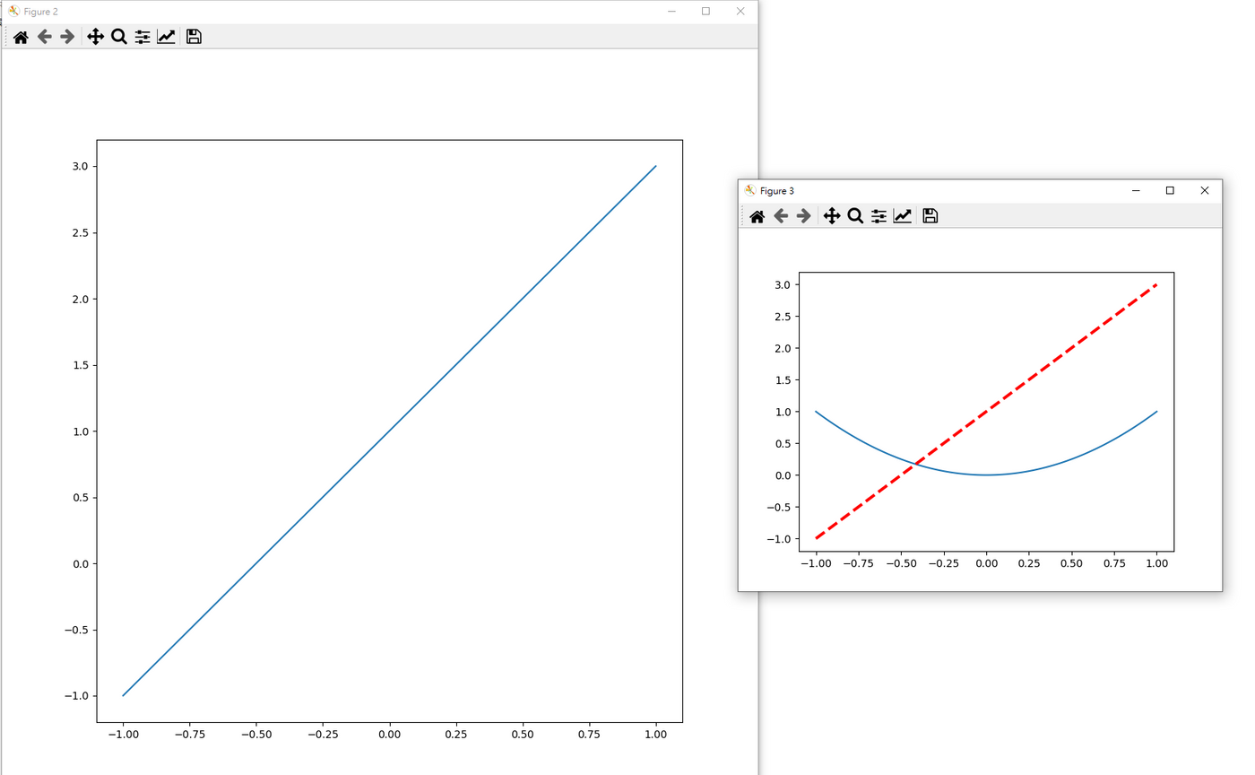
Execution results: It can be seen that the numbers behind the Figure above have changed and become the 2 and 3 we specified.
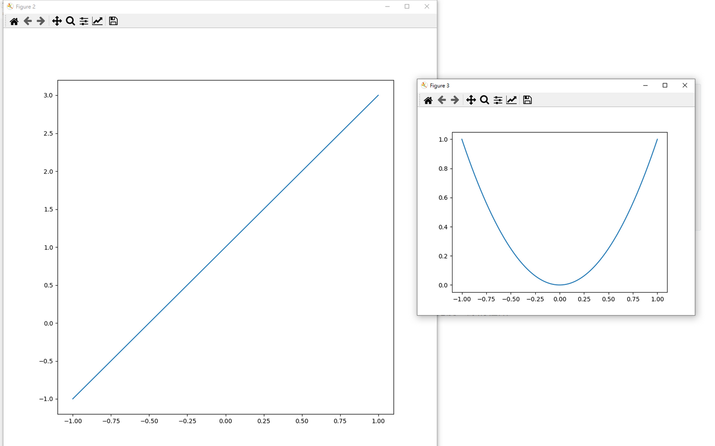
Define the size of different images
 >>> import matplotlib.pyplot as plt
>>> import numpy as np
>>> x = np.linspace(-1, 1, 100)
>>> y1 = 2 * x + 1
>>> y2 = x ** 2
>>> plt.figure(num = 2, figsize = (10, 10))
<Figure size 1000x1000 with 0 Axes>
>>> plt.plot(x, y1)
[<matplotlib.lines.Line2D object at 0x000002D06984A348>]
>>> plt.figure(num = 3)
<Figure size 640x480 with 0 Axes>
>>> plt.plot(x, y2)
[<matplotlib.lines.Line2D object at 0x000002D069F2C348>]
>>> plt.show()
Results of the
Draw two lines in one of the pictures and adjust their color, line width, and line type
Supplement: Types of lines https://matplotlib.org/stable/gallery/lines_bars_and_markers/linestyles.html
 >>> import matplotlib.pyplot as plt
>>> import numpy as np
>>> x = np.linspace(-1, 1, 100)
>>> y1 = 2 * x + 1
>>> y2 = x ** 2
>>> plt.figure(num = 2, figsize = (10, 10))
<Figure size 1000x1000 with 0 Axes>
>>> plt.plot(x, y1)
[<matplotlib.lines.Line2D object at 0x0000019653BF7888>]
>>> plt.figure(num = 3)
<Figure size 640x480 with 0 Axes>
>>> plt.plot(x, y2)
[<matplotlib.lines.Line2D object at 0x00000196542DB588>]
>>> plt.plot(x, y1, color = 'red', linewidth = 2.8, linestyle = '--')
[<matplotlib.lines.Line2D object at 0x00000196542F7F88>]
>>> plt.show()
Results of the
3. Set coordinate axes
Source of public course content: https://www.youtube.com/watch?v=46EsDY8V6lQ&list=PLXO45tsB95cKiBRXYqNNCw8AUo6tYen3l&index=5
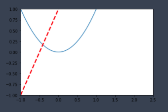
Limit the range of the x-axis and y-axis
## Construct data## From -1 to 1, take 50 points, and the cutting points will be equally divided x = np.linspace(-1, 1, 100) y1 = 2 * x + 1 y2 = x**2 ## Visualization plt.figure() plt.plot(x, y2) ## Types of lines: https://matplotlib.org/stable/gallery/lines_bars_and_markers/linestyles.html plt.plot(x, y1, color = 'red', linewidth = 2.8, linestyle = '--') ## Set the range space of x-axis and y-axis plt.xlim((-1, 2.5)) plt.ylim((-1, 1)) ## Display image plt.show()
Results of the
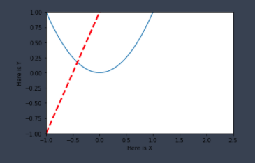
Set x-axis and y-axis label names
## Construct data## From -1 to 1, take 50 points, and the cutting points will be equally divided x = np.linspace(-1, 1, 100)
y1 = 2 * x + 1
y2 = x**2
## Visualization plt.figure()
plt.plot(x, y2)
## Types of lines: https://matplotlib.org/stable/gallery/lines_bars_and_markers/linestyles.html
plt.plot(x, y1, color = 'red', linewidth = 2.8, linestyle = '--')
## Set the range space of x-axis and y-axis plt.xlim((-1, 2.5))
plt.ylim((-1, 1))
## Set the x-axis and y-axis label names plt.xlabel('Here is X')
plt.ylabel('Here is Y')
## Display image plt.show()
Results of the
Change the number and name of ticks
## Construct data## From -1 to 1, take 50 points, and the cutting points will be equally divided x = np.linspace(-1, 1, 100)
y1 = 2 * x + 1
y2 = x**2
## Visualization plt.figure()
plt.plot(x, y2)
plt.plot(x, y1, color = 'red', linewidth = 2.8, linestyle = '--')
## Set the range space of x-axis and y-axis plt.xlim((-1, 2.5))
plt.ylim((-1, 1))
## Set the x-axis and y-axis label names plt.xlabel('Here is X')
plt.ylabel('Here is Y')
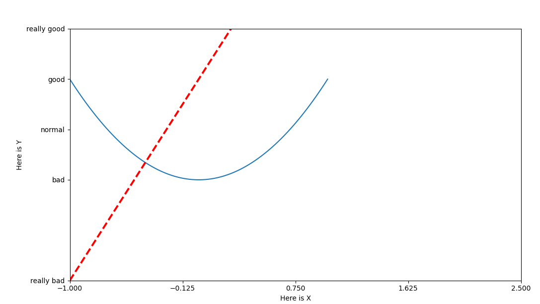
## Change the x-axis scale new_xticks = np.linspace(-1, 2.5, 5)
print(new_xticks)
plt.xticks(new_xticks)
## Change the y-axis scale plt.yticks([-1, 0, 0.5, 1, 1.5],
['really bad', 'bad', 'normal', 'good', 'really good'])
## Display image plt.show()
Results of the
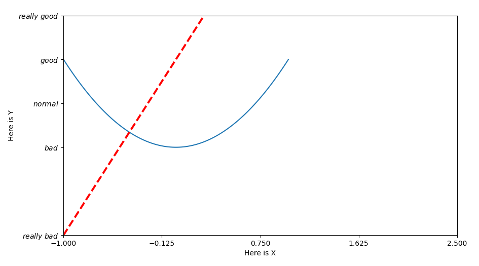
Make fonts look good
## Construct data## From -1 to 1, take 50 points, and the cutting points will be equally divided x = np.linspace(-1, 1, 100)
y1 = 2 * x + 1
y2 = x**2
## Visualization plt.figure()
plt.plot(x, y2)
plt.plot(x, y1, color = 'red', linewidth = 2.8, linestyle = '--')
## Set the range space of x-axis and y-axis plt.xlim((-1, 2.5))
plt.ylim((-1, 1))
## Set the x-axis and y-axis label names plt.xlabel('Here is X')
plt.ylabel('Here is Y')
## Change the x-axis scale new_xticks = np.linspace(-1, 2.5, 5)
plt.xticks(new_xticks)
## Change the y-axis scale plt.yticks([-1, 0, 0.5, 1, 1.5],
[r'$really\ bad$', r'$bad$', r'$normal$', r'$good$', r'$really\ good$'])
## Display image plt.show()
Results of the
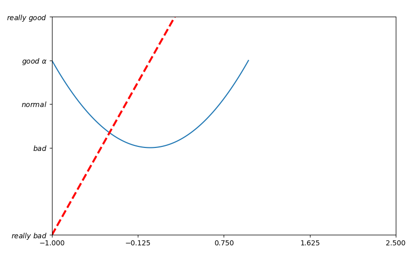
Bring special symbols into tag names
Put mathematical form of Alpha into tick label name
## Construct data## From -1 to 1, take 50 points, and the cutting points will be equally divided x = np.linspace(-1, 1, 100)
y1 = 2 * x + 1
y2 = x**2
## Visualization plt.figure()
plt.plot(x, y2)
plt.plot(x, y1, color = 'red', linewidth = 2.8, linestyle = '--')
## Set the range space of x-axis and y-axis plt.xlim((-1, 2.5))
plt.ylim((-1, 1))
## Set the x-axis and y-axis label names plt.xlabel('Here is X')
plt.ylabel('Here is Y')
## Change the x-axis scale new_xticks = np.linspace(-1, 2.5, 5)
plt.xticks(new_xticks)
## Change the y-axis scale plt.yticks([-1, 0, 0.5, 1, 1.5],
[r'$really\ bad$', r'$bad$', r'$normal$', r'$good\ \alpha$', r'$really\ good$'])
## Display image plt.show()
Results of the
Public course content source: https://www.youtube.com/watch?v=w83mFG5tyW4&list=PLXO45tsB95cKiBRXYqNNCw8AUo6tYen3l&index=6
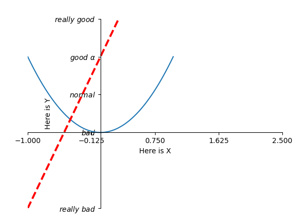
Modify the position of the coordinate axis
Use gca - get current axis
## Construct data## From -1 to 1, take 50 points, and the cutting points will be equally divided x = np.linspace(-1, 1, 100)
y1 = 2 * x + 1
y2 = x**2
## Visualization plt.figure()
plt.plot(x, y2)
plt.plot(x, y1, color = 'red', linewidth = 2.8, linestyle = '--')
## Set the range space of x-axis and y-axis plt.xlim((-1, 2.5))
plt.ylim((-1, 1))
## Set the x-axis and y-axis label names plt.xlabel('Here is X')
plt.ylabel('Here is Y')
## Change the x-axis scale new_xticks = np.linspace(-1, 2.5, 5)
plt.xticks(new_xticks)
## Change the y-axis scale plt.yticks([-1, 0, 0.5, 1, 1.5],
[r'$really\ bad$', r'$bad$', r'$normal$', r'$good\ \alpha$', r'$really\ good$'])
## Modify the coordinate axis position ax = plt.gca()
## Specify the spine - the four borders of the original axis ## Set the right and upper axes to not display ax.spines['right'].set_color('none')
ax.spines['top'].set_color('none')
## Replace the x coordinate axis with the following axis ax.xaxis.set_ticks_position('bottom')
## Replace the y coordinate axis with the left axis ax.yaxis.set_ticks_position('left')
## Move the x-axis and y-axis positions ## Set the horizontal coordinate position to the 0 value position of the vertical coordinate y ax.spines['bottom'].set_position(('data', 0))
## In addition to data, you can also set axes or outward to move the coordinate axis ## axes will be moved in percentage, such as the distance to be moved is the percentage of the y-axis position ## Set the position of the vertical coordinate It will be at the 0 value position of the abscissa y ax.spines['left'].set_position(('data', 0))
## Display image plt.show()
Results of the
Reference
https://www.youtube.com/watch?v=4Y7f0znUT6E&list=PLXO45tsB95cKiBRXYqNNCw8AUo6tYen3l&index=3
https://www.youtube.com/watch?v=5IuawGiZ7_0&list=PLXO45tsB95cKiBRXYqNNCw8AUo6tYen3l&index=4
https://matplotlib.org/stable/gallery/lines_bars_and_markers/linestyles.html
Like my work? Don't forget to support and clap, let me know that you are with me on the road of creation. Keep this enthusiasm together!

- Author
- More