The use of Monospaced Numbers in the interface
This article was first published on Medium on December 25, 2020. View the original text
In chapter 3.2 of the previous article , it was mentioned that the AntD component will use a constant width number globally by default. This is a relatively new concept to me, so I also spent some time observing and summarizing several usage scenarios of constant-width numbers on the interface, as well as the common implementation methods, which can also be recorded as articles.
1. Concept introduction
Two concepts are introduced here, the common proportional font (Proportional Font) , and the monospaced font (Monospaced Font) introduced in this article.
1.1 Proportional Font
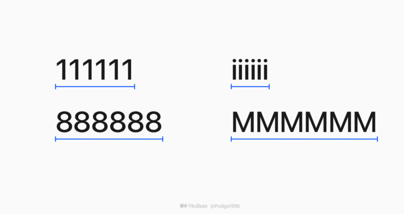
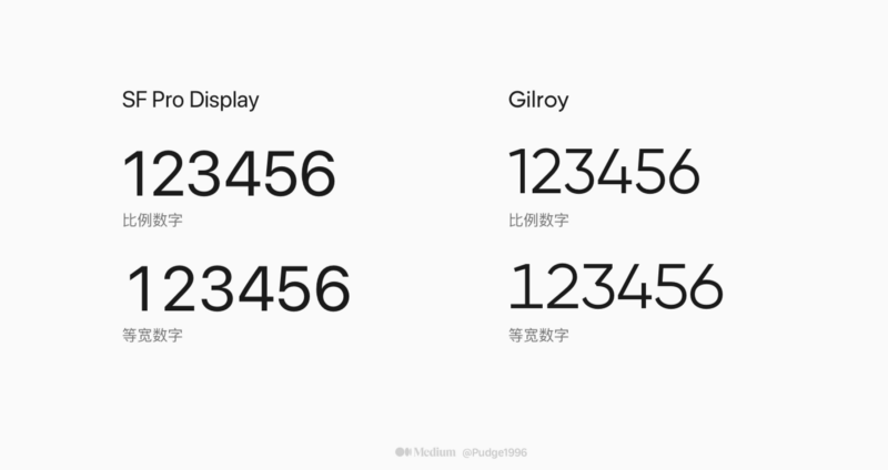
In some fonts, from 0 to 9, from A to Z, the width occupied by each number will be different. For example, I published this article last year. The default font SF Pro Display of Apple system is used by default. It is a proportional font (Proportional Font) , that is, the width of each character is different, and it will be affected by the corresponding character shape.
For example, the word "1" is structurally narrower than the fuller fonts such as "8" and "0", so when it is finally displayed on the interface, the width of the word "1" will be less than that of the word "8". Similarly, the width of the word "i" is less than that of the word "M". as the picture shows:
1.2 Monospaced Font
As the name implies, each character occupies the same width. As can be seen from the figure below, the monospaced font will add some serifs to the originally narrower font to balance and expand the container.
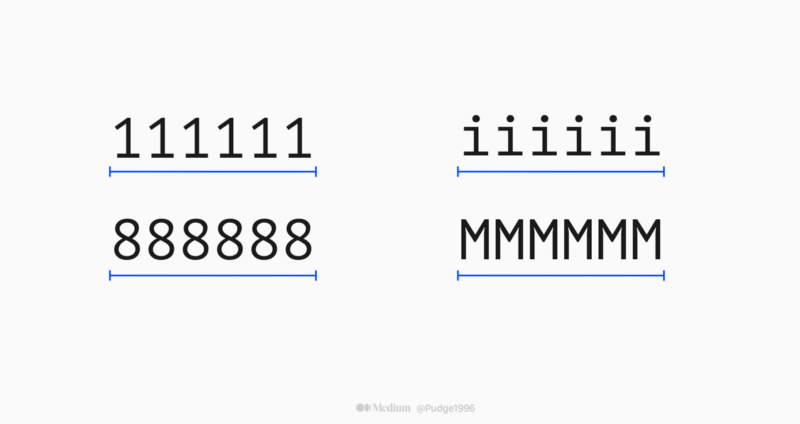
Because the spacing between each character is relatively large, it is easy to indent and align, and each character has a high degree of recognition, so there is no problem of easy identification and error in common fonts such as "1lI!". In other words, in order to improve the accuracy of identification, this font loses the original flexibility of the font. Therefore, it often appears in the code editor, and is rarely seen in ordinary life.
Often such fonts are named with "mono" to distinguish them from other fonts. Such as SF Mono, PT Mono, JetBrains Mono, etc…
But this time we are talking about monospaced numbers, that is, in common proportional fonts, the OpenType advanced typesetting function of the font is used to achieve the effect of only numbers in the same width, letters and punctuation marks are not affected, and the character width is still full of rhythm. ground changes.
2. Usage scenarios
After a period of observation and thinking, I have come up with three scenarios where the use of monospaced numbers is appropriate.
2.1 Longitudinal data display - easy to compare
If there are multiple vertical rows in the page, and the data to be compared, such as price, capacity, milliliter, kilogram, degree Celsius, etc., can be considered to use a constant width number (as shown in the figure below). It is convenient for users to compare various data vertically and obtain a better visual experience.
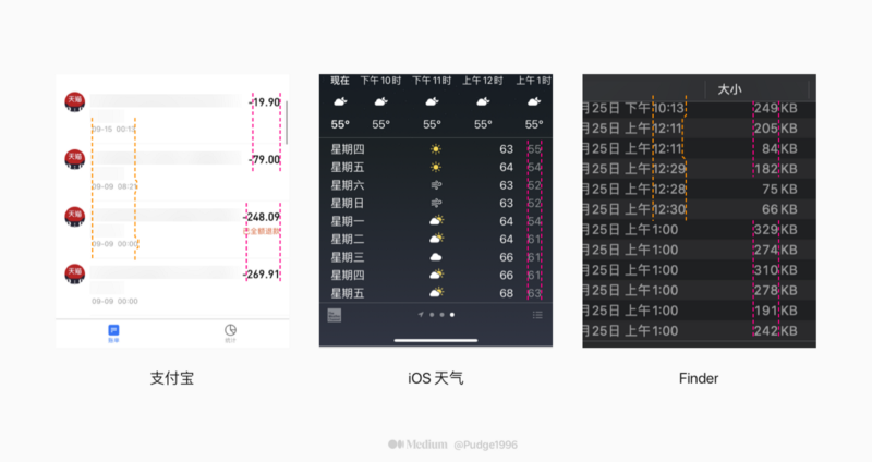
I don't know if you have found from the above example that the use of equal-width numbers is usually required when arranging vertically, and it is also accompanied by a feature: the text is right-aligned.
Even if there is no need to compare data, when a right-aligned field appears in the list, there is another advantage of using a constant-width number, which can ensure that the left side of the field is aligned to the greatest extent.
2.2 Dynamically changing numbers - preventing jitter
In the case of non-uniform width numbers, the width of each number is not the same, which may easily cause the vertical reference line to be crooked and unaligned when arranged vertically. This type of font will have a more serious consequence when applied to a number field that changes dynamically in real time - interface element jitter.
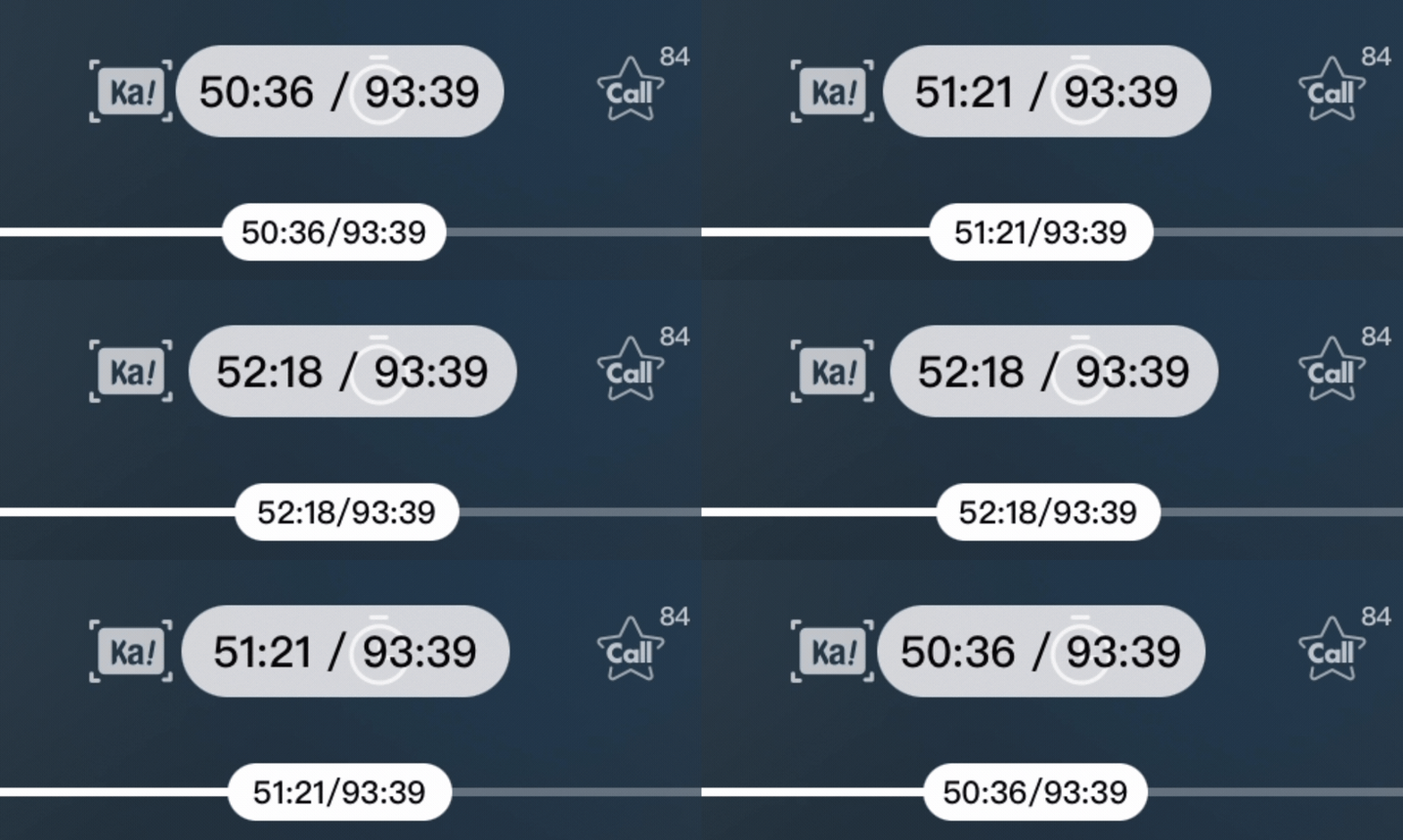
Just like the GIF image above, if a dynamically changing number field uses non-uniform width numbers, the field will keep changing in addition to the data information. Assuming that there are other elements in the field row, or nearby elements that rely on padding for layout, the impact will be greater.
So, I also recently summarized some scenarios that are suitable for dynamically changing numbers with monospaced fonts:
- Time: the progress bar of the audio and video player, the countdown of the spike, the duration of the recorded/screened recording, etc.;
- Various physical units: compass, latitude and longitude, temperature, barometer, AR ranging, etc.;
- Others: Amount, competition score, progress percentage, live broadcast popularity, etc.

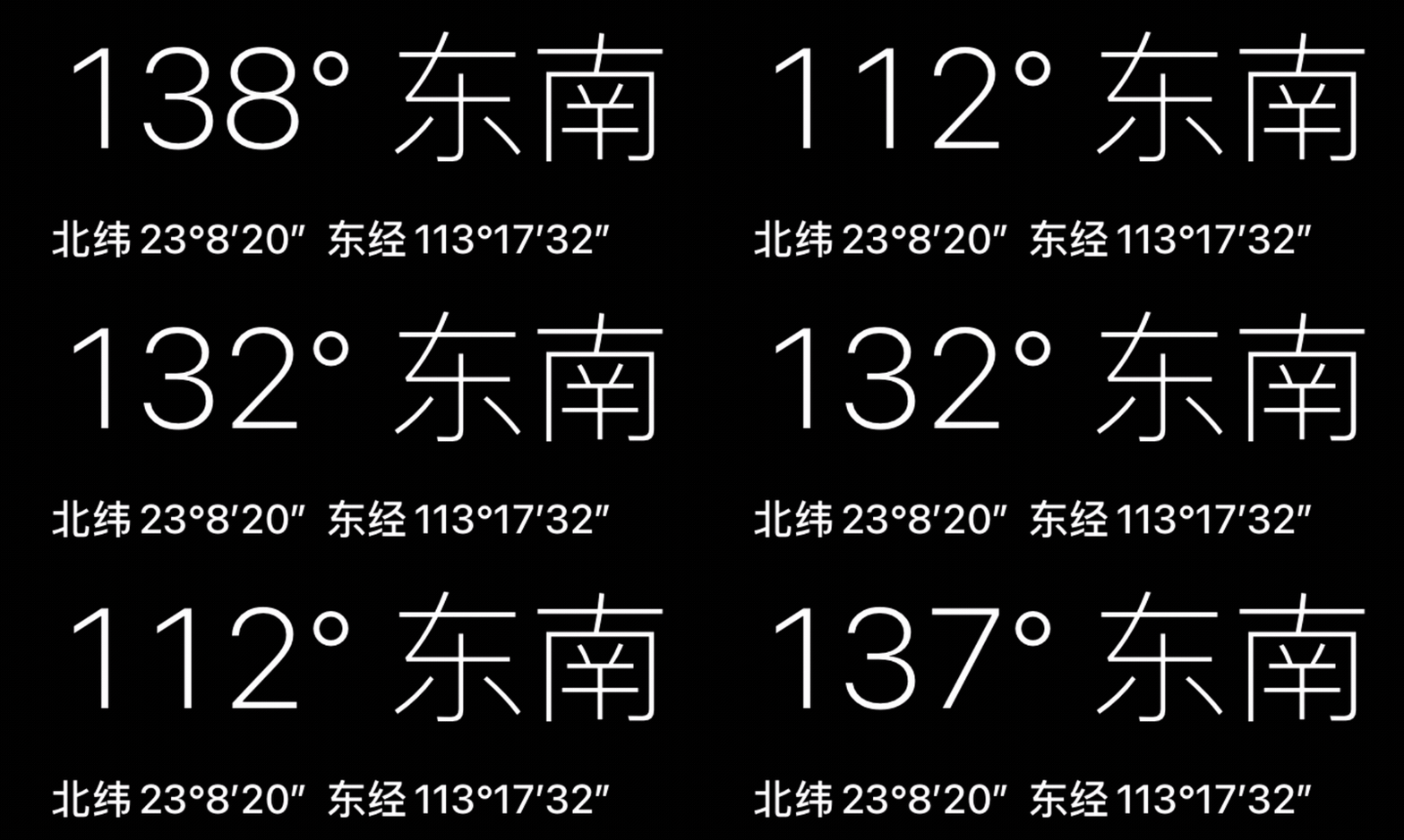
The above list is only the tip of the iceberg. You can consider combining your own business characteristics to list a constant-width numeric field table used in the company to ensure that every design has a trace.
2.3 Layout for calculating digit width - accurate positioning
A number that only displays a field. When you want to fix the width of the field, you need to use both the font size unit ch in CSS and the constant-width number style to get the exact width.
ch takes the width of character 0 as the standard unit, and the width of 1ch is equal to the width of a number 0 under the current web font, which is a relative unit. Will vary slightly depending on the font.
Just like a requirement of the company some time ago, the layout in the figure below should be achieved. The maximum serial number is 3 digits, and the width can be positioned at 3ch to ensure that the set field width is not too large or too small. At the same time, using the feature of monospaced font can avoid the problem that the distance between the number field and the card is different when the serial number is 10, 11, and 12.
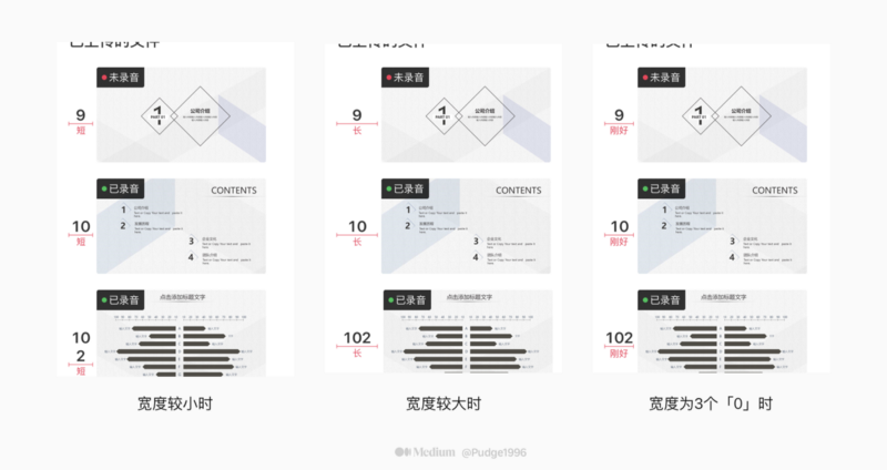
3. Implementation
Regardless of whether you are using monospaced numbers in design software or landing on the mobile phone interface, a major premise is that the font supports OpenType advanced typesetting functions and supports the characteristics of monospaced figures. For example, PingfangSC, which I often criticize, does not support it.
3.1 Using Monospaced Numbers in Design Software
Sketch: After selecting a specific font, select "Text" - "OpenType Features" - "Number Spacing" - "Monospaced Numbers" in the top menu bar to convert to a monospaced number.
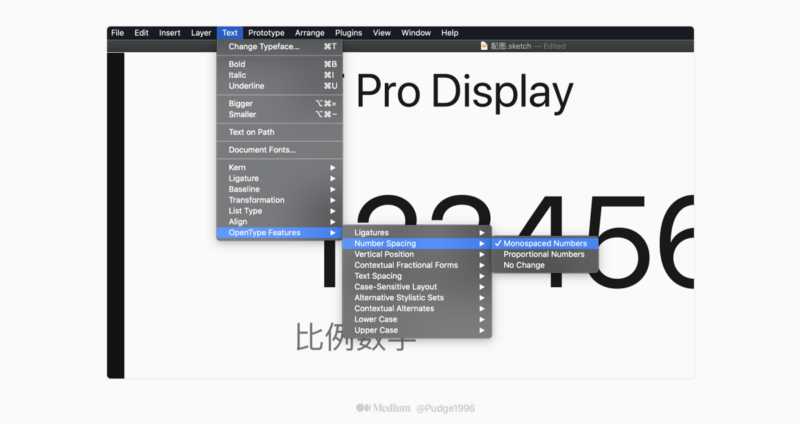
In fact, there are other OpenType advanced typesetting options that may be used in the "OpenType Features" option, such as squares, cubes, fractions, etc.
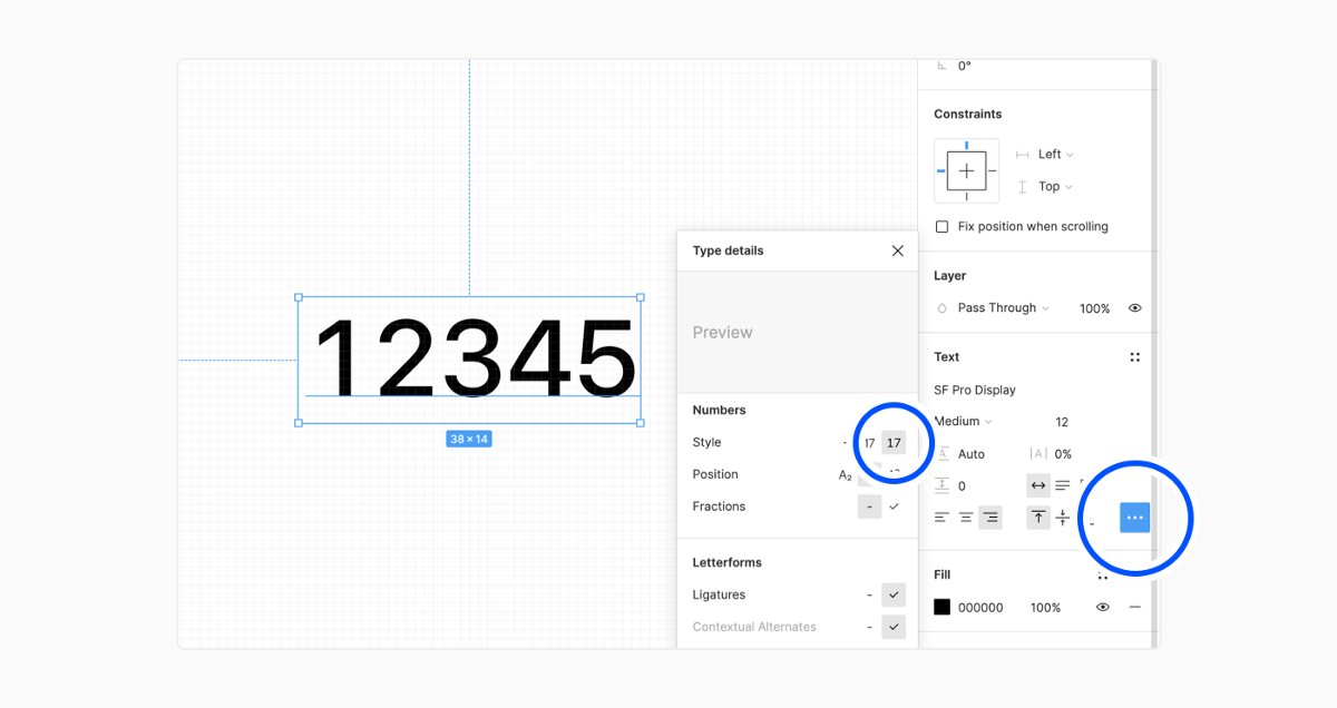
Figma: After selecting a specific font, select "Text" - "Type details" - "Numbers Style" in the option bar on the right, and select the icon on the right that is obviously a monospaced number to convert it to a monospaced number.
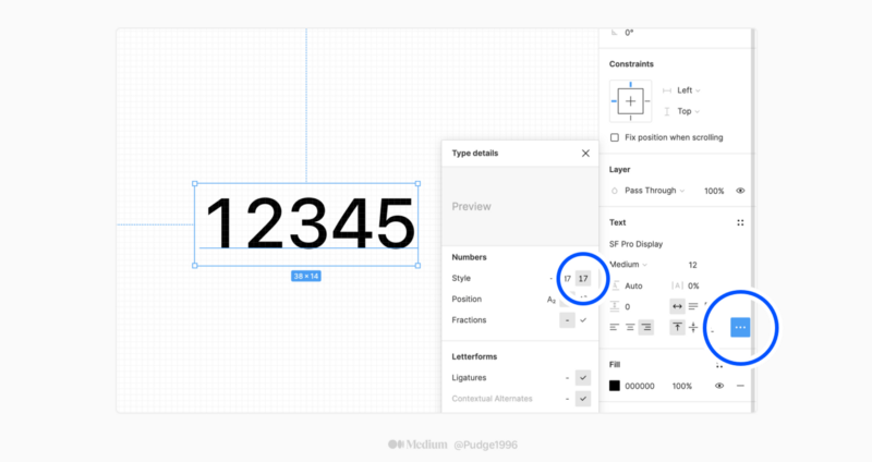
** After Figma became popular in 2019, I also used it lightly for a while, and found that the use experience in all aspects surpassed Sketch. The OpenType advanced typesetting function used this time, Figma can quickly preview the effect after setting a certain feature, on the other hand, Sketch can only click one by one, which is too inefficient.
3.2 The practice of constant-width numbers on the interface
Use constant width numbers on the interface, you can directly use CSS properties on the web side, choose one of the two:
font-variant-numeric: tabular-nums; //Does not support IE browser font-feature-settings: "tnum";
The implementation on the client can refer to this article , because the author has less contact with client development at work, so I will not record it here if I don’t know much about it.
Or another tricky way is to change the font. Platforms such as Mafengwo, Youzan, and Meituan will use another font when marking prices. It just so happens that the numbers in that font have a monospaced feature, so they can be used directly without any other settings.
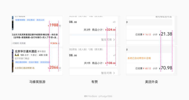
The common default is the same-width number, as well as Roboto, Noto Sans, Helvetica Neue, DIN, Microsoft Yahei, Siyuan Heibody, Alibaba Hewlett-Packard and so on.
The monospaced numbers are just a tiny detail of the text presented in the interface. When I was designing the interface some time ago, I had more and more questions, so I found some articles from senior designers on the Internet. Here are two more interesting articles:
Mobile Reading Software: Things You Don't Know About Chinese Typography | UI-Other | Tutorial | Reading Experience Design YUX - Original Article - ZCOOL
Let me show you two pictures. The text on the two pages is the same. Which one do you prefer? The book taken is "Western Script". If Takaoka Masao is not surprised, everyone should choose the one on the right (if you choose the one on the left, please face the wall consciously)… www.zcool.com.cn
The Type - The Peacock Project: Ideas for Chinese Typography
The Peacock Project: Ideas for Chinese Typography" was initiated by the author of this site, Eric Liu, in 2017. The series advocates discussing Chinese typography from Chinese and using a Chinese way of thinking. … www.thetype.com
Like my work? Don't forget to support and clap, let me know that you are with me on the road of creation. Keep this enthusiasm together!

- Author
- More