Marketing Copywriting Series|How to use a sense of humor to deepen the brand's impression? Five Humorous Ad Copy Examples and Analysis
Can your brand also add a bit of humor to product introductions and marketing copywriting? Ad copy with a sense of humor attracts more attention and increases the customer's favorable impression of the brand. Today, Harry Bear has compiled five extremely humorous advertising copy examples, hoping to inspire you to come up with humorous marketing advertising copy that suits your brand!

The articles in the Marketing Copywriting series teach you how to write to maximize the effectiveness of your advertising. Among the top 20 tips for writing good copy , mentioning a sense of humor is a very good boost to successful ad copy, because ads that make people smile tend to be more deeply imprinted. Furthermore, the average number of advertisements a person sees every day is as high as 5,000. Ad copy with a sense of humor can attract more attention and increase the customer's favorable impression of the brand. Today, Harry Bear has compiled five extremely humorous advertising examples, hoping to inspire you to come up with humorous marketing copy for your brand.
1. Daihatsu Industries - a car that can carry the opposite sex better than Lamborghini?
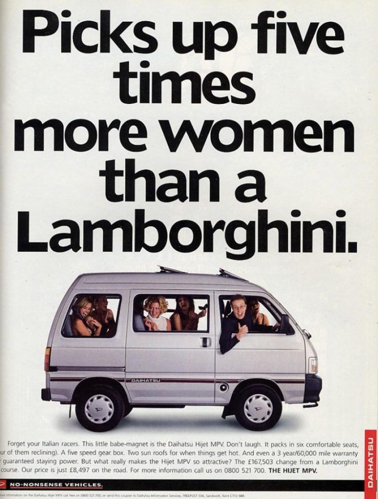
First, let's take a look at this ad from 1996 Daihatsu Industries. Let's divide it into three parts, the first is the "title", then the "picture" in the middle, and finally the "description" below.
- title
This ad from Daihatsu Industries uses a light-colored background to accentuate black and bold letters and images. English "Picks up five times more women than laborgini" is interpreted as "can carry five times more women than Lamborghini". The direct comparison with Lamborghini, a status symbol at the time, aroused the curiosity of the audience.
- picture
Although this series is about advertising copywriting, we know that visual elements are also an important part of a good ad. The success of this ad, in addition to the humorous ad copy, is also the combination of this funny picture.
We see a "homey" man driving a minivan, and we would think that a man like him might never be able to carry as many beautiful women as he does in the car. But, because of this van, he did it. At the same time, the whole picture gives people a pleasant feeling. The car faces to the right, giving people a feeling of about to start. In the picture, everyone opens the window and looks at the audience, as if saying "I won't leave without you".
- describe
Finally, we see the description part. We can see that the sense of humor runs through the entire ad copy. In addition to the title, even the description is interesting. Let's translate it. The description below is
"Forget your italian racer. This baby magnet (meaning attracting the opposite sex) is the best player in the Daihatsu Industrial hijet. Don't laugh. It's loaded with six comfortable seats (four of which are reclining), five shifting box, two sunroofs designed especially for when things get hot, and there's even a three-year, 60,000-mile warranty to keep you motivated. But what makes this Hijet racer so appealing? Certainly more than Lamborghini £167,503 less. Our on-the-road price is just £8,497. For more information, call….”
We said before that the three most important elements to convince customers are "emotion", "logic" and "credibility". We can see that this copy uses data to convince you, but also adds a lot of humor and emotional elements. In addition to introducing the performance of the car, it also humorously and directly compared with the competing brands on the market, and the entire copywriting style is very relaxed, and the use of the text is also smooth, it feels like you are chatting with a company colleague about his weekend. Recreational activities as natural.
2. "The way an idiot dies"
In 2012, Melbourne, Australia, in order to reduce the number of accidents on the railway system, made this very memorable and successful advertising film: Dumb Ways to Die.
The cartoon uses very catchy, rhythmic songs, paired with cute animations, and depicts the many idiotic ways in which one person can lead to one's death. This is a very good example of an advertisement delivering an important message in a humorous way. While we are thinking, "This is too idiot!" Pay attention to the concept of safety.
3. Spotify — Weird listening habit
Whether it’s Spotify or KKBOX, in fact, information such as this year’s hit songs and hit playlists are often announced at the end of the year. At the end of 2018, Spotify released a super odd playlist, which made everyone laugh.
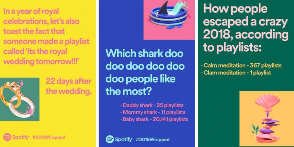
First of all, Spotify made three different #2018Wrapped pictures, all of which use very bright colors, "yellow", "blue" and "green", presenting a lively atmosphere.
- written on yellow background
"In this year full of royal celebrations, we also toast to this, someone made a playlist 'Tomorrow is the Royal Wedding!!!" The next paragraph reads "But made 22 days after the wedding. "
- written on blue background
"Which shark do you like the most, DOO DOO DOO DOO DOO?"
"Daddy Shark - 25 Playlists, Mom Shark - 11 Playlists, Baby Shark - 20,141 Playlists."
It seems that baby shark is very popular!
- On the green basemap it says
"How everyone escaped the madness of 2018, according to playlists: Calm Meditation - 367 Playlist, Clam Meditation - 1 Playlist."
(There is only a slight difference between Calm and Clam in English, but the meaning is very different!)
I think the success of this copywriting is not only in the writing of the text, but in the entire marketing strategy. Instead of publishing the hot list invariably, it took ingenuity to integrate popular current affairs to show a sense of humor.
4. Palace Skateboard—a humorous trendy app for trendy brands
The next one is a trendy brand that has become popular in the UK in recent years. The elements of skateboards run through every single product, and are very popular with young people who are keen on street culture. And because Palace Skateboard focuses on "cool", "trend" and "young people", the design and style positioning of the entire brand must be presented according to customers' preferences.
So we are not surprised, often see some unexpected marketing tactics on their website. For example, the following Palace backpack. Let's pay attention to the place where the products are introduced. They are not like the general e-commerce websites where every focus is to present the characteristics of the product, but to match the consistent style of the customer base, showing the little rebellion of young people.
For example, the following picture is written in the product description section:
- I have a question
- just never listen
- others speak
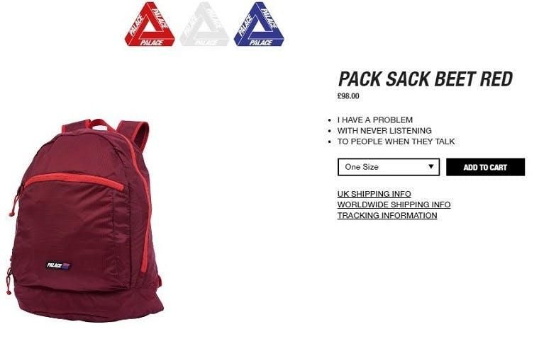
We know that a very important point in writing copywriting is to know who your market TA is, and Palace makes good use of this. When introducing products, the focus is not on the "functionality" that ordinary citizens pay attention to. , or the "beauty" that fashion people pay attention to, but instead directly omits the description of the function and appearance, and directly states the "characteristics and behavioral habits of the target customer group".
The one below is also.
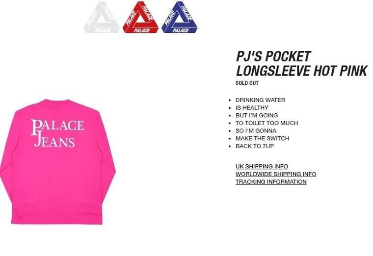
- Drink water
- is very healthy
- but i will
- going to the toilet too much
- so i want
- exchange back
- 7UP
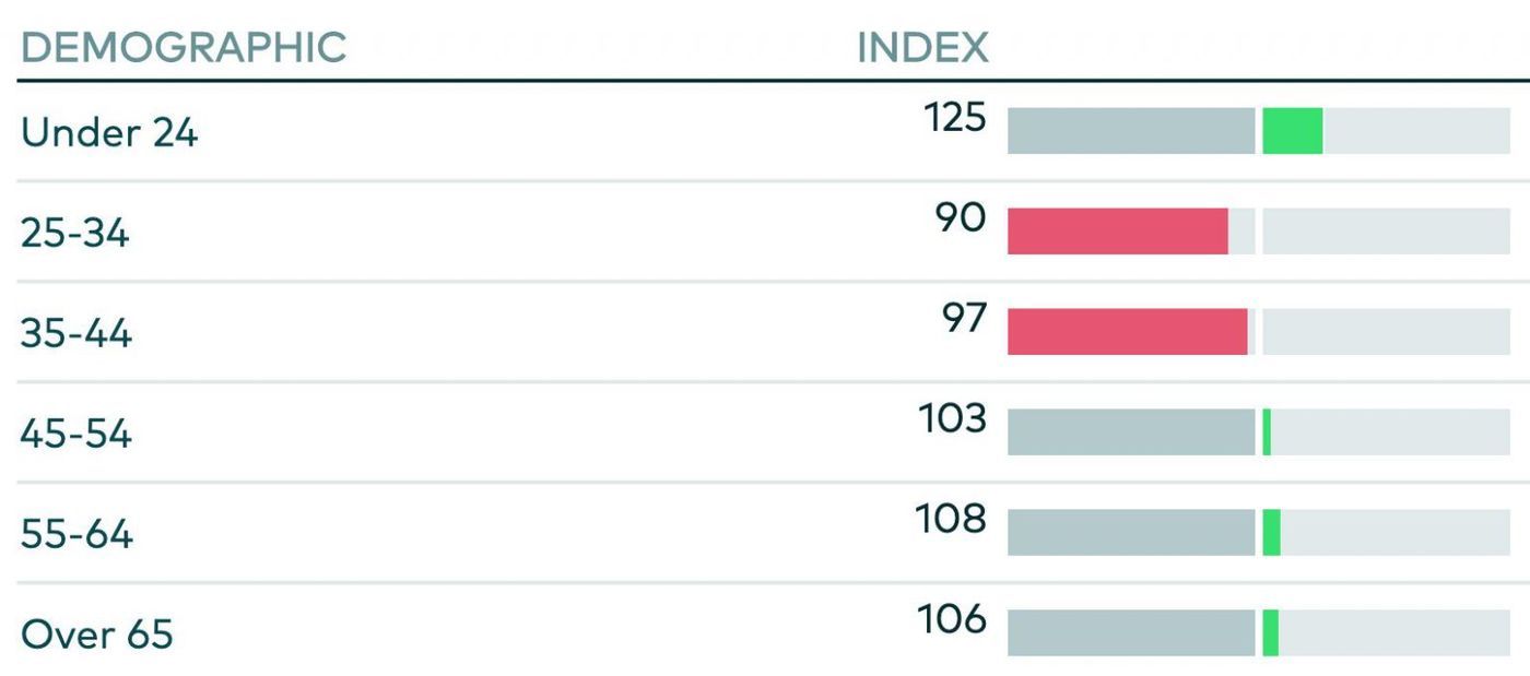
Why 7UP? We checked, because 7UP's brand customers are mostly under 24 years old. That is to say, directly pointing out the eating habits of this customer group, and matching it with humorous sentences, once again showing the "rebelliousness" of this customer group.
5. Dollar Shave Club - Have you ever used such an amazing razor?
Dollar Shave Club has always been known for the brand's humorous style, but we've noticed that this sense of humor extends beyond social media or ad copy to the product's website and product description. It's not the same as the product introduction of the trendy brand just now. The introduction just now doesn't seem to express any information related to the product, but Dollar Shave's humorous way is to let you know more about the function of the product while talking and laughing. In other words, it is based on the sense of humor extended from the functionality of the product, and the central idea of "helping customers understand the product better" in a relaxed and pleasant way.
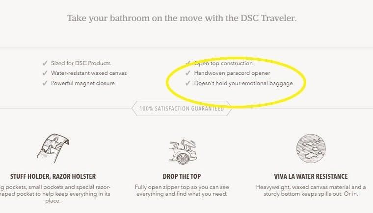
Let's take a look at the six product features above. The first few seem to be normal, but the last one is "won't keep your emotional baggage." This seems to be a common technique used by this brand, and there will be a small twist at the end of the introduction that will make you smile.
Next, we are looking at the following shaving foam, the last sentence is "the foam disappears quickly, your magician friend will ask you how to do it", to show the product "bubbles do not remain" characteristic.

Can your brand also add a bit of humor to product introductions and marketing copywriting? While a sense of humor can certainly be impressive, it can be counterproductive if not used properly, so try to be careful when using it. Also, take a look at the simple five steps to writing a successful marketing copy article, find out your audience and their habits, and then evaluate how to best use your sense of humor!
Like my work? Don't forget to support and clap, let me know that you are with me on the road of creation. Keep this enthusiasm together!

- Author
- More