Figma beginners can start playing with these!
Before fumbling around with Figma, I didn't even know Photoshop or Illustrator. This article is to use simple steps to help you quickly build a feel~
1/ Select the device, draw a square
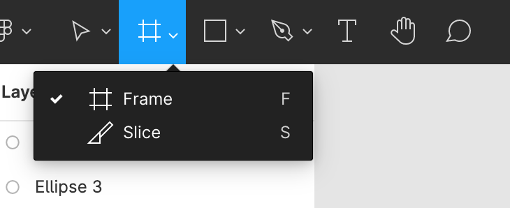
First of all, in the upper left, click on the Frame that looks like a tic-tac-toe key, and a row of mobile device sizes will appear in the upper right. For example, mine is an iPhone 8 Plus. Choose a mobile phone and start doing it!
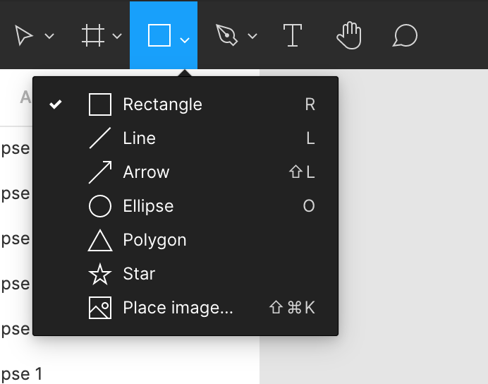
Then pull a square out, press the shortcut key R, you can also play with lines or other shapes below the square~
It is very important to learn to square, it is the information or picture field of the mobile interface, and it is also the most basic of making buttons!
As for the T next to it, it should be seen that it is used to pull the text box, just like doing a briefing. You can also choose the font and set the size in the right row~
2/ Make rounded corners and color
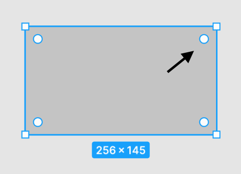
I got the square out, how do I make the shape of the button? Click inside the square to display the dots at the four corners, press and hold the dots to shrink inwards, and an arc will appear~
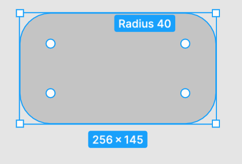
In the Design column on the right row, you can see that the angle of the arc becomes 40. You can also change the number from here!
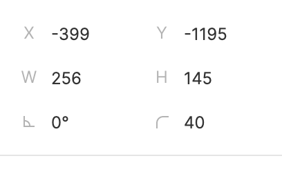
Change the color of the square, click on Fill, find the color you want, or apply the color code.
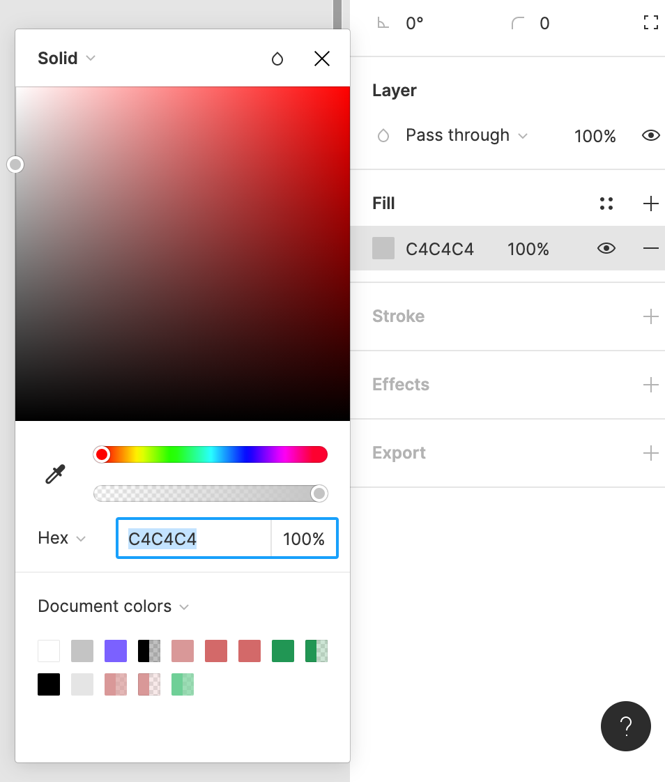
3/ Set components and common colors
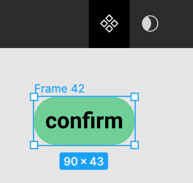
With the first two steps, you should be able to make a button shape with words. Try to select the shape and the word together, and then press the four diamonds directly above, which means to set it as a component (Component), so When you want to design the same button on several pages, you can use this component directly! (Remember to modify the name in the left row for easy identification)
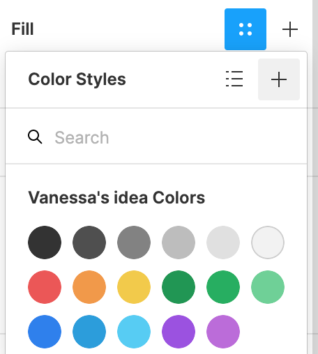
Throughout each page, there will be the primary and secondary colors of the brand to be used uniformly. There is no need to re-copy the color code every time. You can press the + sign on the Fill side and name the commonly used colors. After that, you can directly select the color you want to apply. ~ (Text style is the same way to organize common fonts)
4/ Make interactive prototypes
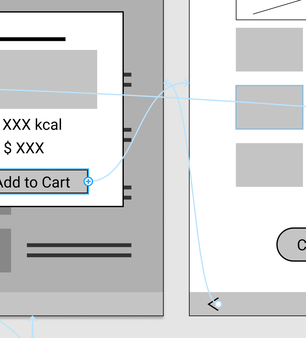
To make your pages connected and buttons clickable, you need to switch from Design to Prototype in the right row of the workspace, move to the position where you want to add interactive design, click it and the + sign will appear, pull the arrow to the desired The linked page is enough, don't forget to go back to the previous page and also link it!
5/ Make good use of templates and icon materials
If you are not a designer, you don’t need to worry too much about beauty and ugliness. Especially in the initial communication, the focus of the presentation of wireframe should be whether the information structure and usage process meet the requirements. Too detailed visual elements will defocus the discussion.
And many common icons are already ready to use, such as the icon database provided by Google, select the SVG file you need to download, upload it to figma, and then modify the color and size.
Officials provide various template material packages , or refer to various UI kits provided by the figma community . In your spare time, you may observe the way others design in this way, which may be absorbed more efficiently than directly reading the design specifications. For example, when I thought about IG posts before, I actually used this template for inspiration.
For more detailed application skills, Figma has course teaching videos . If you are not used to English, I also recommend that I take Hahow's "Product Design Practice: Creating Excellent UI/UX with Figma" course. However, I was learning with UX concepts before, and I didn't plan to continue to study UI design in depth, so I'm afraid I can't answer if you ask me about too professional skills. XD
I hope the above few simple steps can help friends who are interested in getting started, and then learn more and play more, come on!
Like my work? Don't forget to support and clap, let me know that you are with me on the road of creation. Keep this enthusiasm together!


