
我管理世界職業技能競賽之網站技術項目、舉辦本地設計與開發賽事、開課分享技術心得。一個用網頁來表達自己的作家。
Web Accessibility|Use the Firefox browser to simulate color weakness and improve the interface
When we develop website applications, we often use different colors as state distinctions. For example, red means there is a problem or warning, and green means passable or normal. But when we use these colors, we may need to consider color weakness and even color blindness. Otherwise, some user interface operations will make it difficult for people with color impairments to use.
Among all kinds of color weakness, red-green weakness is the most common, and about 8% of men have red-green weakness . Since the weak red and green color is caused by the X chromosome, it is mainly manifested in males with XY chromosomes.
Example: Confirm and Cancel buttons
For example, if we have the following confirmation or cancel confirmation box interface, green and red backgrounds are used. At first glance there is no problem.
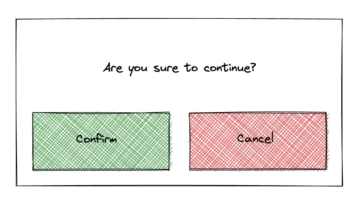
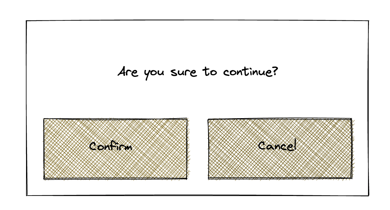
However, if there are people with green color weakness, they will generally see the following screen. It can be seen that there is almost no difference between red and green. Of course, our users can still judge which button is which by text. But imagine if these words are in a foreign language that you don't understand. For example, if you are shopping on a foreign website or operating a flight website, there is a half-page version of the text without multi-language support. At this time, people with color deficiency will only look at the interface. Black question mark .
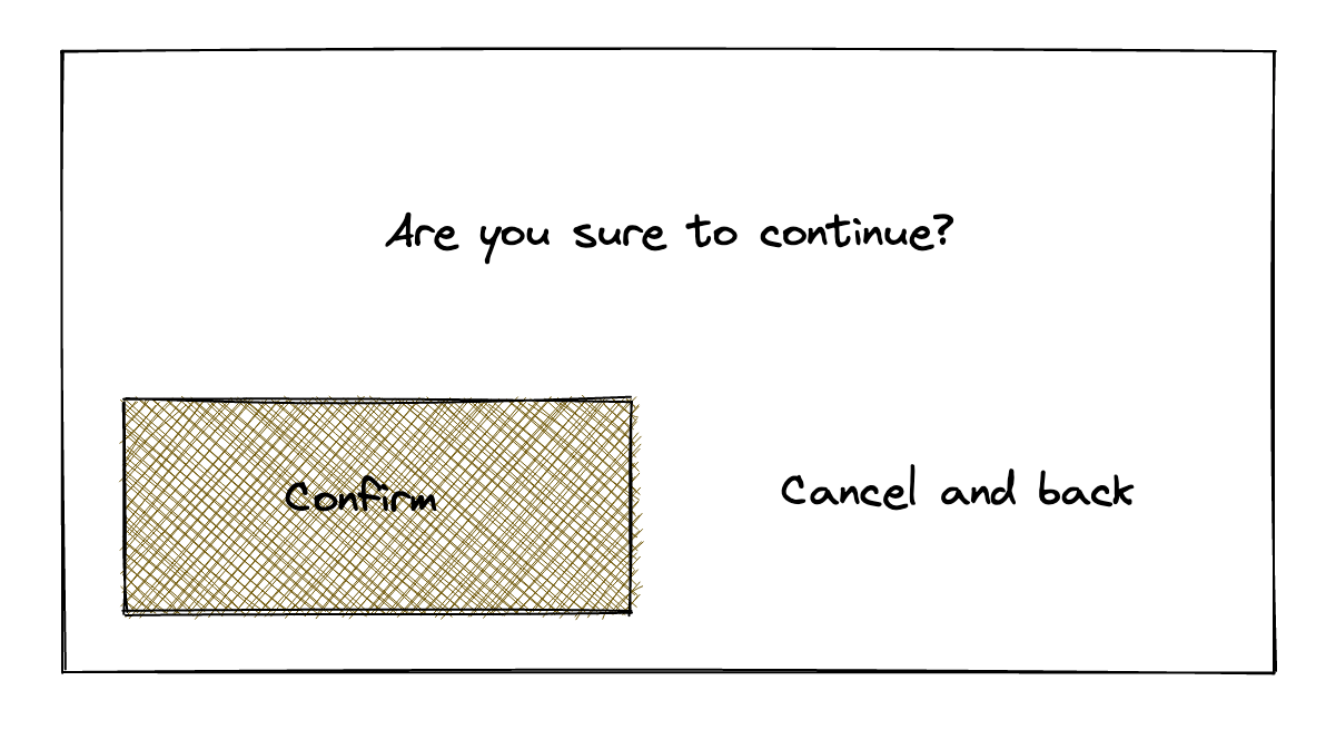
One workaround for this example is to only have a colored background for the important buttons, and use a completely different style for the secondary or non-preferred buttons. For example, after the following modification, the main button is obvious. If this confirmation button appears during the operation, the user can roughly press the main button and continue the operation.
Simulate different color shades in Firefox
In the Firefox browser, we can simulate different color shades. So that developers can debug the color of the interface. Tools are placed in the accessibility page of the developer panel. You can press F12 on the keyboard or right-click on the webpage and select "Inspect" to open the Developer Panel. In different tool pages, find Accessibility.
In the toolbar above this accessibility tool, there is a 👁 eye icon with "Simulate" written next to it. Press it to choose from different color weak visual effects, including red, green, blue color weak, grayscale Color Weakness Simulation. In addition, it can also simulate the visual situation under low contrast.
Note: The accessibility detection tool on this page has other useful functions, such as generating a list of potential errors, viewing the file structure, etc. It is similar to the previously edited axe, WAVE, and headingMaps. I will refer to it later. Writing introduction.
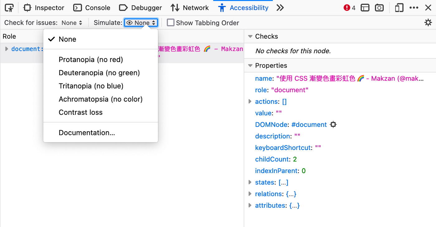
When we select a certain color-weak visual effect, the colors of the entire web page are rendered in the version that a person with color-weakness would see.
Take the rainbow colors as an example
The following is an example of drawing rainbow colors with CSS introduced earlier. The following is the color effect under normal circumstances.
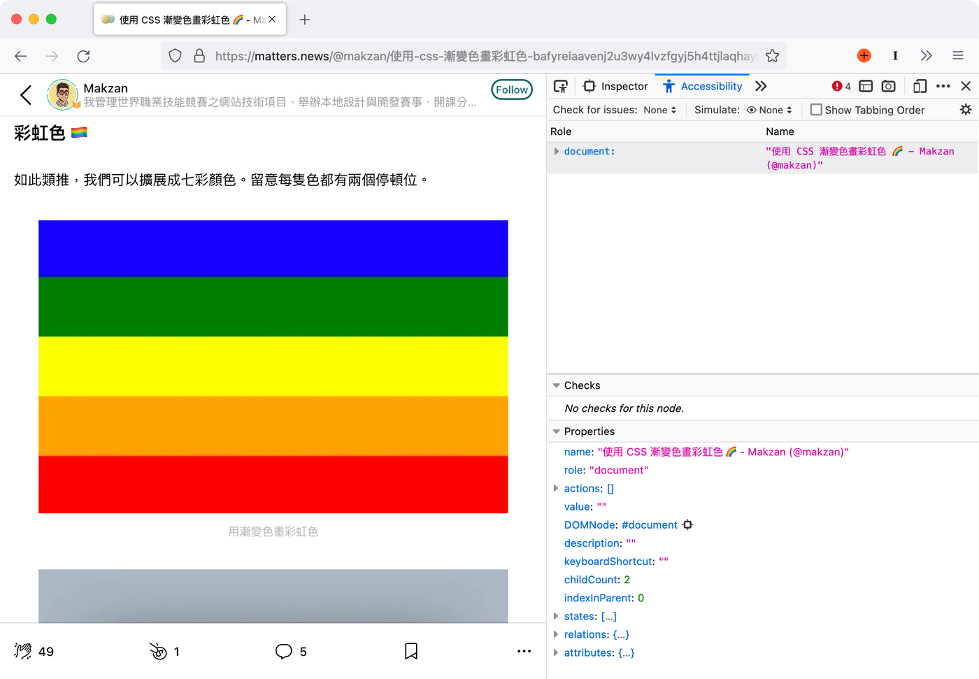
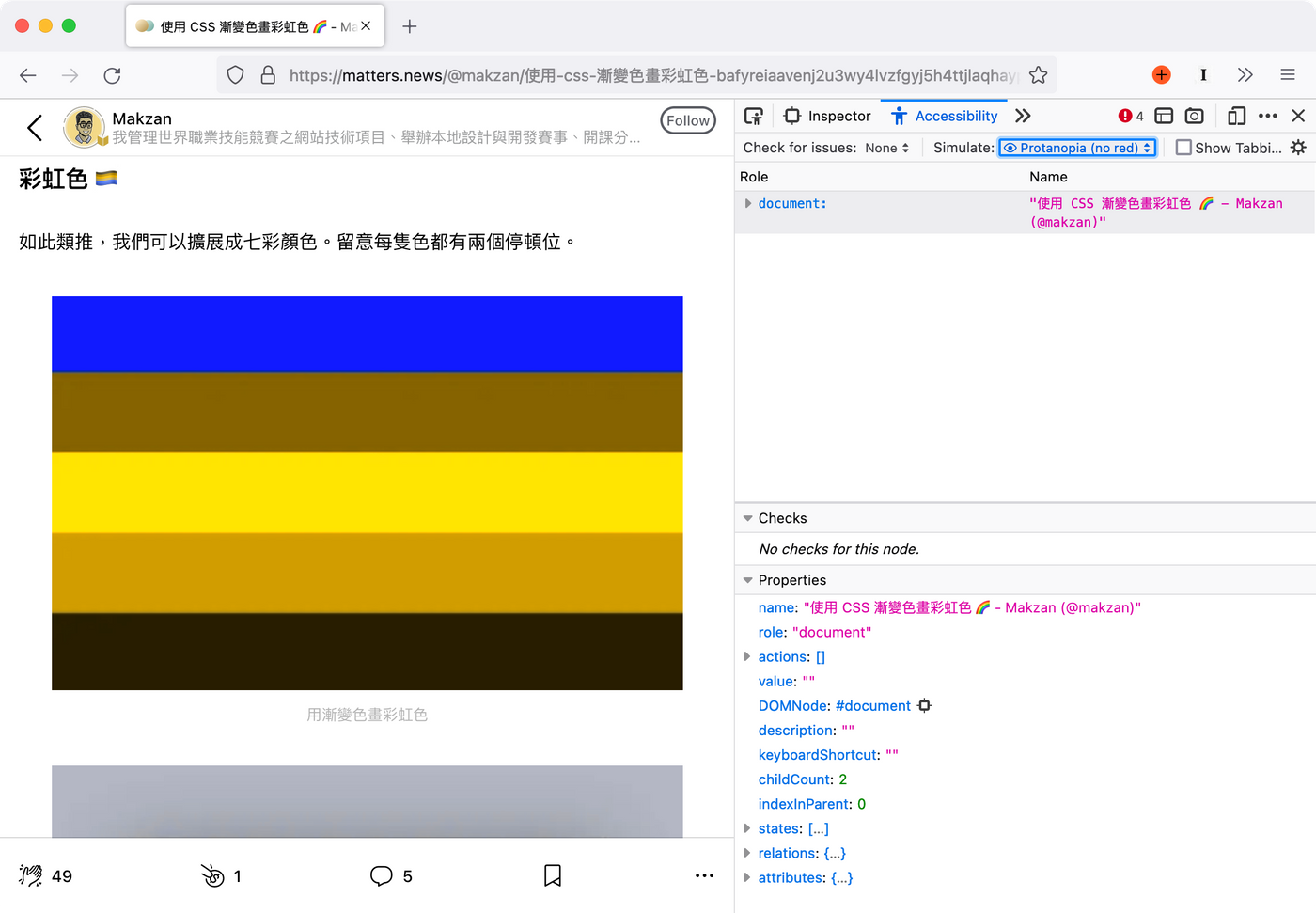
Then we open Firefox's accessibility tools and simulate different color-impaired people to see what color combination they see.
Weak red:
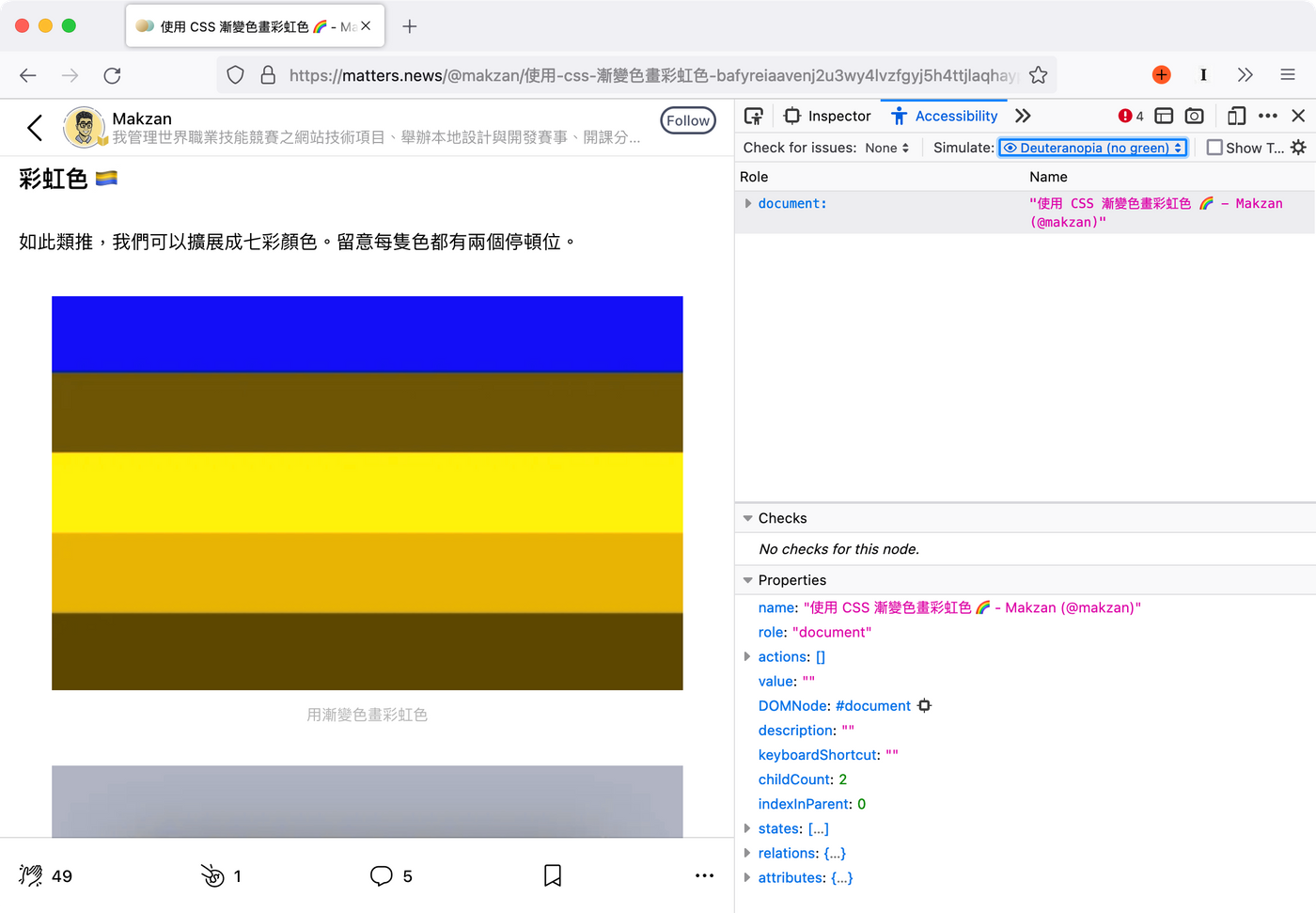
Weakness in green (common):
It can be seen that people with a green color weakness see almost the same red and green as the primary colors. There is only a very slight distinction.
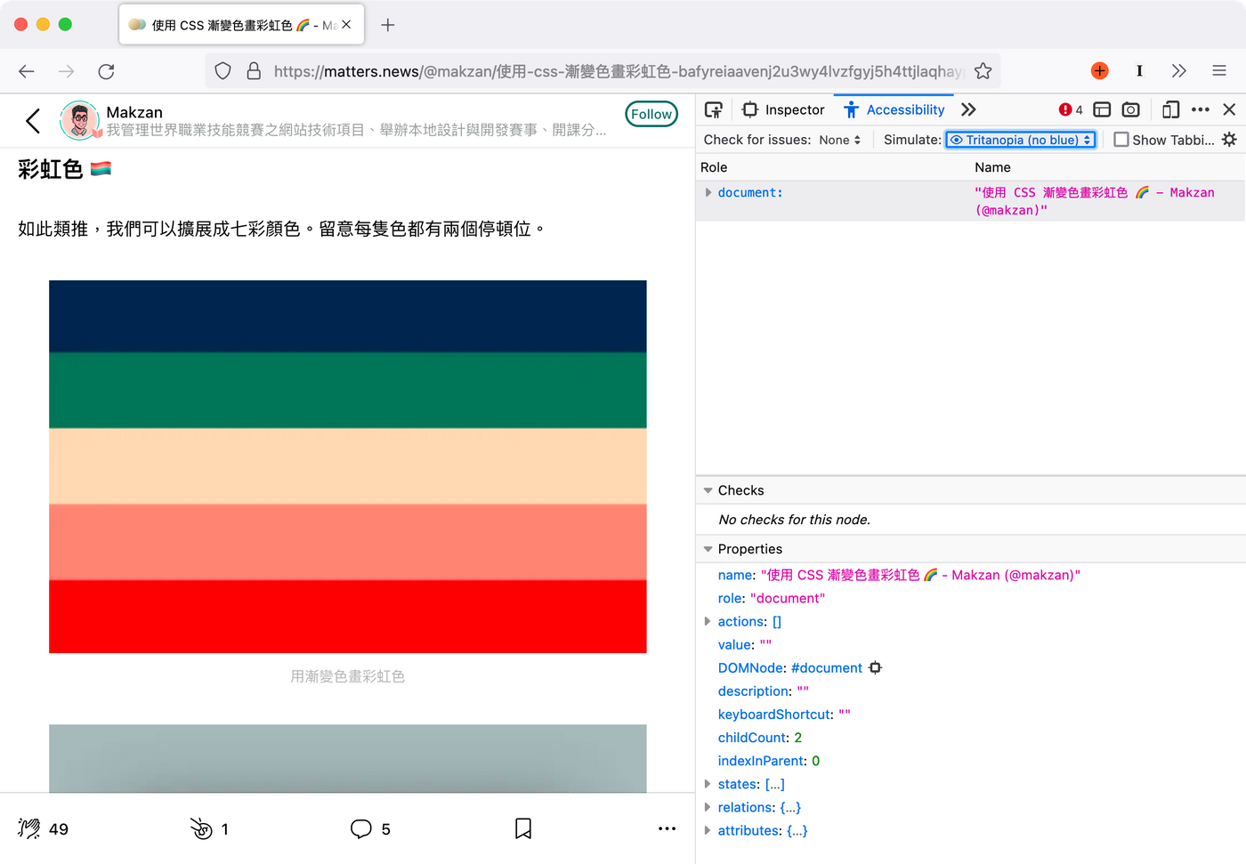
Weak blue (very rare):
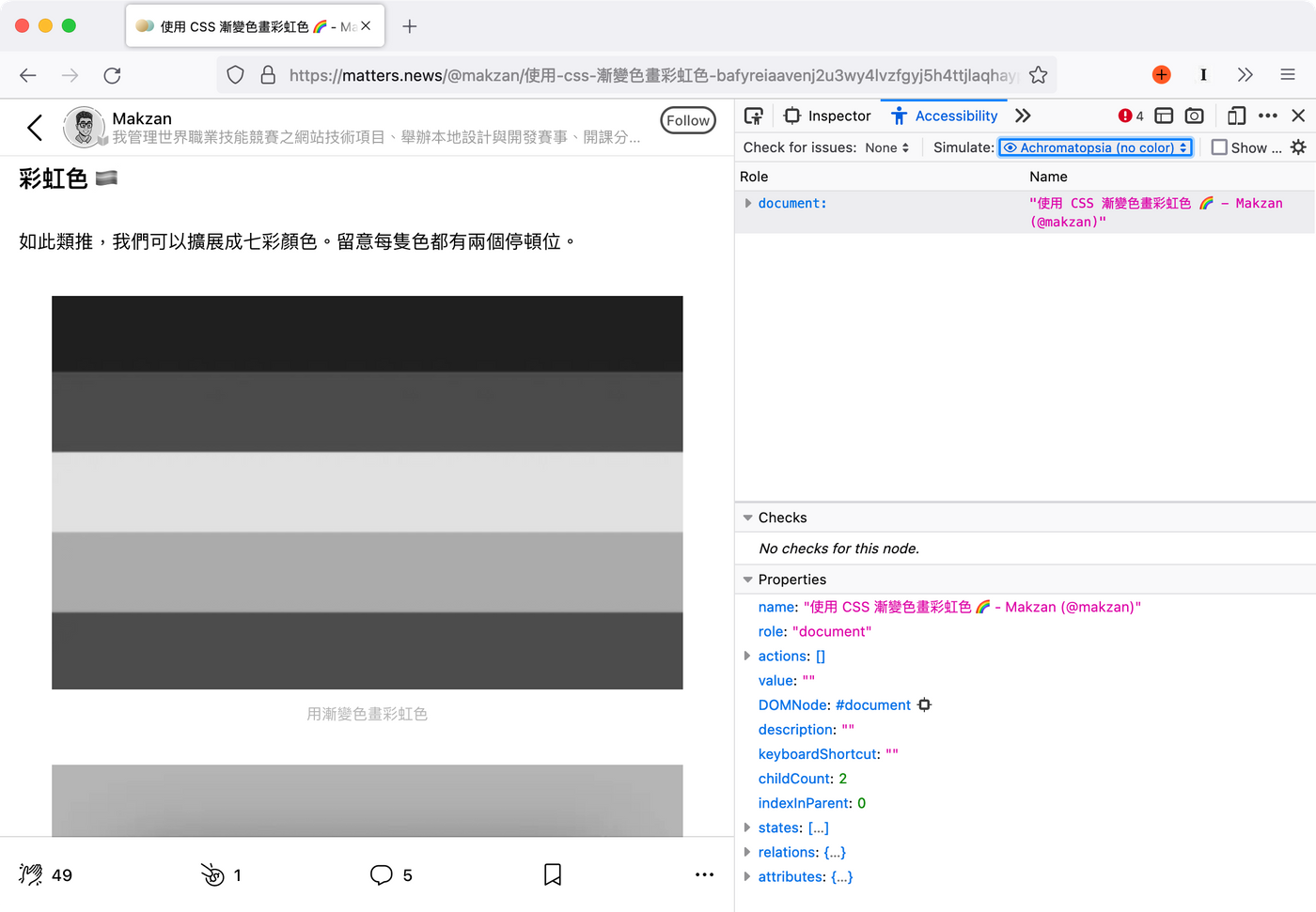
Grayscale (very rare):
Example: Macau Bus Station Information Website
As can be seen from the above figures, the primary color red (#FF0000) and the primary color green (#00FF00) are difficult to distinguish for people with a green color deficiency. However, these two colors are quite commonly used in websites. For example, the following is an example of the website of Macau bus stop.
URL is:
https://bis.dsat.gov.mo:37812/macauweb/routeLine.html?routeName=12&direction=0&language=zh-tw
Note: Readers in Macau, if you usually take a bus, you need to use the Bus Stop Announcement App. You can consider adding the above URL directly to the main screen of the mobile phone, and directly open the bus route you usually take in one step. If there are multiple routes, you can replace the bus numbers and add them to the main screen directory. In the future, when you want to see where the bus is, you can open it with one click, and others are still waiting for the app to load or find the route in the list.

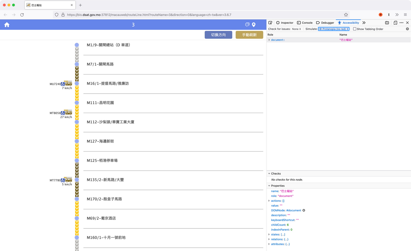
Some bus routes will have red, green and yellow colors to represent the traffic congestion on the section of the road. Here's what the red/green weak people see, where the red for traffic jams and the green for smooth traffic are very similar, if not the same.
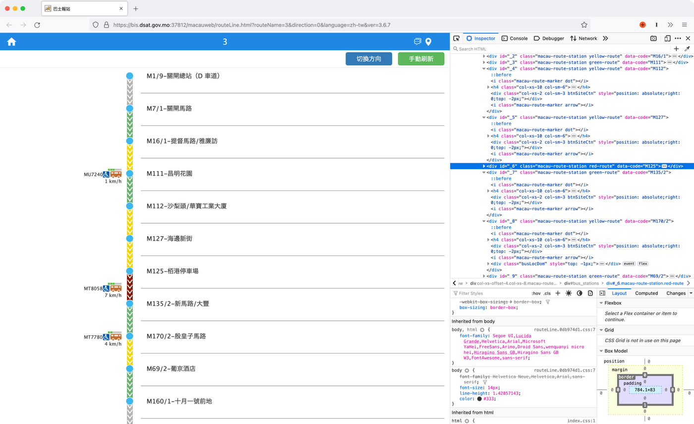
Since the shades of red and green can be perceived by a color-impaired person, one solution is to avoid the pure red and pure green of the primary colors. Instead, choose a darker red and green as the interface color, or use colors of different shades and similar hues for adjustment. Below, I use the developer panel to replace the red and green with dark red and another bright green. The normal visual effect is as follows, it can be seen that the red is slightly brownish, but the interface functionality of red, yellow and green is still maintained.
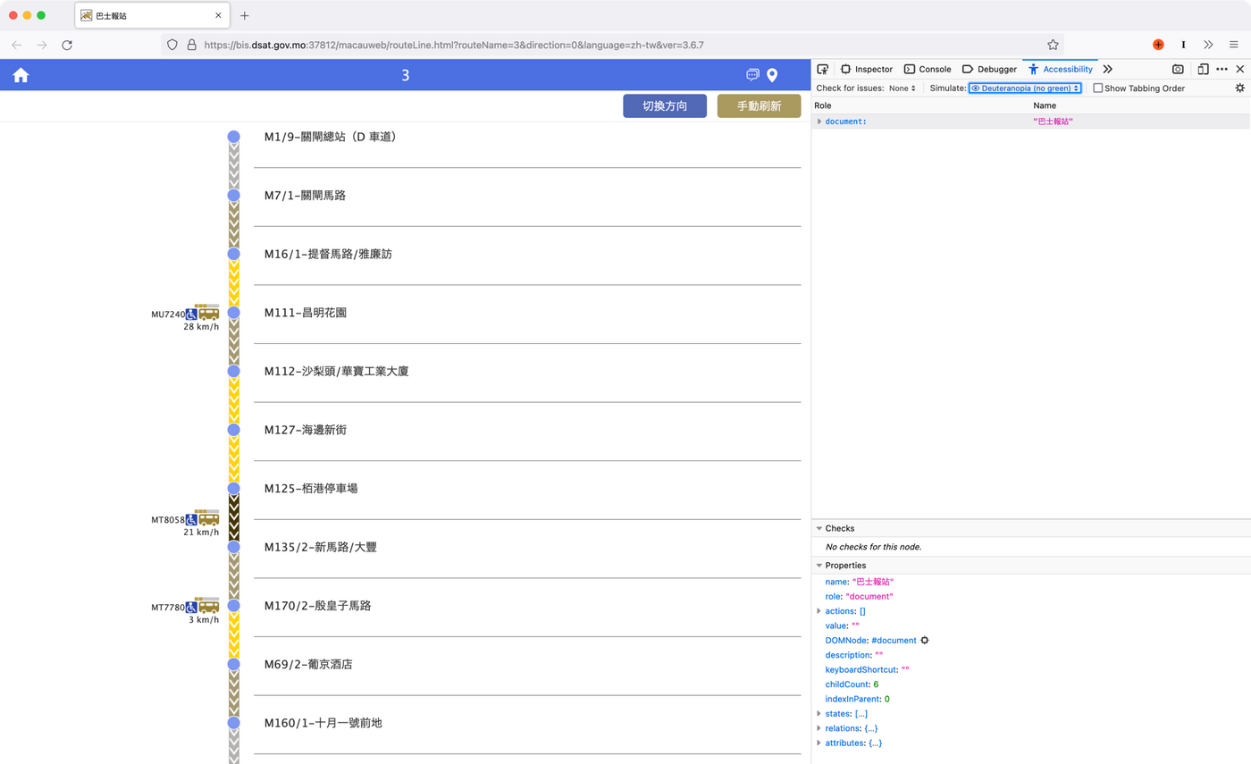
In the simulation of green color weakness, the shades of red and green sections are visible. At least two states can be distinguished.
Another solution is that the interface design does not just use color as a functional distinction, but like the first example, through other visual effects to distinguish, for example, can be distinguished by texture.
Continue on the bus stop announcement page, you can see that each red, yellow and green section has a down arrow texture to express the top-to-bottom direction of the bus from the first stop to the last stop. But in fact, the direction arrow does not provide much information. Basically everyone knows that the bus goes from the first station to the second station and then to the third station. If these textures are replaced to express the degree of congestion on the road, it can help people with color impairments understand the road conditions.
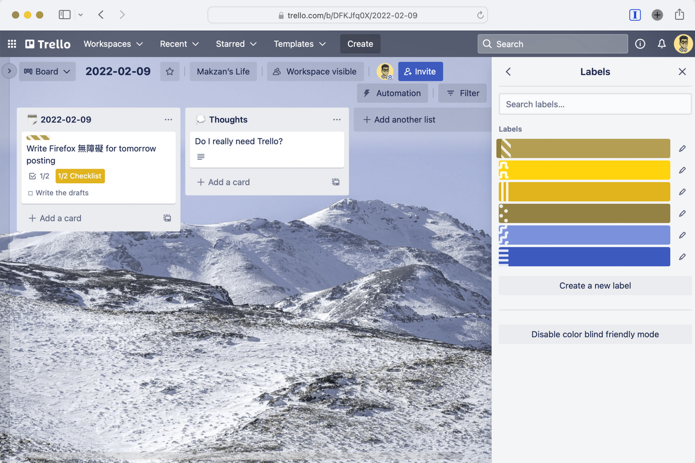
Trello's Label uses texture distinction
The Label in the nonlinear finishing tool Trello uses different background textures as a substitute for color. As long as "color blind friendly mode" is turned on in the settings, you can see different texture backgrounds. The following is the state of simulating green color weakness. Individual Labels can still be easily identified.
When we make a website or a Web App (network tool), it is easy to give up or ignore the basic usage requirement for the convenience of rapid development: the online world is used by all human beings. Everyone can benefit from accessibility. Therefore, when designing the interface in the future, the visual effects of people with color impairment can also be taken into account. Especially for some important interfaces, be sure to go through the simulation process at least once.
— Makzan by Mai Mai , 2022-02-10.
Like my work?
Don't forget to support or like, so I know you are with me..
Comment…