
Matters 社區官方帳號 Official account of Matters Community For English community: @Matterslab Everything related to Web3
Matters has the first version of the logo (said to be very similar to the brewery logo?)
Recently, I was thinking about what kind of Logo Matters should have? After all, everyone will see the news of Matters soon.
At first, I thought about finding a few powerful designers to help us design a logo that fits the image of Matters.
What is the image of Matters?
It should be cool, atmospheric, abstract, mysterious, with a sense of technology. I don’t know what it looks like.
When I was thinking (worried) in the face of a list of designers & studios (good designs are really expensive, of course they are worth it!), a small friend suggested that we should play something different.
- How is it different?
—Go to a competition to design a website, a Matters logo design competition.
-it is good! Special (a bit false)? What if it doesn't look good?
- It doesn't look good, just change it. (is it random)
I went to the design website to see the price, it seemed very good, so I went with the attitude of giving it a try.
The design site asks if there are any elements we would like to add to the logo design. I thought about it, of course it is MAT wheat seeds! So I just mentioned that you can consider putting the image or color of wheat seeds into it.
Publish after writing the design requirements, and have 7 days to wait for designers all over the world to submit their works. The platform said that generally 30 to 50 works can be received. Still looking forward to it.
After the release, I didn't expect a designer to submit it within 30 minutes. I was so excited. After opening...
In 7 days, I received a total of 120 works (it seems to be very popular), but the result is very... special, it seems that the designers have been taken away by the wheat seeds I said. But I also mentioned very advanced terms such as blockchain, content value, and ecosystem. Where did these keywords go! ! !
(Choose a few for everyone to see, because we don’t have the copyright for those that are not selected, so everyone just take a look, don’t spread it, and I will delete it in a few days. You will understand my heart after reading it.)
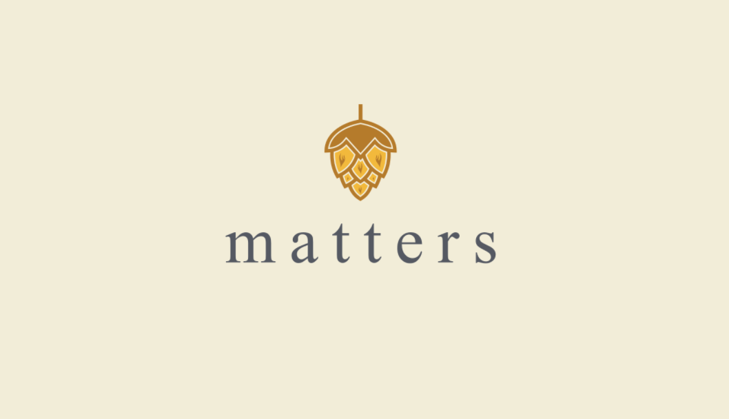
Much like this one from Golden Arches (how did the designer know I like McDonald's...):
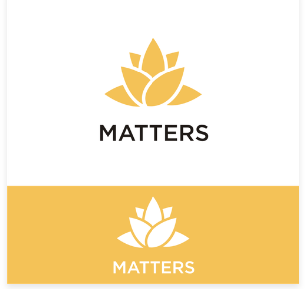
This looks like a lotus
This could be a grape (M-shaped grape)
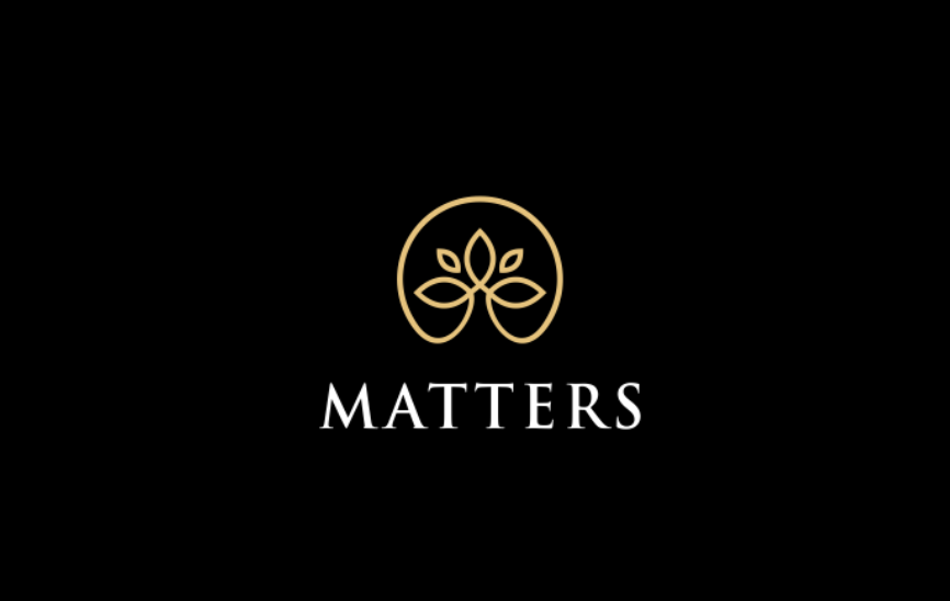
seems to be a religion
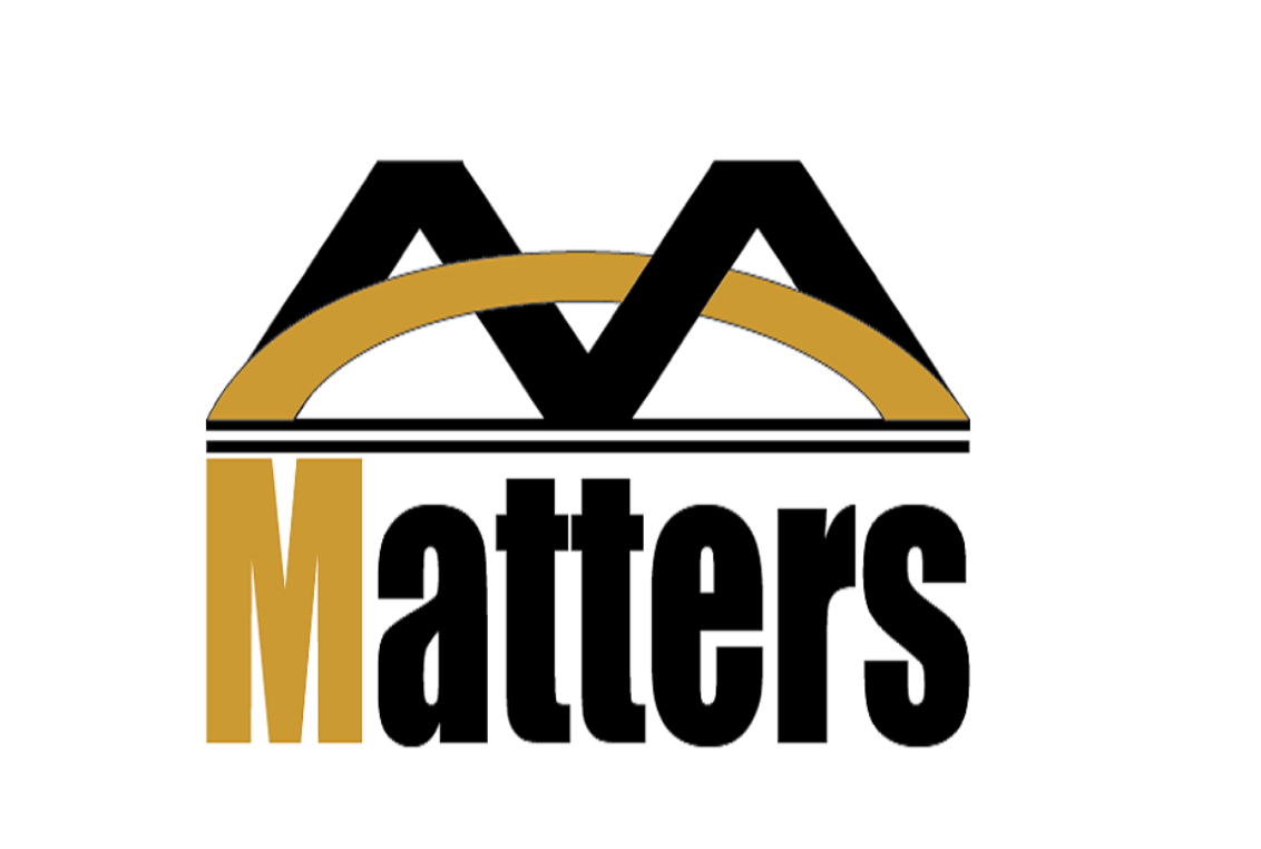
Thank you so many dozens of designers, thank you for your "brain-opening", there are countless choices, and finally we chose this as the first version of Matters' logo.
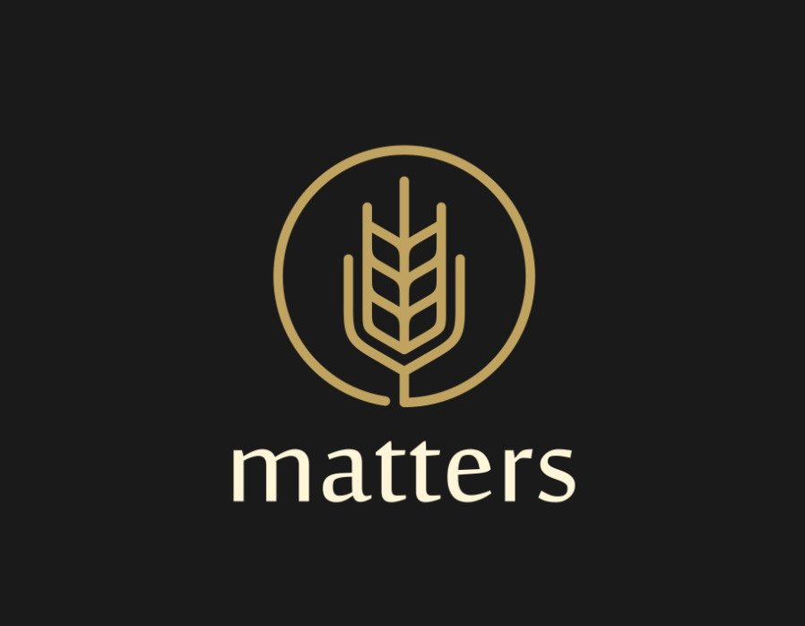
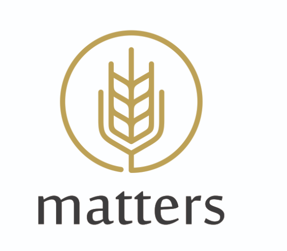
OK, I know what you're going to say. When the friends saw it, they spit out one after another, some said it looked like the logo of a brewery, and some said it looked like a pen tip.
But, after all, this one has wheat seeds, and it also has a sense of lines. Do you like it? It doesn't matter, you can express your opinions freely.
Logos can also evolve, right?
(By the way, I would like to ask everyone in the group if there are any good designers, please recommend, hahaha)
Like my work?
Don't forget to support or like, so I know you are with me..
Comment…